 This guest post is part of a three-part series, tackling the heuristics of conversion, and was written by Phiture alumni Mateusz Wrzeszcz, a specialist in Global App Store Optimization and CRO @ Klarna.
It is safe to say that today the life of an app developer is awash with data. But, data is only as valuable as the insight it gives you. It isn’t enough to simply pile up numbers in a spreadsheet; because without any insight gained, leading to a hypothesis you can test, all the data in the world won’t produce an increase in your conversion rate (CVR). Instead, it is about establishing a structured approach to your Product Page Optimization (PPO) and asking the right questions to ensure that the information you collect informs a hypothesis you can actually test. In turn, allowing you to harness all that data into a real-world solution that will help grow your app, your users, and your conversion rate.
This is why we at Phiture, as part of our Conversion Rate Optimization Loop (CRO Loop), developed the Product Page Analysis Cheat Sheet to help guide you through the often murky task of Product Page Assessment.
The ironclad questions to structure your PPO.
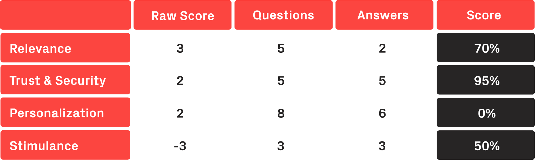
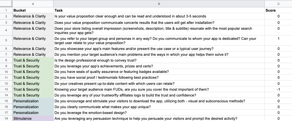
A table displaying scores in relation to qualitative questions to structure your research.
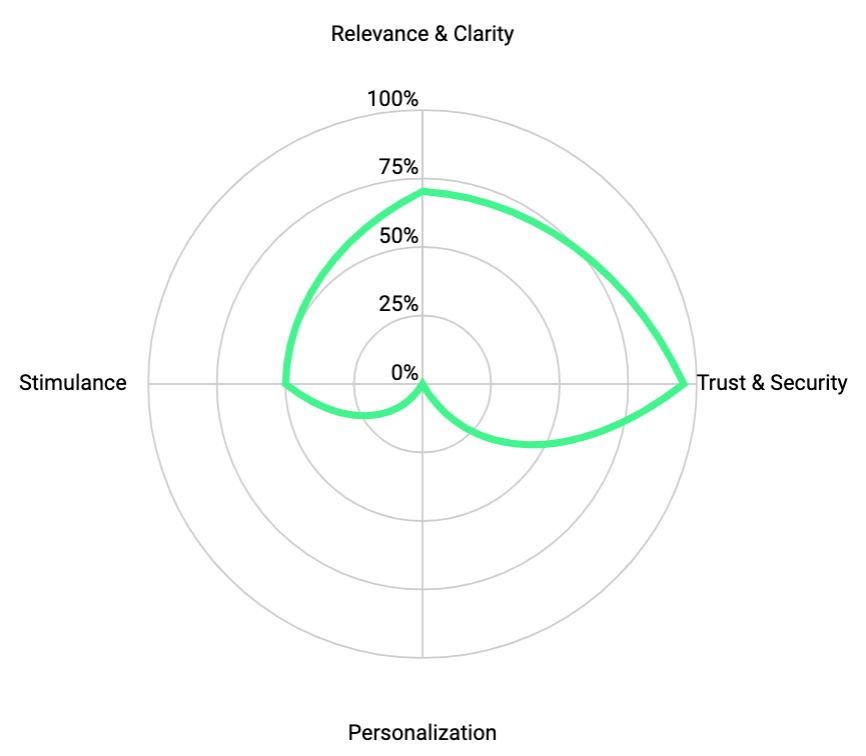
A graphical representation of where an ASO professional needs to concentrate their efforts.
A survey of 700 digital marketers conducted by Econsultancy and RedEye determined that companies with a structured approach to conversion were twice as likely to have seen a significant increase in sales over the previous 12 months. Phiture’s Product Page Analysis Spreadsheet is an easy-to-follow cheat sheet designed to deliver that very structure, ensuring that the data you collect is the data you will use to supercharge your Product Page Optimization and your conversions.
How does it work?
Based on a simple 3 point scoring system, the Product Page Analysis Cheat Sheet contains a series of 46 iron-clad questions designed to help you drill down into every aspect of your Product Page and find the areas most in need of optimization.
1 point = Good. When your product page is nailing the requirements of the question.
0 Points = Fair. If your product page addresses the issue but could use some improvement.
-1 point = Poor. When your product page is missing the mark entirely.
If the question asked doesn’t apply to your product page at all, simply enter N/A, and the Analysis Spreadsheet will automatically strike that question from its assessment to ensure that the analysis you receive is custom fit to your app’s needs.
Once you have answered all questions and completed the audit of your Product Page, the Analysis Cheat Sheet automatically generates a graph displaying your product page’s strengths and weaknesses. Based on the four layers of our Heuristic Analysis Model, this visualization gives you a precise understanding of the areas of your product page that require optimization and where you should be focusing your resources for your next round of tests.
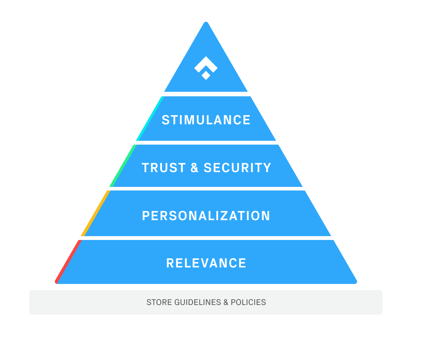 The Heuristics Analysis Model
- Helps you ask the right questions but doesn’t provide ready-to-use answers.
- Can indicate specific opportunities, but it’s up to you to decide where to focus your research and testing.
- Should be adjusted to suit the objectives, the business environment, and the industry in which the app is positioned.
- It is not about tricking users; it is about understanding them and using that insight to develop a better app and app store listing page.
If you have not already read our piece diving into the Model, we encourage you to do so, as it will only better prepare you to answer the questions in the audit.
Additionally, the third page of the Cheat Sheet finds those weak points in your Product Page and automatically generates a list of possible experiments to help you prioritize your A/B testing and optimize those areas that need the most attention. So, not only do you get that structure that has proven to boost conversions, you also receive suggestions for the next steps to guide your hypothesis and your testing going forward. Ensuring that you’ll never get caught in analysis paralysis and the data you’ve gained from your audit always leads to insights that drive your A/B testing and help grow your CVR over time.
How to score the questions for your page
With any system for analysis, the results are only as good as the data you put into it. So let’s take a deeper look at some of the questions that make up the Analysis Cheat Sheet, as well as some examples for scoring, so when it comes to the time to put your own product page through an audit, you can answer each question with confidence and trust the results of your analysis.
Relvance and Clarity
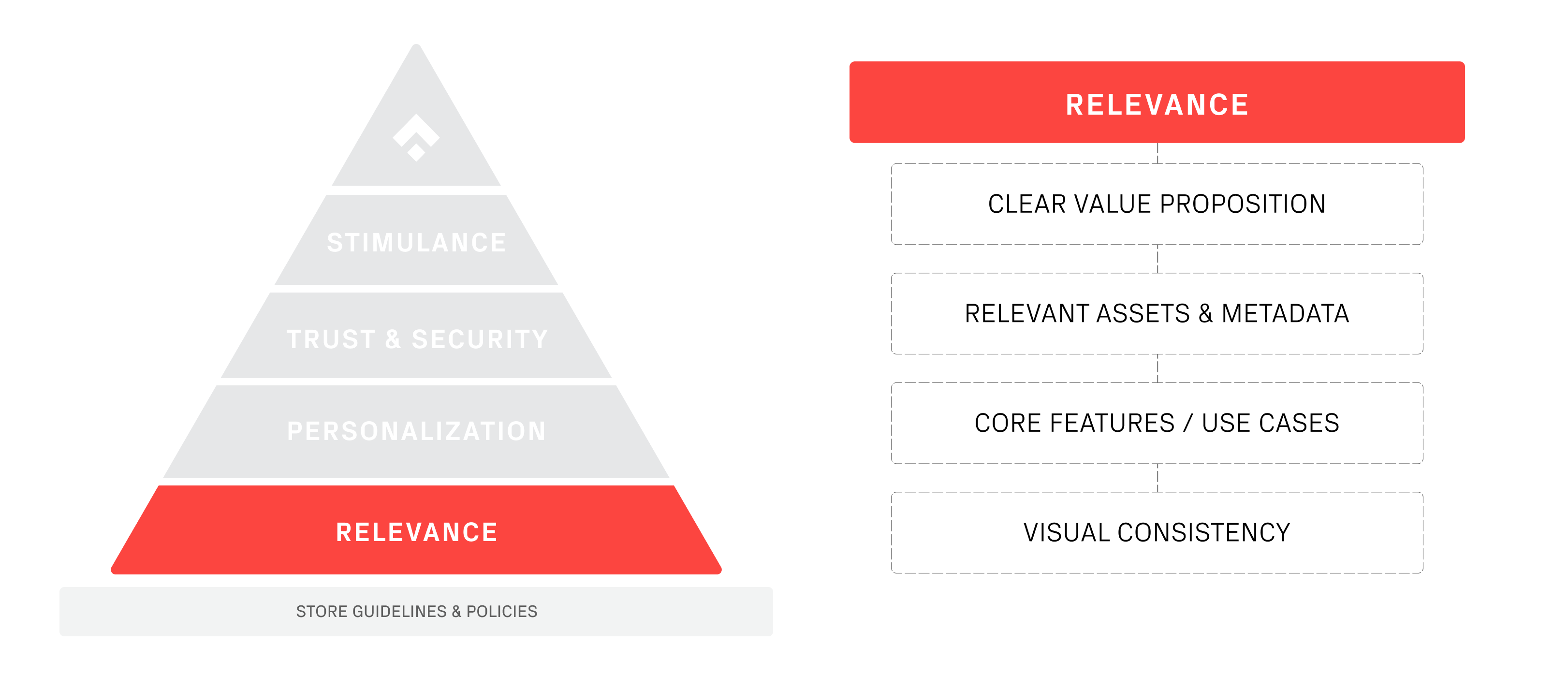
As outlined in the previous article in this series, one of the core elements of your product page’s Relevance & Clarity is your app’s value proposition. As this is perhaps the most effective tool in your arsenal for conversion, it is vital to place your Value Proposition where it stands to make the most impact. And, given that users spend an average of seven seconds on the store landing page, and 87% of users never scroll through the screenshots at all, it is critical your Value Proposition be clearly defined and highly visible to users the second they open the page.
Simply put by the first two questions of the audit:
- Is your app value proposition placed on the first/second screenshot?
- Does your value proposition communicate the concrete benefits users get after installation?
Two short questions that are easy to score and go a long way to help optimize your product page. Take a look at these examples of product pages with clearly defined and well-placed value propositions:

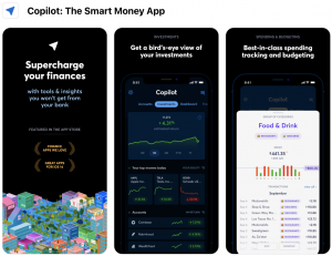
Source: https://scrnshts.club/
If we were running an assessment on these examples, when answering the first and second questions, we could score both “1”. That is because the value proposition sits on the first or second page for both, and they clearly communicate the benefits users will receive after they download the app.
Perhaps you have your value proposition on the first page, but a design element like the font choice or the layout itself has overshadowed the message. That would suggest that you have achieved the requirement of the first question, but you could use some work on the second. So, then you would score “1” for the first question and a “0” for the second.
However, if you have a great value proposition, but it doesn’t appear till the fourth screenshot, then you are not meeting the requirement of the first question, and you would have to mark it down as a “-1”, but you would still give “1” point to the second.
Already, just from the first two questions of the audit, you can see how the Analysis Spreadsheet allows you to objectively analyze your Product Page and give you actionable insight toward optimization.
Personalization
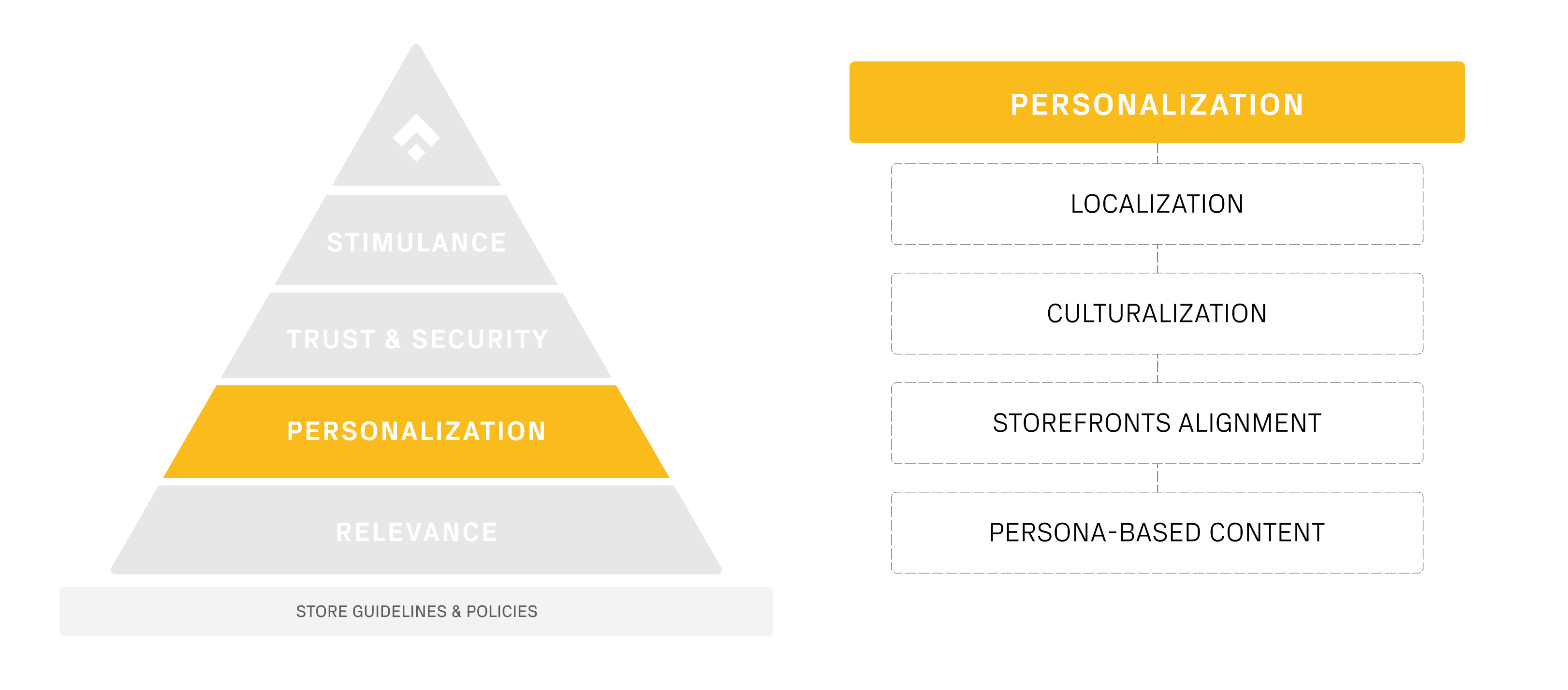
When it comes to Personalization, some of the questions can be quite clear and easy to assess, as the second question in that section: Have you translated your screenshots’ captions, video preview, and descriptions using professional translations?


Example of properly implemented culturalization elements in Italy and the United Kingdom store listing by VSCO.
As you can see in these screenshots above, those issues are addressed exactly, with different creative elements, professionally translated to target each specific country.
However, not all apps have the same needs and goals, and this is where an unassuming but powerful feature of the Product Page Analysis Cheat Sheet comes into play: N/A.
Let’s say you have taken all the proper steps to personalize your app with a professional translation and localization team, and you have scored 1’s all down the line so far. Then you reach the question: Do you consider optimizing your store listing in third-party storefronts, such as Huawei App Gallery or Galaxy Store?
The app you have developed has no market in Asia, and therefore, no need for placement in the Huawei App Gallery or the Samsung Galaxy Store. Therefore, this question doesn’t apply to your product page. Simply score it N/A, and the Spreadsheet will remove this question from the final tabulation, giving it no impact on your assessment and thus tailoring your analysis to the exact needs of your app’s product page.
Trust & Security
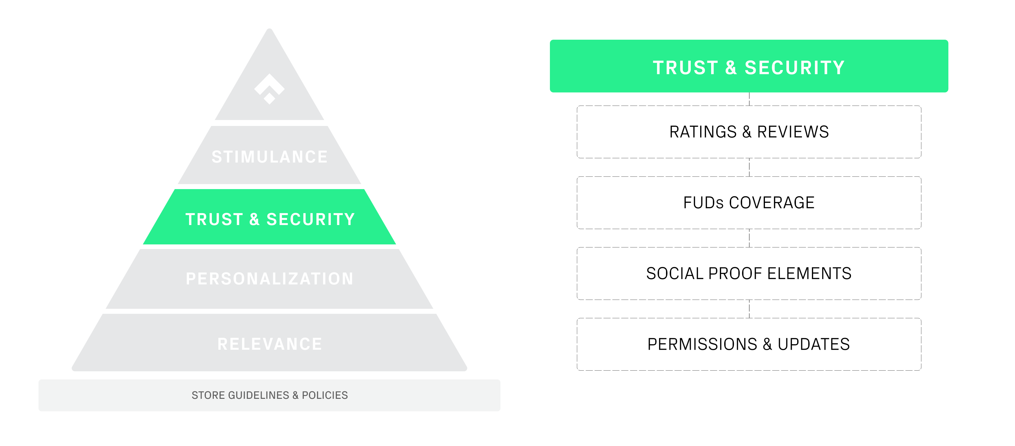
It is not uncommon for people to look at Trust & Security and think this is solely the realm of Fintech Apps and the encryption and protection of personal data. However, once you run down the complete list of questions in this section, you can see that there are numerous ways apps across all industries can leverage Trust & Security to optimize their product page.
Trust and security can come in many different forms for users, and as you can see in these examples below, there are elegant ways to incorporate them into a product page to significant effect:

Source: Current
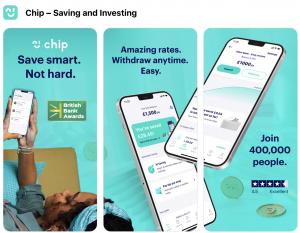
Source: Chip
In these examples, you see explicit use of social proof, earned awards, and trustworthy affiliations; all elements of Trust & Security that you can employ to address your users Fears, Uncertainties, and Doubts (FUDs). These are the core elements that make up the bank of questions inside the Trust & Security section of the Analysis Cheat Sheet, showing you that there is far more to this area of optimization than encryption and data protection.
Stimulance
Based on Cialdini’s Principles of Persuasion and the Phiture PET-ASO Model, the final section of the Spreadsheet focuses on neuromarketing and persuasive techniques you can leverage to optimize your store listing page. For example, are you using visual cues to motivate users to scroll through your screenshots? Have you applied the psychology of colors to your designs to stimulate your target market’s perception of your app? Is there room to offer visitors a reward and thus encourage a download?
One aspect of Stimulance that is easy to address and still quite impactful on conversions is the Seasonal Alignment of your product page. As you can see below, apps based around sports and entertainment can significantly benefit by adjusting their assets to reflect the start and end of new seasons in a league or a television series.

Source: Drop
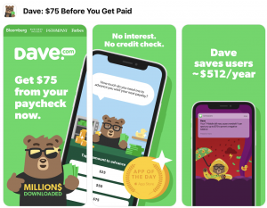
Source: Dave
However, Apps across all fields can benefit from assessing seasonal alignments. For example, how can you leverage holidays like Christmas, Mother’s Day, or New Year’s to improve your conversions? Do your target audience’s needs change around tax time, the start of a new school year, or through the literal change of seasons?
The questions that make up the Stimulance section of the spreadsheet can undoubtedly lead to robust gains in your CVR. Still, as you can see with an area like Seasonal Alignment, these questions must be asked regularly as part of a structured optimization strategy. The needs and preferences of your users are constantly evolving, so you must establish a continuous testing routine to ensure that you always remain one step ahead.
There is no such thing as a perfect score
With the questions that make up this audit, it is important to remember that there is no such thing as a perfect score. Every app has a different target market, with a unique set of personalization needs, FUDs, and goals. Those individual requirements coupled with the guidelines and policies dictating every app store, plus screen sizes setting inherent limitations on design elements, it is simply not possible to score a “1” on every question every time you conduct an audit. This Analysis Cheat Sheet isn’t something you use once to develop the “perfect product page” and then walk away.
There are no silver Bullets in PPO, and there are no universal solutions for CRO. Your product page will evolve as the needs of your users, the features of your app, and goals for conversion change over the course of weeks, months, and years. So, you should be conducting this audit regularly as part of a systematic loop for ASO so you and your product page can stay ahead of your user’s ever-changing preferences and continue to hit your conversion goals.
However, when employing a Heuristic approach to PPO like this Cheat Sheet, there will always be a level of nuance required to assess the data your audit produces. The Analysis Spreadsheet doesn’t provide ready-to-use answers; it simply helps you ask the right questions. The collected answers to those questions can indicate opportunities for optimization, but it is up to you to decide how to prioritize those needs and implement tests to address them.
So, in the next and final piece of this series covering the Product Page Analysis Cheat Sheet, we will break down the visual assessment and the testing suggestions the spreadsheet produces once you have completed your audit. Plus, we’ll help you understand how to interpret that visual assessment and use the recommendations provided by the Cheat Sheet to inform the next steps in your research and testing.
What next?
Now that you’re more familiar with the Product Page Analysis Cheat Sheet you can follow the link and start working with the sheet from today.
We encourage you to read the first article in this series, Supercharge your App Store Optimization with our Product Page Analysis Cheat Sheet, for a deeper understanding of the theory that underpins this methodology.
The next article in this three-part series tackling implemention will be, Turning Your Product Page Audit into Robust Experimentation.