 This guest post is part of a three-part series, tackling the heuristics of conversion, and was written by Phiture alumni Mateusz Wrzeszcz, a specialist in Global App Store Optimization and CRO @ Klarna.
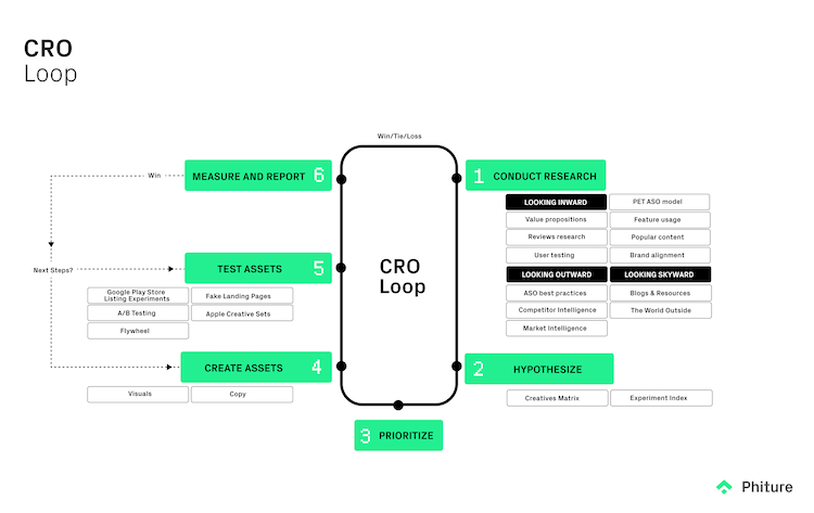
Developers have more power than ever to test and experiment with optimization in the app stores, not least since last year’s launch of product page optimization (PPO) as part of Apple’s App Store Connect. However, with so many options for experimentation on each native platform, thorough, qualitative research has never been more important to direct and complement experimentation efforts. In this article we introduce the Product Page Analysis Cheat Sheet with a Heuristics Analysis Model as a means to structure this crucial research; the inward-looking part of the CRO feedback loop used by the Phiture team of ASO consultants.
Where to begin?
Thorough research begins with data. Here at Phiture, we know that structuring your ASO investigation to produce data and build a solid strategy isn’t easy. With so many variables and elements to consider, it can become overwhelming, and very quickly, you can find yourself lost in a sea of options. That’s why we’ve developed the Product Page Analysis Cheat Sheet to help you structure your store listing page assessment and provide an actionable plan for focused and beneficial experimentation.
The Product Page Analysis Cheat Sheet
The Product Page Analysis Cheat Sheet is a straightforward and systematic template designed to ensure that you always have a path forward on your research and testing strategy. By simply answering the iron-clad questions we’ve developed, the cheat sheet will produce a clear visualization of your strengths and weaknesses, empowering you to focus your time and resources on the elements with the most potential for impacting your app’s conversion rate.
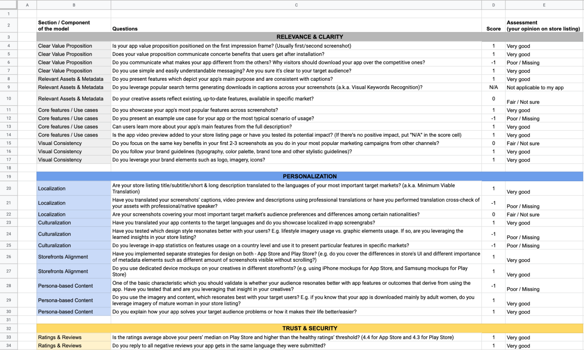
A screen capture of the questions in the cheat sheet
Additionally, the cheat sheet will automatically recognize where your product page may fall short and suggest research ideas to address weak points. So you’ll always have a testing strategy for every aspect of your app store product page.
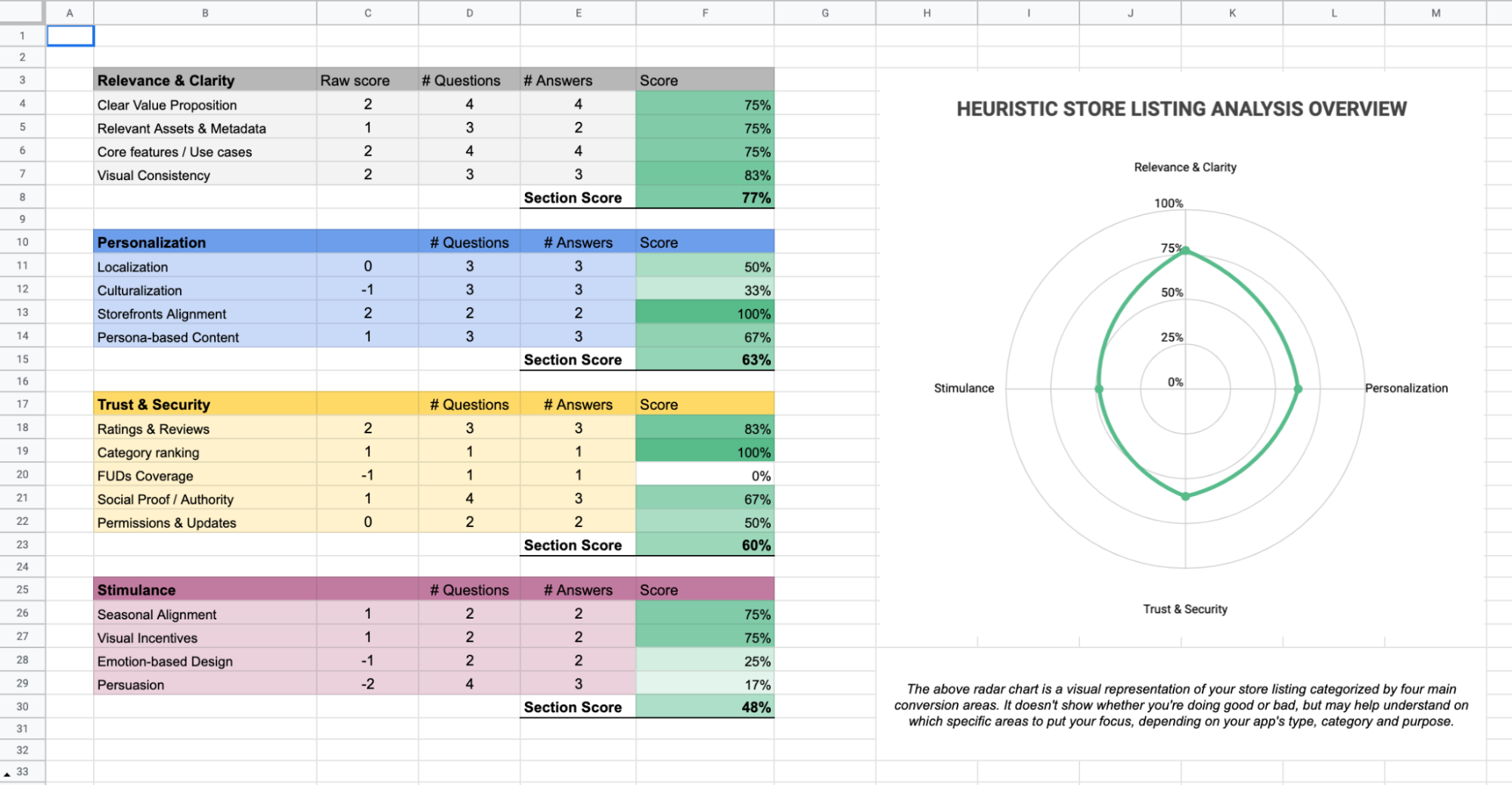
A screen capture of the visual representation of a product pages strengths and weaknesses
For as simple as the product page analysis cheat sheet is to fill out, it’s a pretty powerful tool. And like any power tool, it’s best to understand how it works before you fire it up. So, to start, let’s dive into the concepts behind the cheat sheet. That way, when it comes time for you to use it on your app, you can answer every question with confidence and trust the data you’re getting is solid and actionable.
The model behind the Product Page Analysis Cheat Sheet
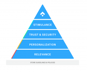
The sheet is built on the Heuristics Analysis Model, which we debuted at the Phiture ASO Conference in 2021. It’s a four-layer model, drawing from Maslow’s Pyramid of Needs, designed to help you structure your research around the critical elements being proven to impact conversion within the app stores. It’s a perfect framework to guide the assessment of your current store listing assets, reveal the areas in need of optimization, and help you plan and prioritize your testing backlog.
The Heuristic Analysis Model:
- Helps you ask the right questions but doesn’t provide ready-to-use answers.
- Can indicate specific opportunities, but it’s up to you to decide where to focus your research and testing.
- Should be adjusted to suit the objectives, the business environment, and the industry in which the app is positioned.
- It’s not about tricking users; it’s about understanding them and using that insight to develop a better app and app store listing page.
Understanding the Heuristic Analysis Pyramid:
When using the Heuristic Analysis Model, like Maslow’s Pyramid of Needs, we must always begin at the bottom with Store Guidelines and Principles and then work our way up to Stimulance at the apex. For as impactful as the upper layers of the pyramid can be, it’s important to remember that they’re nothing without a solid foundation.
Within each level are four specific components designed to work in tandem with a set of 46 questions to help you focus your attention and resources on areas for improvement and optimization. However, before you can dive into the four main layers of the pyramid and their more specific components, you have to start with the most crucial element of the model: Store Guidelines & Policies.
As you can see in the examples below, both storefronts require all app developers to stick to their own set of unique and very strict rules.

While Google Play does allow screenshots that break user interface (UI) across multiple images, they also come with a very strict set of rules and recommendations as you can see on the Play Store Guidelines for Store Listing Assets.

Before you take a step up the Heuristic Analysis pyramid, you’ll need to familiarize yourself with those rules and stick to them. One single element out of place can lead to valuable time wasted developing concepts unapproved for testing or, even worse, the rejection of your app altogether.
Store Policies & Guidelines may not seem like the most exciting part of this model, but they are of the highest priority, as they can cause all of your creative optimization to come crashing down before it even starts. Once you’ve laid the foundation and met all of the required policies and guidelines for your app store product page, you can get to work on the first layer of the Heuristic Analysis Model.
Relevance and clarity
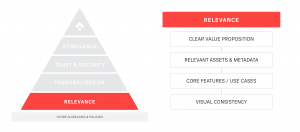
This first layer of the Heuristic Analysis Model starts with your app’s value proposition. Is it relative? Is it clear? A resonant value proposition has the greatest potential to impact your conversion rate out of every possible optimization you can make. MECLABS Institute has proven this through years of testing and research on actual product and service offers presented to real customers of companies like Amazon and Google.

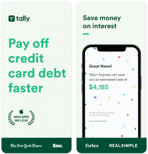
Two examples of well-crafted value propositions from bilboa and tally.
If you’re looking for more information on crafting an impactful value proposition, check out MECLABS Institutes’ and Marketing Sherpa’s: Framework to Assess an Existing or New Value Proposition.
In addition to the relevance and clarity of your value proposition, this first layer of the Heuristic Model analyzes your assets & metadata, the presentation of your core features, as well as the visual consistency of the designs between your ads and your store.
For a more in-depth breakdown of each component and the corresponding questions for analysis, see slides 17-21 of the Heuristics for Conversion Slide Deck.
Personalization
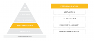
Once you’ve examined the relevance and clarity of your value proposition, you can continue up the pyramid to the second layer and turn your attention to Personalization. This layer and its corresponding components are often treated as low-hanging fruit for increasing your app’s conversion. However, making sure your listing is personalized and designed with a focus on your target users is not always that easy.
Localization and culturalization can have the most significant impact on increasing your conversion rate. However, as you can see in the images below taken from the VSCO store listings for Italy and the United Kingdom, there can be a lot to consider when targeting your users across borders and preferences.


Example of properly implemented culturalization elements in Italy and the United Kingdom store listing by VSCO.
In addition to ensuring that you provide appropriate and relevant translations, you must evaluate the cultural differences in your screenshots, tailor features of your app to specific markets, and show potential users that you understand their needs and speak their language. From there, you can begin to adjust your storefront to align with the specific needs of both the Play Store and the Apple App Store and cater to your target markets using persona-based content. On its surface, personalization can seem simple, but once you start to drill down, you’ll realize there’s more to it than Google Translate.
For a thorough breakdown of Personalization and its root elements, see slides 22-26 of the Heuristics for Conversion Slide Deck.
Trust and security
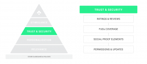
The Heuristic Model’s penultimate layer is devoted to tactics you can use to boost trust & security. By understanding your users’ fears, uncertainties, and doubts (FUDs) and other core elements, you take great strides to build the faith and trust your target markets have in your app.
However, trust & security is not just for banking and trading apps to establish public confidence with sensitive personal data. There are numerous ways apps across all industries can optimize their trust & security to see ASO gains. For years marketing experts have leveraged social proof elements such as trustworthy partnerships, awards, and the number of downloads to increase conversions.


Some examples of impactful social proof elements implemented by Truebill, Cleo, Public.com, and Jour.
Additionally, caring about the healthy score of Ratings & Reviews and clear communication of your permissions & updates can both be effective tactics to increase trust and security However, it’s important to note that while the inclusion of ratings and reviews is common among developers on the Google Play Store, be mindful that it can be considered a violation of content guidelines and could cause your store listing to face restrictions.
For deeper dive into the elements inside Trust & Security, see slides 27-31 of the Heuristics for Conversion Slide Deck.
Stimulance
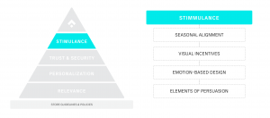
At last, we reach the top layer of the pyramid: Stimulance. Focused primarily on the persuasive techniques you can deploy to incentivize your visitors to download the app, Stimulance is a robust set of practices proven effective by years of research and real-world execution.
Seasonal alignments such as Black Friday-themed screenshots presented alongside a thoughtful promotional campaign can significantly increase your conversion rate. Elements of persuasion like discounts and special offers paired with visual incentives and emotion-based design are tools that, when properly executed, can encourage users to notice your app among other results and incentivize visitors to scroll through your screenshots.


Some precise uses of persuasive elements as implemented by Cleo, Vivino, Bolt, and TripAdvisor.
The elements that make up the top layer of the Heuristic Model are powerful techniques that we are all bombarded with every day in marketing and advertising. So, it’s critical that you deploy them precisely, effectively, and remain careful never to overuse these Stimulance tactics.
Remember, just because it sits atop the pyramid doesn’t mean Stimulance is the most important part of the model. For as powerful as persuasion can be, it’s nothing without the layers beneath it. Or, simply put by MECLABS Institutes’ Flint McGlaughlin, “Clarity always trumps persuasion.”
For further insight into Stimulance, as well as each component in the layer, see slides 32-36 of the Heuristics for Conversion Slide Deck.
What next?
Now that you’re more familiar with each layer of the Heuristic Analysis Model, you’re one step closer to utilizing the Product Page Analysis Cheat Sheet to analyze your own app store product page. You can follow the link and start working with the sheet from today, however, first we encourage you to continue your reading for a deeper understanding of the questions that make the spreadsheet such a powerful tool for product page optimization.
The next article in this three-part series tackling the heuristics of conversion is the iron-clad questions to help structure your PPO.