The Conversion Rate Optimization Loop: A framework for increasing conversion rates via app store optimization.
This article was co-written with Stuart Miller, Design Lead at the mobile growth and ASO consultancy Phiture.
“My keyword rankings are shooting up, my search impressions have never been so high, but my listing doesn’t seem to be able to convert enough of those views into installs”. Should you face this problem today, then you’re reading the right article. There is no doubt that today, conversion rate optimization (CRO) is a core component of your ASO efforts.
Without assets optimized for conversion, your visibility efforts and impression gains will be wiped out. Indeed, 1) impressions do not correspond to installs and 2) the algorithm from both stores supposedly take into account your ability to convert visitors into users as a factor in determining keyword ranks. If your app listing conversion is poorer than your competitors’, then your chances to succeed will be limited.
In this article, we will explore a framework valuable for improving the conversion rate of your app’s store listing. You might not always know what to begin with and how to proceed, and this framework is here to provide you with the right steps to success. This methodology, embodied by the CRO Loop (also described in our ASO book), incorporates six stages.
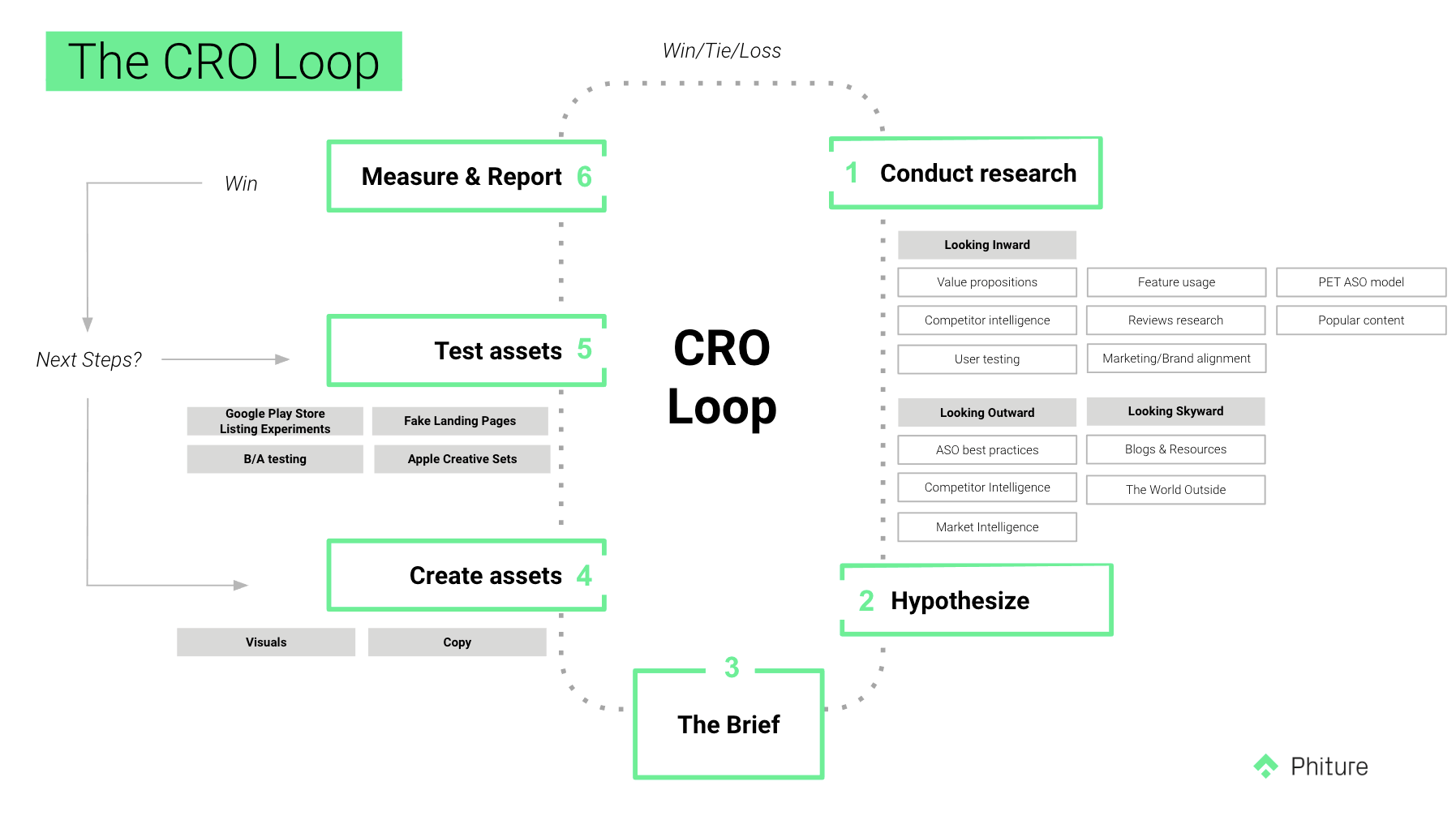
The CRO Loop used by the ASO team at Phiture
Step 1: Conduct research
Research can take multiple forms. We generally divide ours into 3 categories: Looking Inward (or, scrutinizing the App and its store presences), Looking Outward (or, looking at some simple best practices, as well as looking at one’s direct competitors), and finally, Looking Skyward (or, looking at phenomena separate from the app stores). We’ll look these in detail here.
1.1 Looking Inward
Are your Value Propositions reflected in your store Assets?
It’s always good to evaluate whether your messaging is highlighting features or value propositions. A feature is something your app can do — e.g. counting calories… A value proposition, however, deals with the benefit that your app provides to its users, e.g make tracking your diet easy. Sometimes a feature is a value proposition, but it is always worth making sure that you’re clearly highlighting the advantage of your app to its potential users.
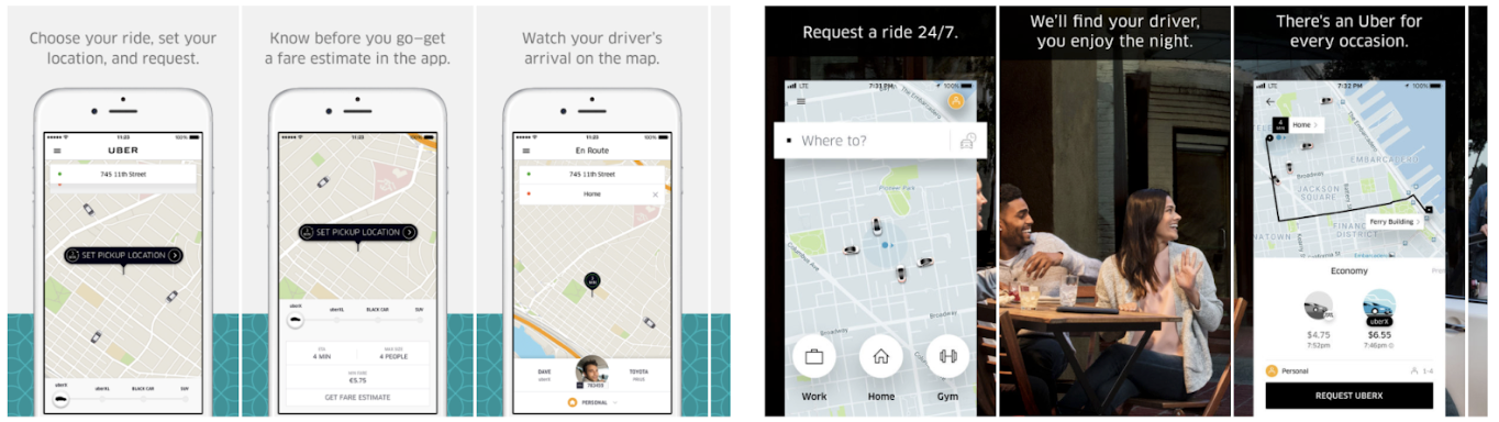
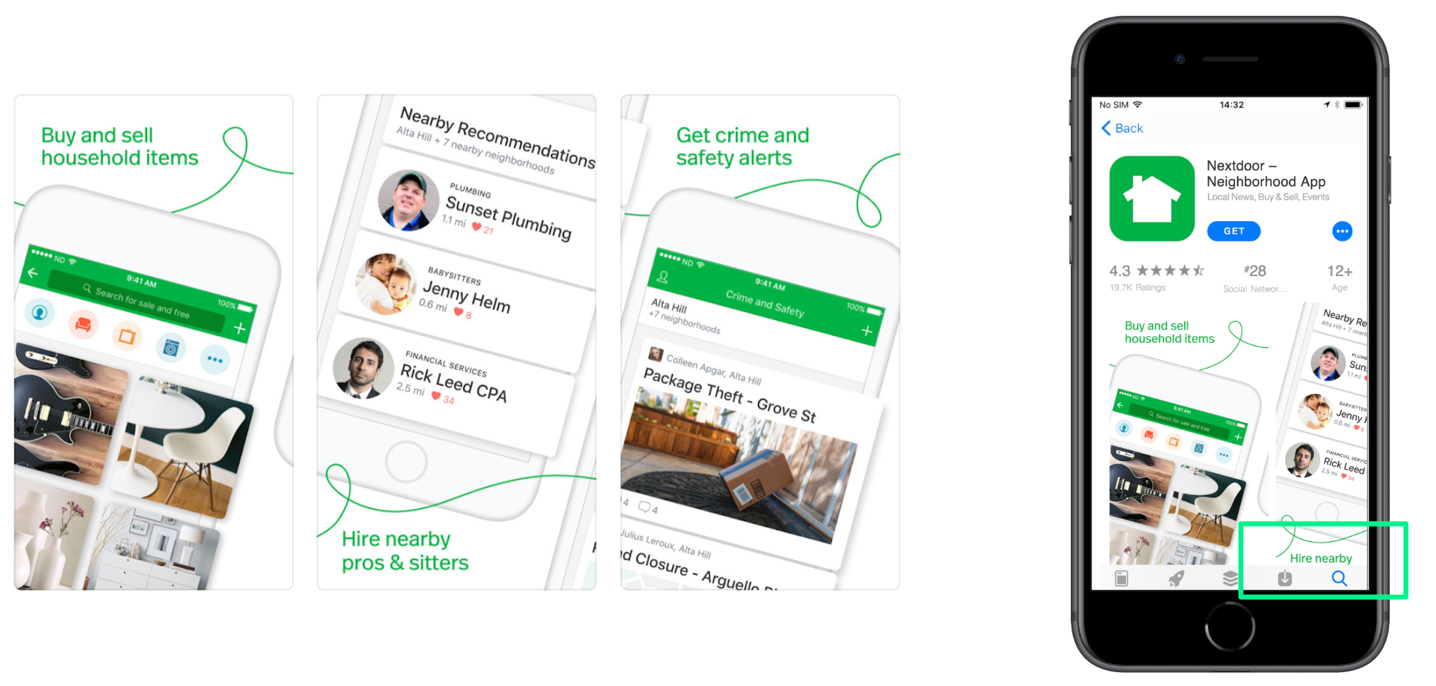
Notice the change in Uber’s titles from left to right. The titles on the right are a better reflection of Uber’s value propositions than those on the left.
User Testing
For ASO purposes, a common type of User Testing would involve asking a user to search for a term that you know would include your app in the top 5 results (be careful not to tell them which app you’re performing research for, in order to eliminate as much bias as possible). Then ask them to comment on the first 5 results — what they think the app’s function is, what they like or dislike, what stands out to them compared to the others, etc. The most valuable research will come out of doing this in person, but a cheaper and simpler option is to do it online with one of the many available user research tools.
User Reviews
One will often find that an app’s users can summarise its benefits more easily than the app’s marketers or even its creators. User reviews on any of the platforms can prove to be a treasure trove of insights. In the image below (a workout companion app), three of the top reviews mention how much they love the workout tracking feature, and yet this feature is not mentioned once in the app’s store assets — icon, short description or screenshots. User reviews should be constantly checked and monitored to see how an app’s store presence can be optimised to include much-loved aspects or address relevant concerns.
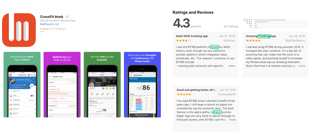
The first three reviews all mention the tracking feature of the app as a standout feature. Yet that is not reflected in the store assets themselves.
Popular Features
Your data should be able to tell you which of your app’s features are used more than others, and you should optimise your store assets accordingly. It stands to reason that highlighting your most popular feature in your first or second screenshot is going to do more for your conversion than tucking it away in your long description. Your store assets are also a good way to test new features — if you strongly highlight a brand new feature and your conversion rate increases, you know you’re onto something (assuming you’re running a ‘clean test’ — more on that later).
Which of your app’s features are the most used? And to what extent are you promoting those features in your assets?
Popular ‘Content’
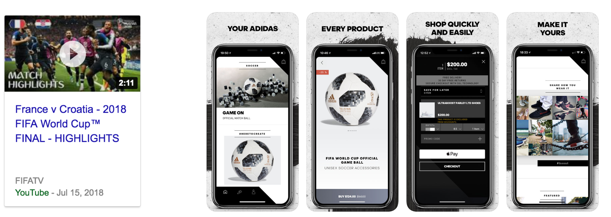
Let’s say you have a music streaming app available in multiple countries. You should absolutely be looking at your analytics to see what most people are listening to in each of your locales. Perhaps Metal is consumed far more than Pop in one of those locales; it would be smart to reflect that content in your store listing. ‘Content’ doesn’t only mean music, pictures and video — you may have content even if your app doesn’t publish anything. A flight aggregator, for example, may show a holiday background in its screenshots: if that background shows an African Savanna, but most holiday seekers are searching for flights to Thailand, then you may be missing a trick.
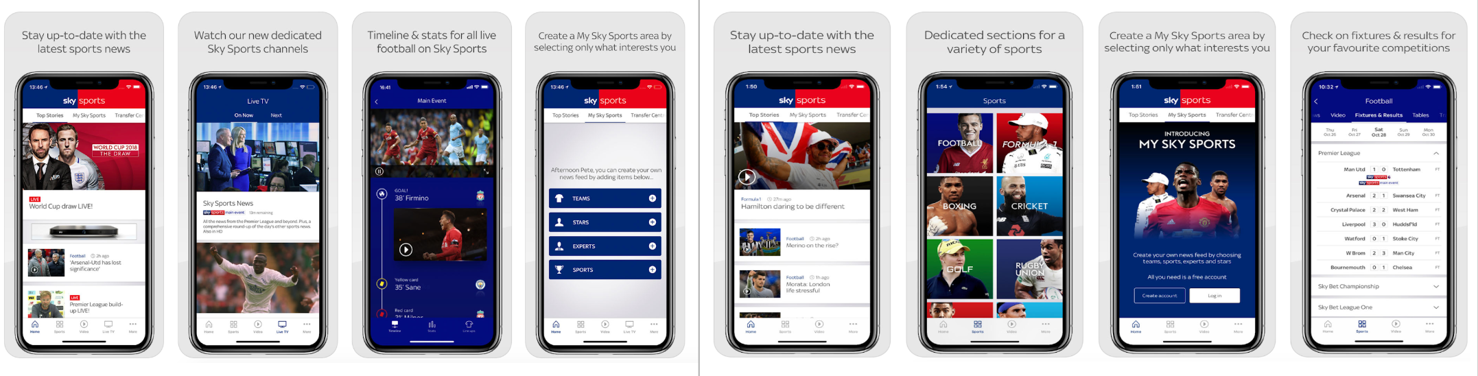
Sky Sports in the UK use their assets to focus on their most popular content (Football & Live News) whereas the US version shows a larger variety of sports, with Formula 1 being just as important as Football.
Understanding your traffic sources
In 2019, I published an article about understanding your Play Store traffic sources to ideate for experiments.
The PET-ASO model
The Persuasion-Emotion-Trust Design model is a well-known and freely available resource which looks at how to ‘sell’ something from multiple angles. These are easily applied to the App Store and Google Play Store, since we are, in essence, selling the idea of an app to a store visitor (even if those apps are free). The PET-ASO model — which is simply a variation of the traditional PET model, will be covered in greater detail in a future post.
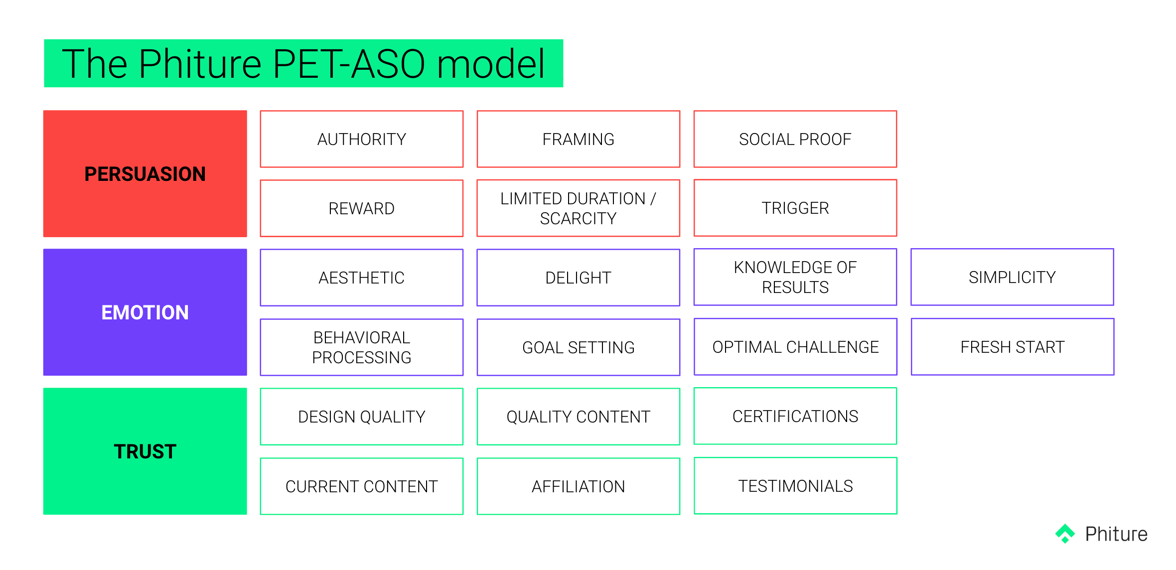
The PET-ASO model — a variation of the traditional PET model applied to ASO by Phiture
1.2 Looking Outward
Best practices
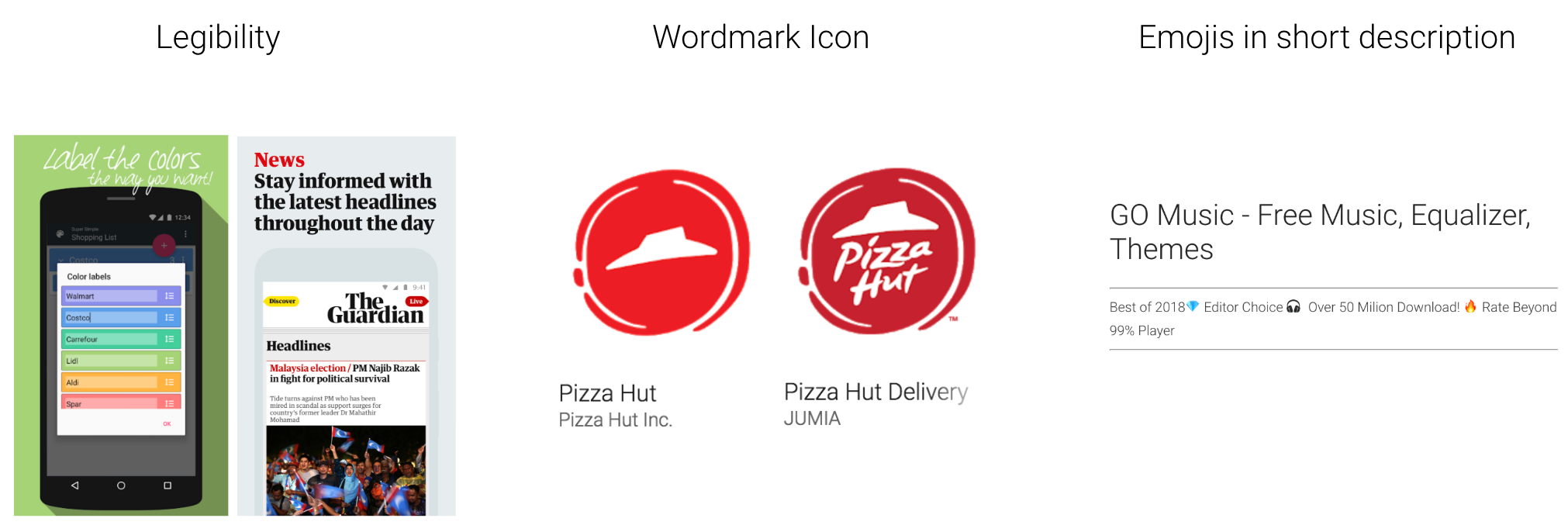
- Legibility
This is mostly applicable to screenshots captions. If you’re adding graphics or text to your screenshots, it’s important to remember that they’ll be viewed on a small screen — even our largest smartphones and tablets are several times smaller than the desktop monitors we usually design on. And the size of text is only one part of the equation — font choice, contrast and letter spacing all play a role, too.
- Icon
A good icon must tick several boxes, but a good place to start is to include your app’s name in the icon. Perhaps if you’re a massive brand, a logomark sans name may be recognisable to most store visitors, but for the vast majority of apps, adding the name into the icon is a reliable way to build trust and increase conversion.
- Text Formatting
Emojis can add a fresh twist to your short description. Likewise, using basic HTML to bold text or change colours in your long description will create a valuable few degrees of separation from an otherwise staid and dreary piece of the ASO puzzle.
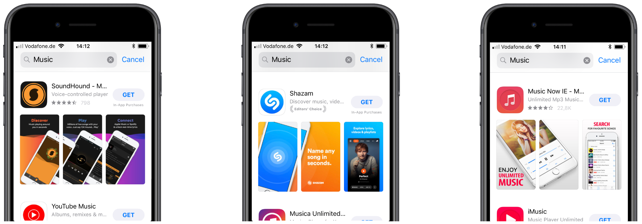
Competitor Intelligence
Regularly check up on your most direct competitors’ store presences. What are they saying, how are they saying it — and why — are questions you should never stop asking. Take a screen grab of their store presence every time they make a change, or enlist the help of a tool such as Tune or AppFollow to track their changes over time. Keeping abreast of competitor movements within the App Store and Google Play store can provide valuable insights for your own App.
Certain tools like Tune/AppFollow/SensorTower/AppAnnie allow you to track competitors store changes, which may provide valuable insights into their research and strategy.
Market Intelligence
It’s important to remember that different locales will have different aesthetic trends, visual symbolism, religious attitudes, demographic breakdowns, and understanding of things like emojis. If your app is a social media platform, for example, don’t show profiles with British names in your Brazillian store. Or, using characters and mascots may go down a treat in Japan, but may backfire in another locale. Its critical that as ASO practitioners, we stay abreast of these trends and make sure that what we’re showing and saying in the app stores won’t come across as random, misplaced, or — even worse — offensive.
There are also certain visual styles and tones of voice which are specific to different markets. For instance, mascots are widely used in Japan but are not that effective in Western countries. Different countries and age groups also have different understandings of the same emojis.
1.3 Looking Skyward
Blogs & External Resources
Some of our favourite resources are listed below, but there are a whole host of others with freely shared insights from ASO experts.
The World Outside
What is happening in current affairs which could influence how people perceive an app’s store presence? What about politics? The environment? Something like GDPR and data privacy is an easy example in the wake of well-publicized account leaks and data breaches, but there is a myriad of other influences which may have an effect. Make sure you’re keeping up to date with developments and concerns in your app’s field and beyond.
Be careful of disingenuine promises or greenwashing.
External factors undeniably shape marketing and therefore CRO efforts. Make sure that you’re taking potential opportunities when they arise, as well as addressing relevant concerns.
Step 2: Hypothesize
After our research has concluded, it’s time to hypothesise for potential experiments. A hypothesis is simply a statement or theory about what you think an experiment will do, and why you think it will do so. This is important because it ensures that your experiments aren’t aimless and random.
A good hypothesis always satisfies three requirements.
- It mentions a specific action.
The action is what exactly you’re changing.
For example: “Including Building Materials in the screenshots” - It mentions a specific result.
The result is what you expect that action to have (and since we’re talking CRO, the result will likely be “Encourage Downloads” or “Increase Conversion”. - It mentions a specific reason and should lead back to your research.
For example: “Because this app is designed for construction workers.”
So your hypothesis could look something like this:
You should absolutely approach your experiments as iteratively and selectively as possible. If each subsequent experiment changes 5 variables, it will be very difficult to pin down what element is responsible for any changes in your conversion rate. Pick a single element to test in each experiment, and let the results inform your next.
Sometimes an experiment may be a little more…well, experimental, and simply aims to provide data rather than increase conversion. This is acceptable, so long as the learnings find their way back into subsequent hypotheses down the road.
In August 2019, we introduced a new step to the framework after “Hypothesize”: Prioritization — allowing you to focus on the high-impact experiments likely moving the needle and avoid running the risk of being overloaded with poor quality ideas, as well as prioritizing low efforts initiatives as time is often issue with prioritization.
Step 3: Brief
A brief is a set of clear, simple instructions on how to transform the hypothesis into an experiment. It can vary in terms of how detailed it is. It’s possible that the person who performs the research and creates the hypotheses will not be the same person who crafts the experiment, and thus a clear brief ensures that any loss of context will not affect the core of the experiment. Simply put, the brief is a set of clear, actionable steps for your designer or copywriter.
A brief for the previously mentioned hypothesis may look something like this:
Format: Android Screenshots — 1080 px (w) x 1920 (h)
Please replace the current flat colour background with close up textures of brick (first screenshots), wood (second screenshot) and cement (third screenshot). Please ensure that each screenshot shows a current Android device. Brand guidelines to be consulted for font rules.
Step 4: Create assets
This section highlight a few best practices and common techniques for visual and textual experiments. This is by no means an exhaustive list.
Screenshot Caption Placement
It may be tempting to eschew the norm of captions at the top of your screenshots in order to differentiate your app from competitors who are doing just that, and while it does add a certain visual interest, you risk sacrificing legibility when users view your app from the product page, as some of the screen is usually cropped off at the bottom.
Changing the placement of the text on your screenshots may seem like a way to differentiate yourself from the competitors, but you risk cutting off words and thus hinder communication
Screenshot Order
It’s statistically unlikely that potential users will scroll past the first few screenshots, so ensure that your most important features, value propositions and content are visible in the first three screenshots. Placing any critical messaging towards the back of your screenshot set is a reliable way to significantly decrease the number of store visitors who will see it.
The first three screenshots are the most valuable. Data suggests that a tiny percentage of potential users scroll past these first three. Make sure your most important information and value propositions are located here.
Connected Screenshots
Connecting screenshots by using overlapping imagery, patterns or devices is a common technique which aims to work around the unavoidable spaces between screenshots and provide an impactful first impression. This technique is more suitable for the Google Play store than on iOS because of the nature of Creative Sets testing (more on that in step 5).
Connecting your screenshots is a way of working around the divisions between your images. Due to the nature of Apple Creative Sets testing, this is more useful on Google Play.
Raised User Interface
Raised UI is another very popular visual treatment which involves elevating UI elements to give them the illusion of 3-dimensionality. This technique allows us to increase the size of certain elements because it may free the UI from the traditional confines of the device. Be aware, however, that overuse of this technique is rife, and unless it is applied with restraint, it can actually create more visual clutter and noise, rather than the intended effect of focussing the attention.
Raised User Interface is a particular style of layering in which certain UI elements are magnified and appear to hover above the background. It’s a good way to highlight small but important UI or functions within the app.
Short Copy
When it comes to the amount of copy, we believe shorter is better. Research shows that our attention spans are minuscule when browsing on mobile devices — we have fractions of a second to convince our users, and thus every superfluous word is a strike against you.
A good rule of thumb is to limit the number of words in your visual assets to 5 words or less.
On Google Play, brief and decisive short descriptions often show excellent results, and a good rule of thumb for screenshot captions is 5 words or less per screenshot.
One exception here would be when tone if voice or personality is critical to your brand’s/app’s identity. Such an app might compromise brevity for brand cues or a particular style if that is central to convincing users to download the app.
The same can be said for apps which are sub-culture-specific. If your app revolves around meme humour and viral videos, then it’s worth using language which makes potential users feel that your app understands them, and is built for them.
Step 5–6: Test assets, Measure & Report
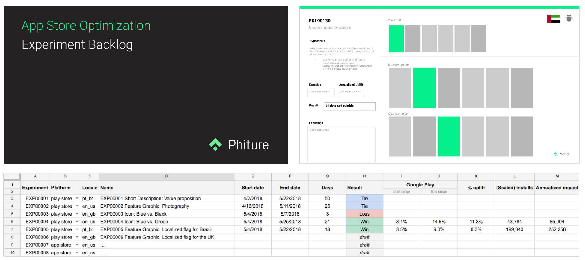
Before we start testing: set up an experiment backlog.
This experiment backlog should be based on the research from the previous steps. This backlog should allow to you plan and prioritize your tests, as well as to keep track of experiments and learnings. Don’t forget in there to remind what your hypothesis is (entailing your variable, expected outcome and rationale).
Select your testing method
It exists today four main testing alternatives:
- Google Play experiments: native a/b testing within the Google Play store
- Creative set testing: testing conversion of different screenshots on the App Store via Apple Search Ads
- Sequential analysis: updating your assets and measuring conversion before & after (also called B/A testing)
- Fake app stores: landing pages with A/B testing, either your own or from commercial solutions.
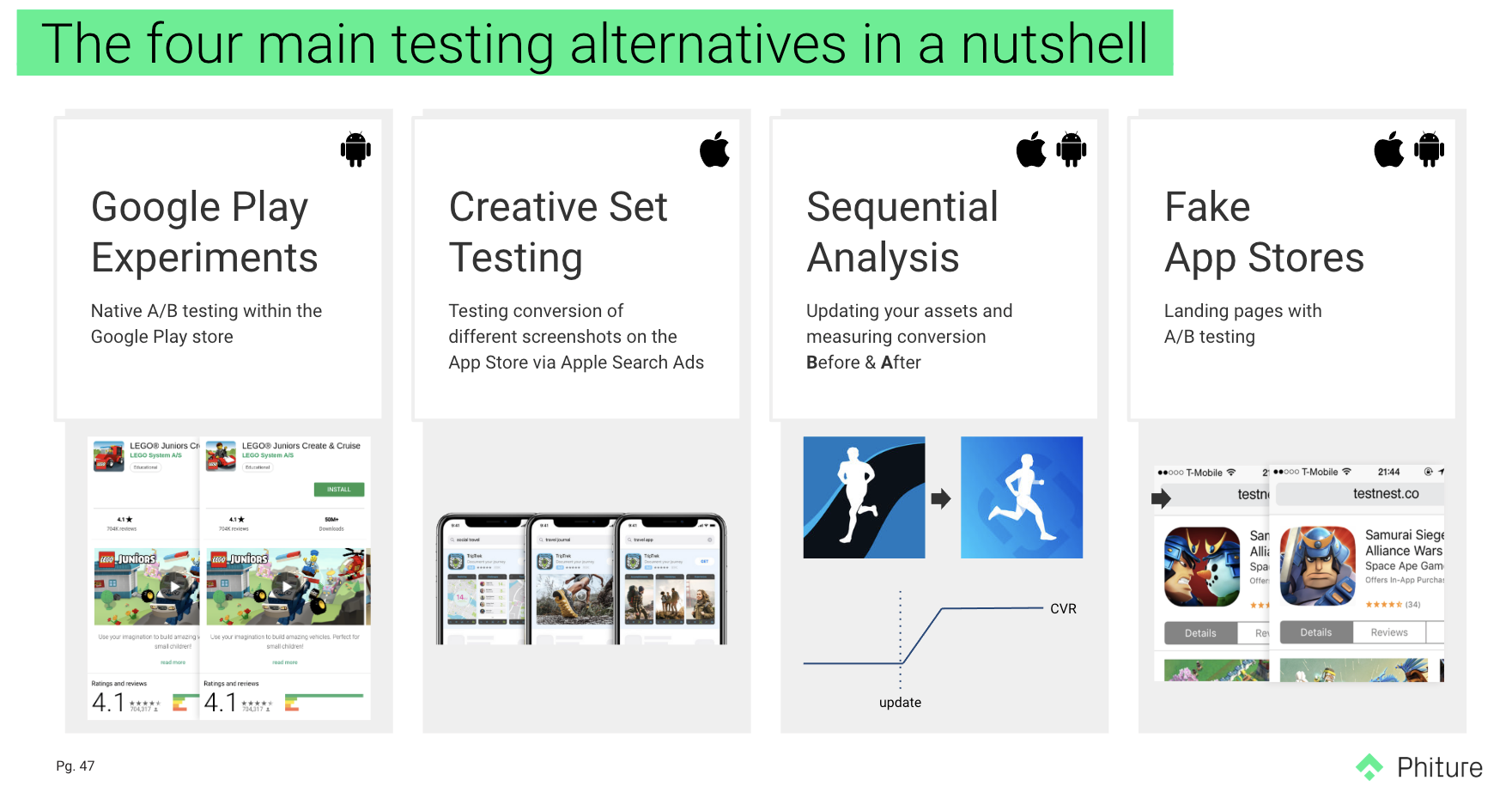
Some initial considerations for all testing methods:
- Traffic should be divided equally between variations.
- When possible, try keeping your marketing efforts consistent.
Google Play Store Listing Experiments
Google Play offers a native experiment tool in the Google Play Console, which allows you to test your current listing assets against up to 3 variants. It’s possible to test most assets including icon, descriptions, screenshots. The listing has recently been revamped and presents new challenges in optimizing the assets.
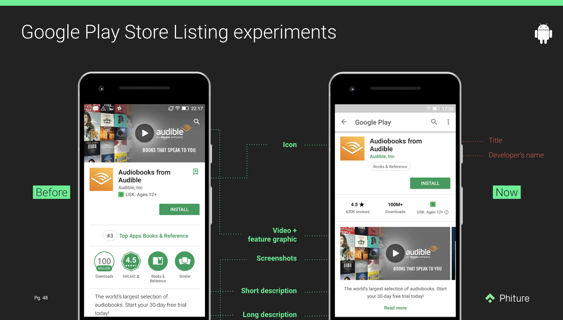
Indeed, the most visible an asset is, the most impact it’ll have. The feature banner became a simple poster frame for the video and it no longer appears when not having the video. As screenshots are now above-the-fold, ASO practitioners should consider it as an optimization priority.
It’s considered the most attractive way of testing at the moment even though it has lots of drawbacks.
Pros
- Free and accessible to anyone publishing an Android app on Google Play
- Native store UX
- Up to 5 localized experiments at the same time
- No need for technical resources or technical knowledge
Cons
- It calls out a winner with a 90% confidence interval while the 95% significance level, used to mean something is good enough to be believed, is the most commonly used.
- No segmentation control.
- Doesn’t differentiate the type of installs (non-organic, organic, brand/non-brand searches…) and therefore focus on aggregate conversion rate (CVR) as a go-to metric and inability to optimize for valuable users. This consideration is really well explained by Gabe Kwakyi (Incipia) in this post.
Apple Creative Sets
While Google Play Console has its own testing tool, this is not the case of App Store Connect. Since last May, you can, however, test different creatives with the Search Ads to understand their conversion rates on the App Store. This only allows you to test your screenshots and app previews.
Only a couple of steps are needed to launch a test. First, you need to upload up to 10 screenshots and 3 app previews -either in landscapes or portrait- to App Store Connect. Beware that if you mix landscapes with portraits, the former will be flipped so add them to the back.
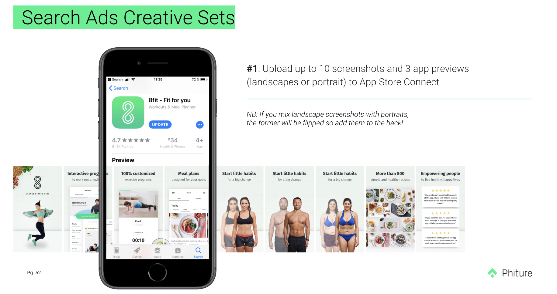
Screenshot 5 to 7 of 8fit have most likely been used for creative testing
Once done, connect to your Search Ads account and select the campaign or ad group for which you want to add a creative set. Here are some hints to select the right ad group :
- It should get high impressions volumes to be able to collect enough data ;
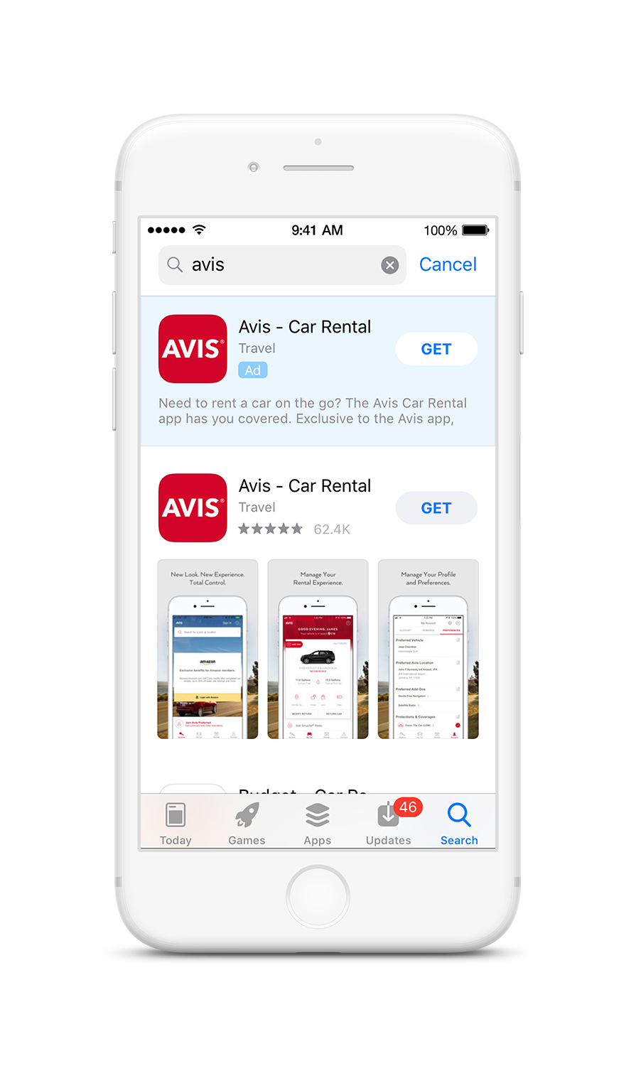
- “High volume? Let’s select my brand ad group!”. Well, I’d avoid this: you most likely rank #1 for your brand (see example of Avis), and only text ads display for searches in which you rank #1 organically and it’ll certainly don’t teach you much about the impact of your creatives.
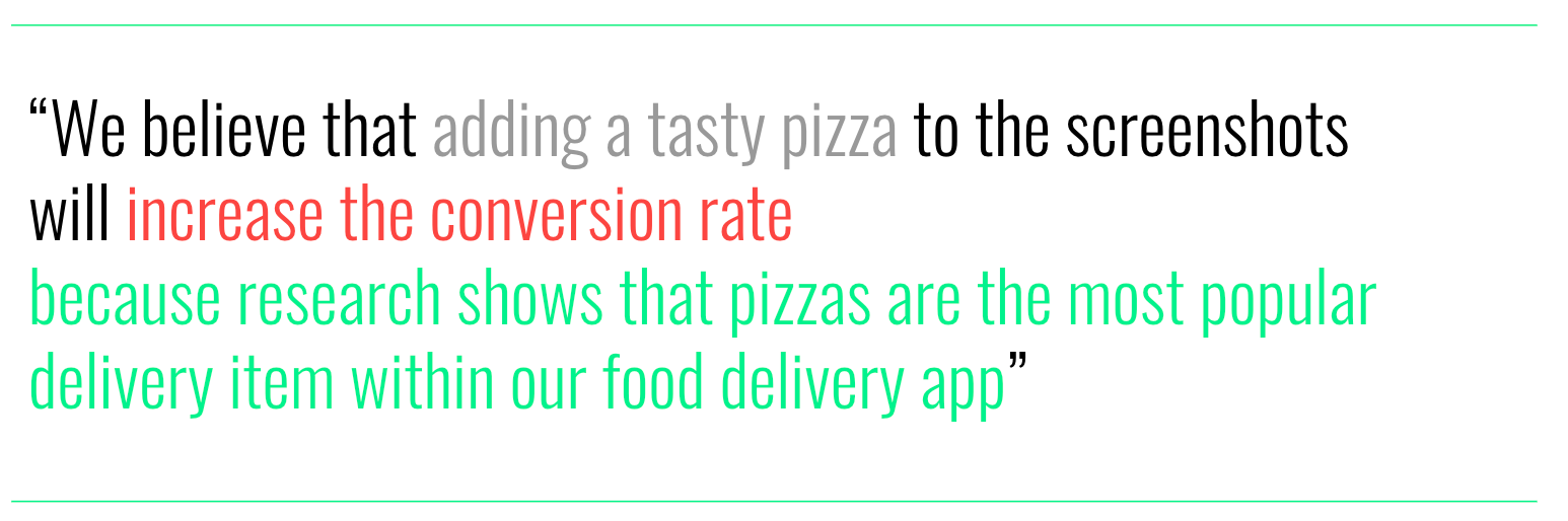
- Avoid ad groups with a strong bias, such as the ones targeting only one gender or a specific feature of your app. For example: assuming a food delivery app wants to determine whether displaying pizzas on screenshots increases conversion, ad group with [pizza delivery] search term won’t be the right fit.
Typically, competitor ad groups with a good blend of competitors are ideal. You can also consider running the same test on different ad groups.
It’s pretty easy to set up new creative sets in Search Ads. The only thing you need to keep in mind is that you can only select the screenshots and app previews in the order that they were uploaded in. You have to select these for all the device resolutions that you’ve uploaded.
Creative set setup in Search Ads interface
Want to know more about all the edge cases? Read this comprehensive article from AppTamin about creative sets best practices and optimization examples.
Pros
- Native store UX.
- Segmentation control and therefore the possibility to get useful learnings to optimize for the best-performing ad group users.
Cons
- Costly. As it runs with ads, there is obviously the need for a certain budget.
- Not true AB testing: Apple decides how much traffic it puts into each test and when.
- Very limited: Only two elements can be tested (screenshots, app preview), in search results only, in a predefined order, after they’ve been approved by Apple.
Sequential hypothesis testing
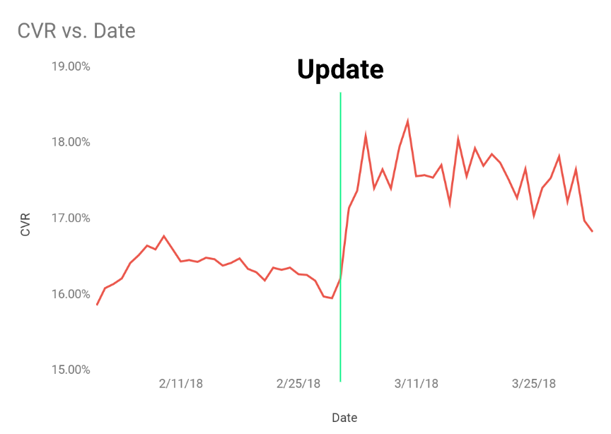
Let’s say now that you would like to evaluate the impact of a title change. Neither Google Play Experiments nor Apple Creative Sets are solutions in this case. The sequential hypothesis testing, sometimes also called B/A testing (for Before and After) is the best method to evaluate the live impact of a change to your store listing. Two considerations:
#1: Applying a change should lead to an immediate, noticeable uptick in conversion
#2: Calculate the uplift over 30 days before & after and see if it has statistical significance
Pros
- Free
- Native store UX
- No need for technical resources or technical knowledge
- Possible to “test” all elements editable by the developer (exclude for instance reviews)
Cons
- Well, it’s not really a test… Which means that it will be displayed to 100% of the users and that you don’t have a control group nor the ability to segment.
- There is, furthermore, a high risk of decreasing your conversion rate (hence impacting installs and paid acquisition campaigns).
- Lastly, if you’re using this technique on the App Store, you’ll face a long rolling back time as there is the need for a new release to update your listing (besides for the promotional text).
Fake landing pages
Alternatively, you can also test using a fake landing page.
To better understand what this is about, we will have a look at the example below from Soundcloud. Users would click on an install button in Soundcloud website and be redirected to a page imitating the real App Store, where 50% of the audience would see the default screenshot symphony, while the other 50% would see the test version. When users clicked on “Get”, they were sent to the real App Store (where they would have to click again on the install button).
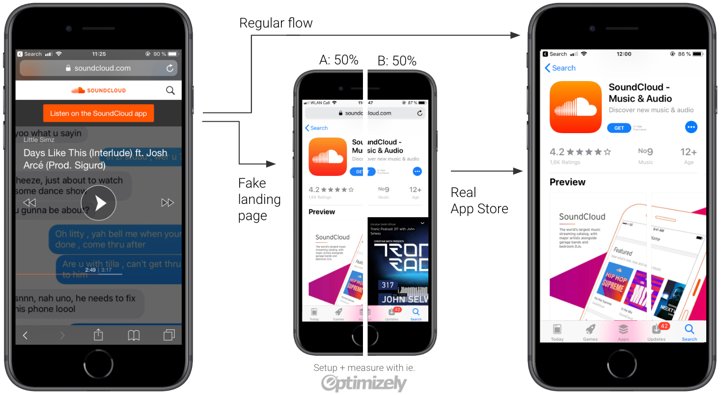
Should you not have the resources to create this landing page internally, it exists today two good commercial solutions offering this service: StoreMaven and SplitMetrics.
Pros
- Platform-agnostic
- Ability to test everything (from app name to the impact of rating)
- Pre-launch testing
- Test new store layouts seen in betas
- Track behaviour (time on page, screenshot clicks, scroll behaviour…)
- Measure LTV instead of installs (with mobile measurement partners) and therefore the ability to craft messaging for potential best-performing users. This is especially useful for subscription-based apps or apps with in-app purchases.
Cons
- Costly: either because it requires some development time on your end, or because you pay a commercial solution.
- Bad UX
- Legalities: 1) Tracking without consent: you are tracking (in some cases even tracking whole heatmaps and clicks) these users in the tests. 2) Apple IP infringement of copying the look & feel of their app store exactly.
- Priming affects your test
- High drop-off (15–30%). First drop-off from users realizing they are in a test or not in the real app stores; and a second drop-off from users thinking that the app is loading in the background, who haven’t understood the need to click again on “Install” or “Get”.
Step 6: Measure & Report
You need 3 criteria before declaring a test done. Consider the following questions:
- Did you reach statistical significance? Google calls out winners when the confidence level is above 90%, but it should ideally be 95% or more (p-value >0.05).
- Are you sure the experiment has run long enough to even out? You want a representative sample, not a convenient sample. Sometimes Google calls out a winner too early… There might be little fluctuations throughout the week for a music app and users will likely be the same all week long, but that’s not the case for a productivity app which has two use cases (business during weekdays). Here at Phiture, we use our homemade Slack integration to monitor tests on a daily basis and make sure we’re not missing anything.
- Did your experiment get enough installs? Conclusions shouldn’t be based on a small sample size. It’s usually said that you should aim for at least 1000 installs per variation. SplitMetrics explains that it actually depends on the expected difference in conversion for all versions and on the current conversion rate. The lower both values are, the higher the sample will need to be.
Once your test is done, it’s time to report. When considering how to measure the impact of your CRO efforts, the best numbers to consider are naturally ratios and relative data points, as CRO is about improving your app’s efficiency. Defining the right metrics to evaluate the impact of your ASO actions could be an article in itself, we will advise in this article to focus on the following ratios:
- Google Play: First Installs / Store Listing Visitors
- App Store: App Units / Impressions (Unique Devices)
It’s now time to use again your experiment backlog and to feed it with the results of your experiments.
Conclusion
Congrats, you’ve made it until the end! We’d like to give now you some final considerations. There is no need to go through every step of the CRO loop before every experiment. Instead, you should remember that testing is an iterative process and your next tests should be inferred from your learnings — either if a test win or loss. Let’s say one of your Google Play experiment was a fantastic win in Australia, do not only consider testing it on the App Store but also in different locales.