 The award-winning Phiture Academy specializes in mobile growth learning. We distill our knowledge from the forefront of mobile growth to deliver comprehensive online lessons that build your knowledge of mobile growth marketing.
Designing a sub-brand is no ordinary challenge. On the one hand you should be inspired by the parent brand and its style guidelines, but on the other, it needs to accurately represent your new service offer in a novel way.
It’s a tough balancing act. Visuals, tone of voice, fonts and color schemes all need to stand alone whilst still trying to leverage existing brand recognition.
When we decided to build our own online learning platform, we wanted to achieve this balance in order to welcome a new sub-brand to Phiture’s already distinctive identity. In this article, we show how we went about this, explaining the vision, inspirations, and processes that ultimately resulted in Phiture Academy’s sub-brand.

Our mission from the beginning was a new online learning experience
Figuring out your sub-brand’s core mission and vision
Where to begin? A natural starting point for any branding exercise is a solid understanding of the mission and vision. A mission typically entails the company’s business and objectives, and a vision incorporates the desired future state of a company.
We started out with an idea which quickly grew into our core mission: an e-learning platform, that could distill the wealth of knowledge we’ve accumulated working on the forefront of mobile growth topics.
Why? Our team has thousands of hours of experience, gathered from the countless experiments we have conducted working with some of the world’s most popular apps.
For our mission, we were determined any learning platform should be accessible to all – whether that’s the CEO of a blue chip company, a marketing professional, or a student just starting out. It’s for this reason, we decided early on that videos would be a cornerstone of the content, allowing for the presentation of complex topics with a human face. We also quickly adopted our name.
The word Academy for our project was a natural fit, denoting higher learning, while the name Phiture as a prefix denotes the source of this knowledge. We also decided to call it simply “Phiture Academy,” with its contemporary feel which alluded to the modern topics under discussion.
At this point, we paused. The broad mission and vision were there, and we decided to focus on the tone of voice of Phiture Academy.
The Tone of Voice
The tone of voice for any brand is crucial, guiding how a brand communicates and connects with its audience. We wanted to make sure the right people across Phiture were consulted on this, but in an ordered and systematic way which yielded concrete results that allowed for a variety of perspectives.
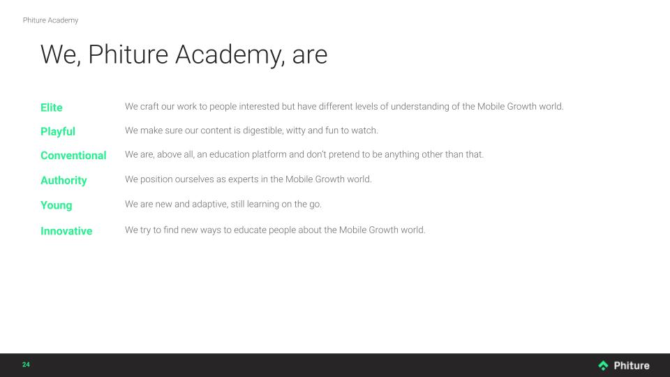
How? We settled on personality sliders as a brand strategy exercise to set the tone for the sub-brand. Very simply, you position your sub-brand between pairs of opposite adjectives, for example, ‘elite’ and ‘mass appeal,’ and ‘serious’ and ‘playful.’ Each participant is invited to indicate on their slider where they felt the brand should lie, whether learning towards one adjective or the other.
This was a fantastic way of building consensus in the team; while we didn’t always agree with each other on the positioning of each personality scale, each participant was invited to explain why or why not. By the end of the session, a clear picture had formed as to how Phiture Academy would communicate in the form of the average of our combined sliders.
The preliminary outcome of our tone of voice session.
It was at this point, we worked with a professional copywriter, Will Campbell of Words on Brand, to refine this vision for our brand. The idea was to consult a fresh pair of eyes to assess the vision, mission, and embryonic sub-brand, who wasn’t already invested in the process.
Will only slightly edited our value propositions, the personality sliders had been a great success at distilling our brand. Will instead got to work on a lexicon for Phiture Academy. This was a vital step, which steered the future structure and form of our learning content with an agreed lexicon that was aligned with our tone of voice.
With our foundations in place for how our brand would communicate, we got to work on the design.
Designing a sub-brand logo
Next designing a sub-brand logo was a natural place to start for our design team to apply their talents. It was vital that Phiture Academy have its own brand identity while paying homage to the established look and feel of our agency and consultancy.
A simple way to achieve this for any brand is to repurpose aspects of an existing logo. We used the roof shaped element in the Phiture logo, rotated it 45 degrees and rounded off one edge to represent an “a” for Phiture Academy.
We thus had a logo which was close enough to be associated with Phiture’s brand, but distinct enough to be separate.
![]()
The Phiture Academy logo takes shape
The colors: green, dune, lilac (education, potential and renewal)
The colors were the next step – and it’s an important one. Primary, secondary and accent colors for any brand help ensure that it’s recognisable and trusted.
We decided the primary color had to be chalkboard green to link in with the existing Phiture branding and create an association with education, ambition, and knowledge sharing. This shade of green is also distinct enough from the ‘Phiture green’ to establish its own identity.
We decided the secondary color should be ‘Phiture Dune’, a natural tone that represents the untapped potential of human perception and brainpower. We also use Lilac; the thought process being that because lilacs bloom early in the year, they symbolize spring and renewal.
To highlight important information, we use the original Phiture Green, tying everything back into the parent brand and a tone often associated with vitality and excitement. In a similar vein, it was also important to keep a similar font for Phiture Academy – another nod to Phiture’s overarching brand book.
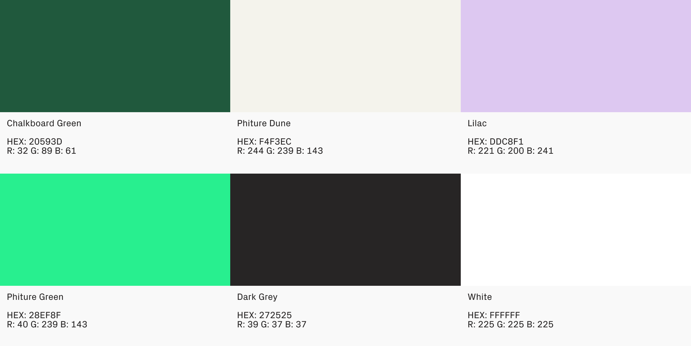
Phiture Academy’s color palette
![]()
The applied use of Phiture Academy’s color palette
The visual elements of the sub-brand
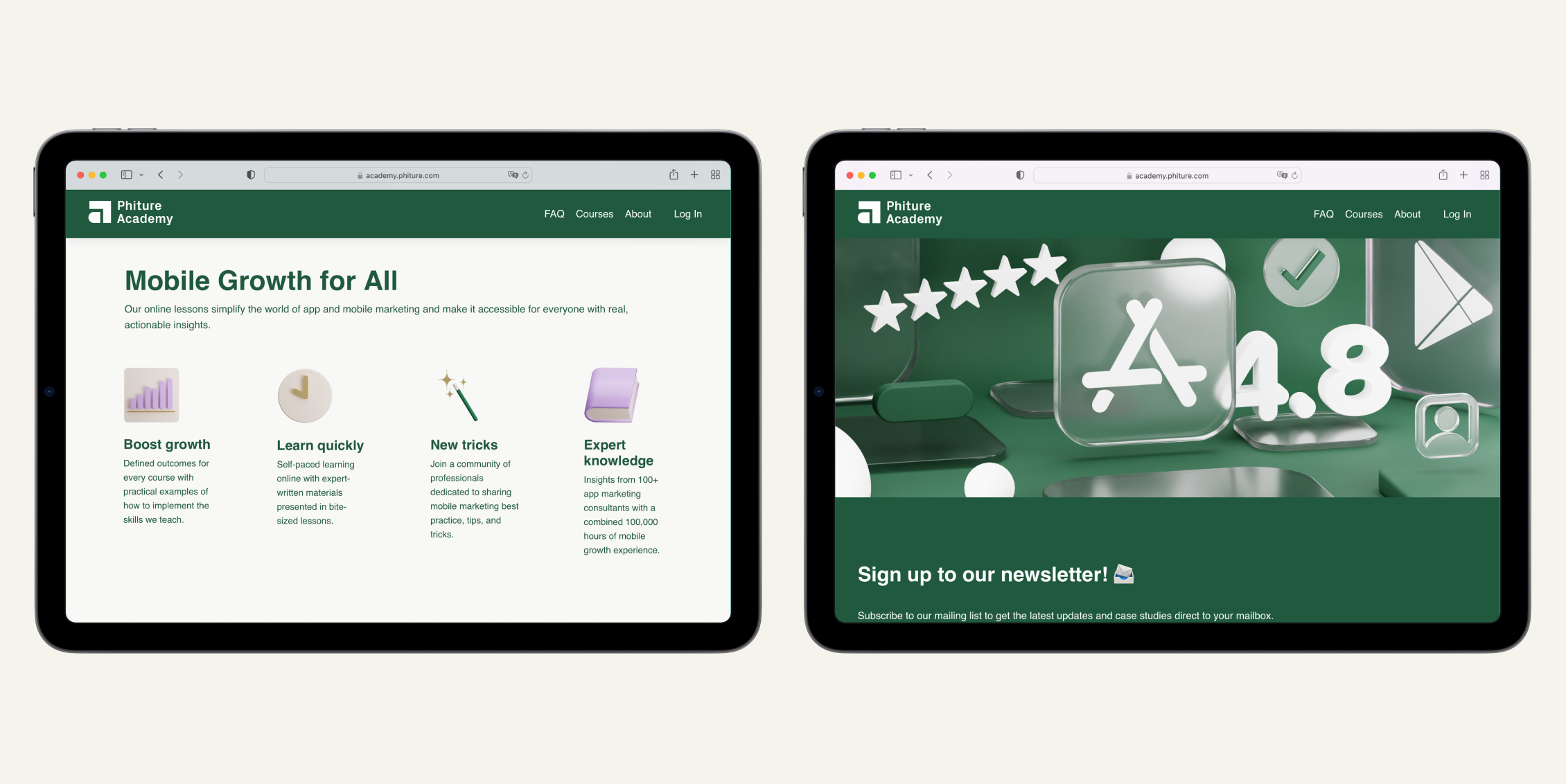
Graphic elements and imagery are a very good way to further reinforce your brand. Pictures used on the website, social media channels, newsletter, and other promotional materials should be consistent to be recognizable. In addition, elements of the learning experience, such as charts, graphs, or icons were consistent with the sub-brand aesthetic throughout Phiture Academy.
For the visual elements, we wanted to take as much inspiration as possible from the world of ASO. It was decided early in our vision that an ASO for Beginners course would be the first of our learning materials and as a core service of Phiture it was a natural place to find inspiration.
We wanted to include all the shapes, symbols and elements ASO practitioners would recognize and new learners would soon become familiar with. We made an effort to incorporate the star rating, app store style icons, and the same corner radius on our rectangle images as those in the app stores.
We used Blender to create the graphic elements. The open-source and free to use software was perfect for our needs not only in terms of cost efficiency, but also for the level of precision it offers. We took the new color palette and applied it to these elements from the world of ASO, creating a distinct aesthetic.
 The visual elements were heavily inspired by the world of ASO, and combined with our color palette.
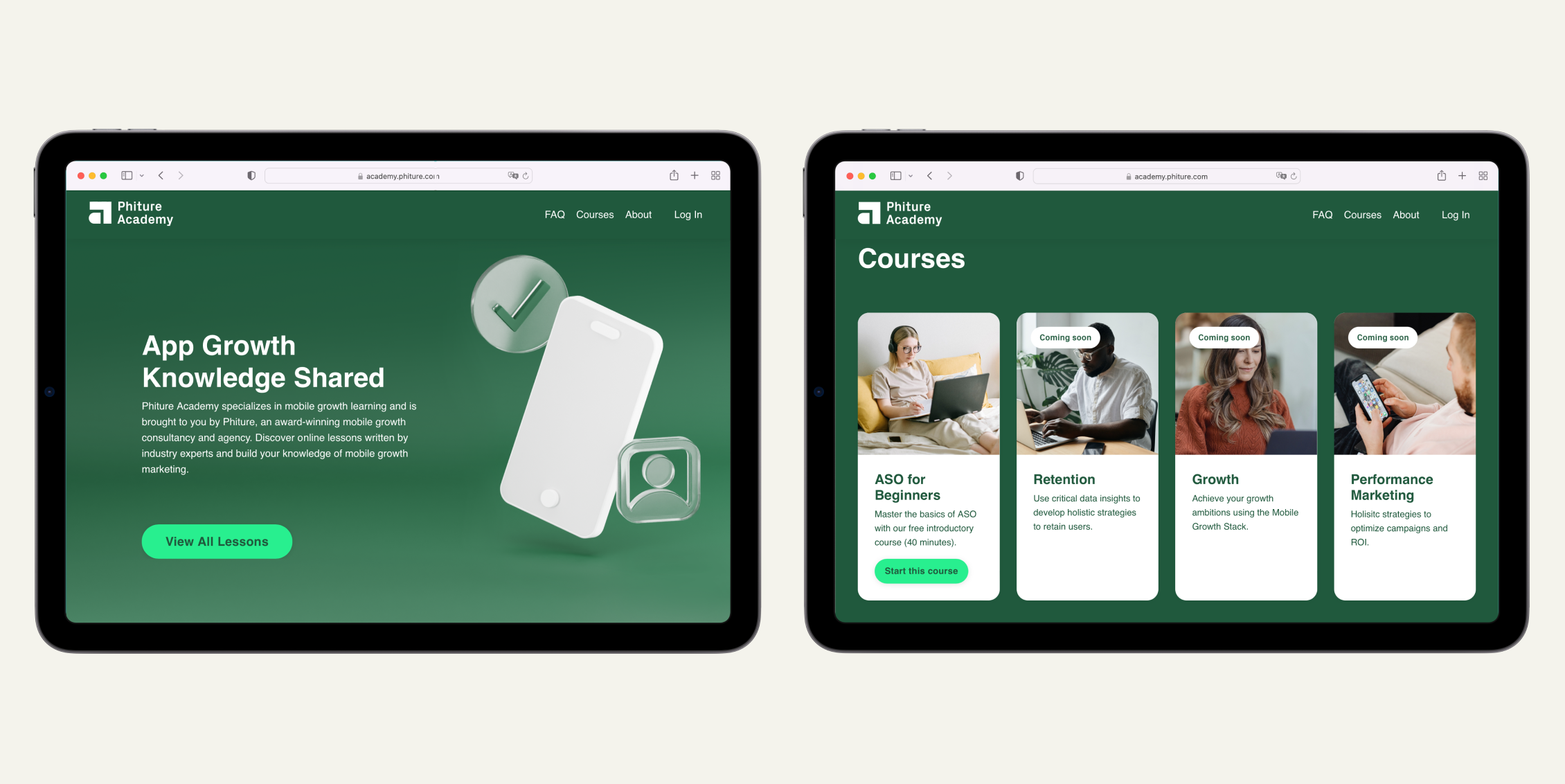
The Phiture Academy home page incorporating these visual elements
Transposing the design to video content
Developing a sub-brand for an e-learning solution meant the Design Team had to not only think how the visuals would look in static environments, but in motion design too.
As the visual elements began to take shape, weekly cross-team alignment meetings were held between videographers, motion designers, marketing, web design and ASO consultants. This was to ensure any potential snags in transposing the content were caught early, and served to give already a general impression of what Phiture Academy would look like for the Marketing Team.
Our in-house videographer then took the completed visual elements and reworked them in Adobe Premiere Pro for inclusion in Phiture Academy’s promotional videos and course content.
An example of the new sub-brand transposed to video

Animated graphical elements in the new aesthetic
The brand guidelines
The final step was to create documentation for Phiture Academy’s new sub-brand. This would ensure consistent design of the new sub-brand on all platforms, as well as social media channels.
It is important to mention and realize that brands, and especially sub-brands, evolve. We fully expect the Phiture Academy sub-brand to develop in the future. Our brand guides are not set in stone, rather they will continue to be the most up to date documentation of the sub-brand available.
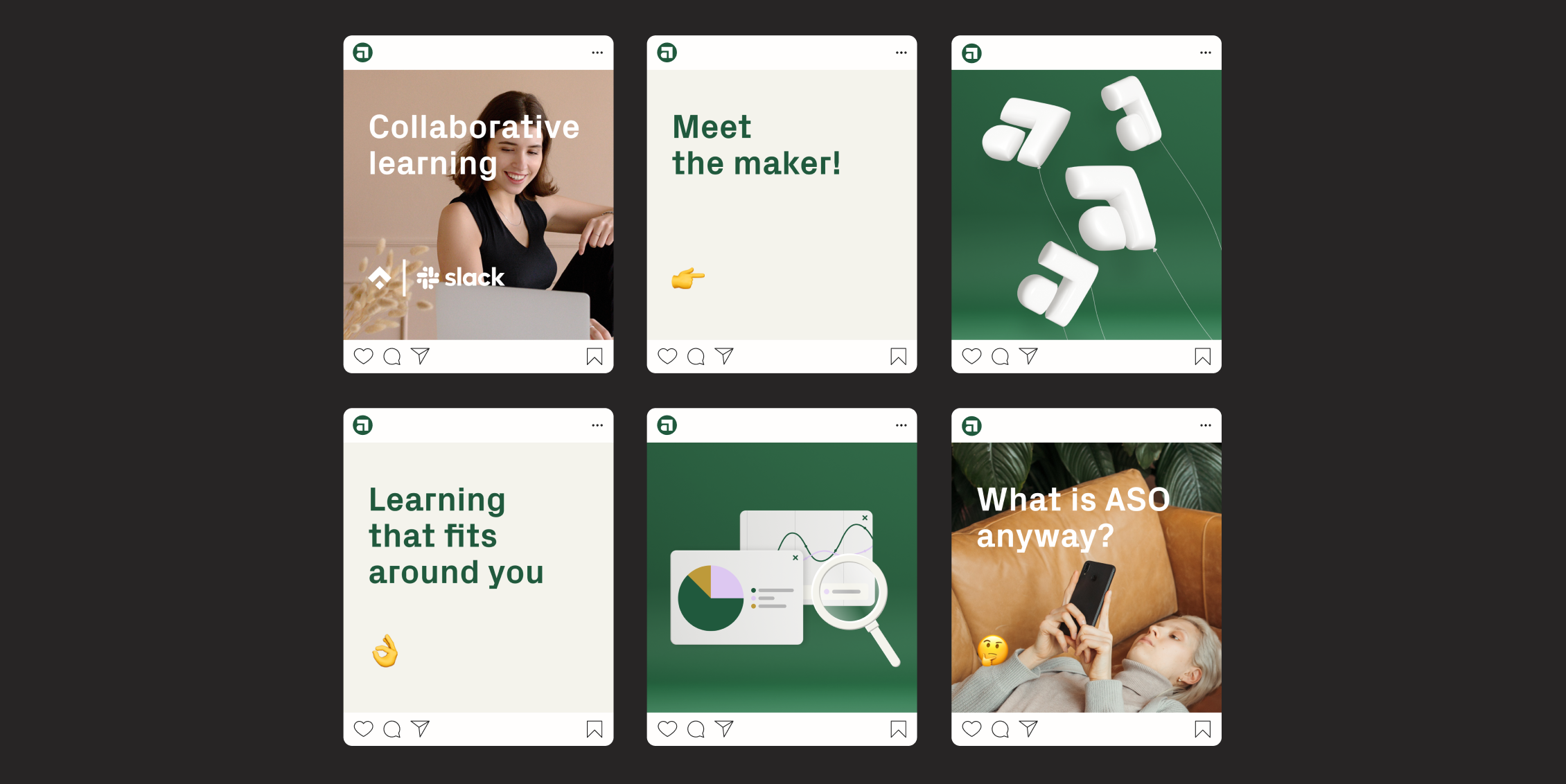
The sub-brand in action with our Instagram posts
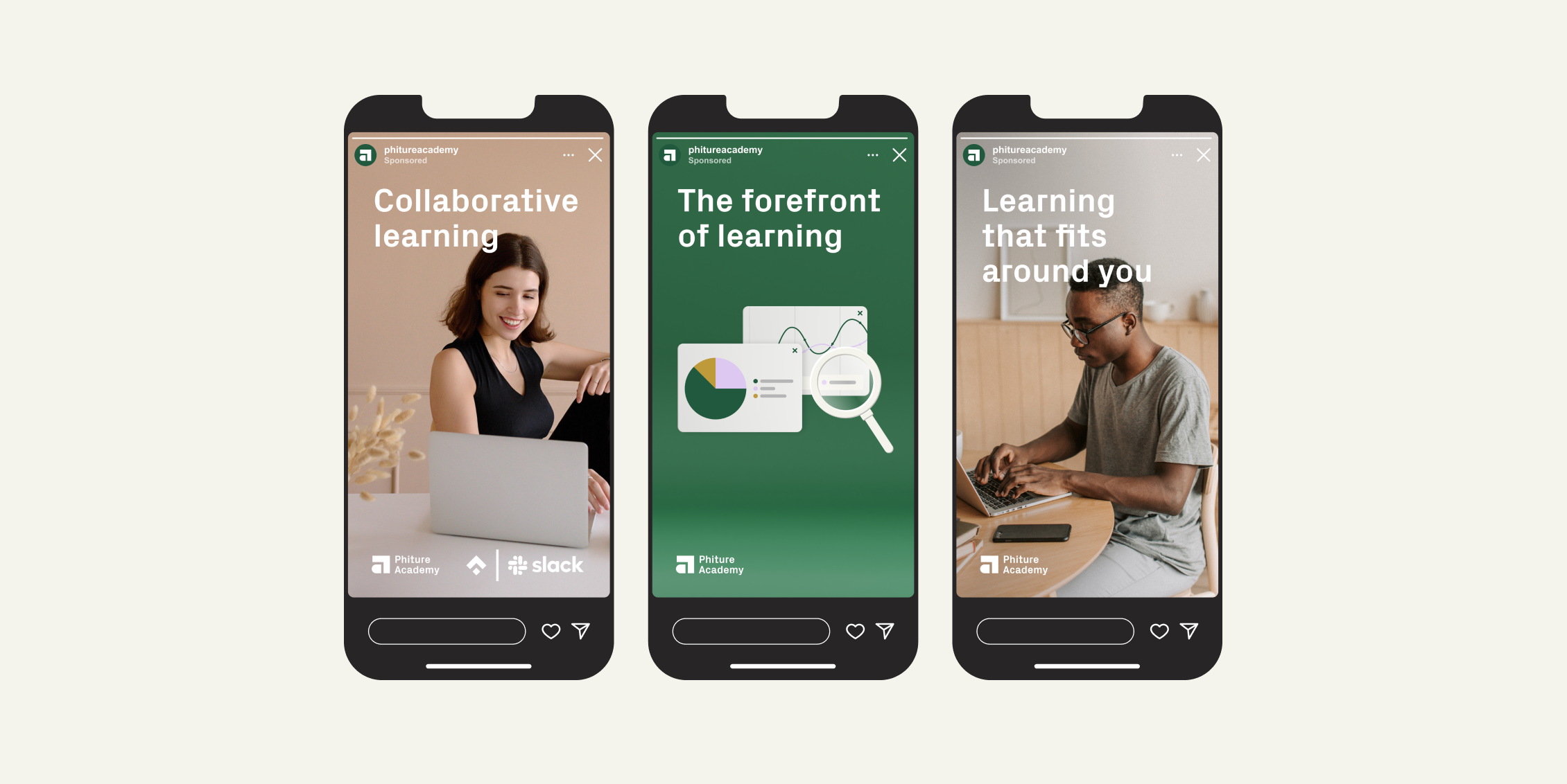
Instagram stories display our sub-brand.
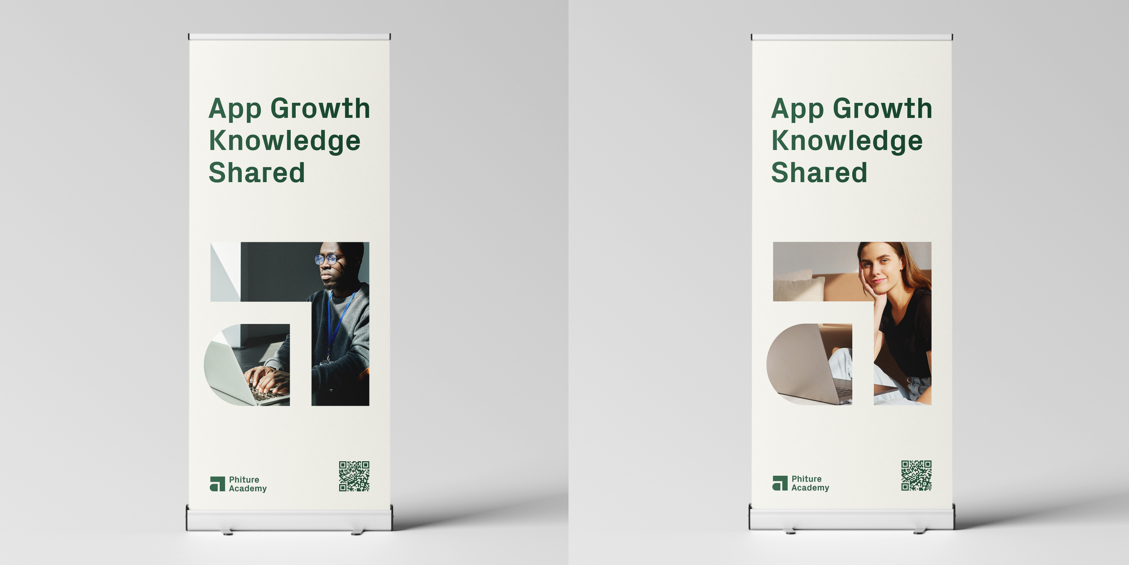
The visual elements displayed on roll up banners for use at events
Conclusion
Every sub-brand brings its own unique challenges when defining its identity, however we hope our own experience of designing a sub-brand for Phiture Academy will inspire your own creative and developmental process.
Remember this should be a fun process and creativity happens when we are free to experiment and play. Think laterally about what you want to communicate with your new brand and use subtext and the subconscious to the full.
Before You Go
- You can see our sub-brand for Phiture Academy in action now, by enrolling for the Advanced ASO course. Learners can expect to be equipped with the skills to plan, execute, and continuously improve an advanced ASO strategy.
- Adobe Express’s 2023 Guide to Brand Strategy is instructive in building a great brand strategy, and highly recommended reading to understand the importance of brand strategy, the key elements that make a successful brand, and how to create an effective brand strategy for your business.
- 3D design is a powerful tool for creative strategy for mobile apps and games. Executed well, 3D creatives can elevate a brand and its product offering in the eyes of the consumer, helping you get the results you need. In this article we aim to demystify 3D design and share our best practice on how to get started and deploy 3D design effectively.
- Phiture’s award-winning Design Team combine creativity with systematic testing to get results for mobile, with eye-catching designs that boost ASO, Performance Marketing, and Retention efforts. Want to find out more about how we can help your branding efforts with stunning creatives? Write to us here.