Graeme is a graphic designer with the App Store Optimization team at the mobile growth and ASO consultancy Phiture.
This article was inspired by the Mobile Growth Nightmares Podcast by Phiture co-founder Andy Carvell and Gessica Bicego.
Humans are visual creatures; we all like things that are easy on the eye. We also happen to have very short attention spans. Design layout, hierarchy, typography and colour all influence the way in which we perceive and react to an app’s listing. Marketers only have a few seconds to convert an app store viewer into a user. If your app store screenshots are not well designed, many users will be subconsciously deterred. This all seems self-evident, but many marketers fail to take basic design rules into consideration when designing their app’s store presence. There are numerous articles on what constitutes ‘good design’ in the stores (a good place to start); however, today we’ll look at what not to do.
How to ruin an app store icon:
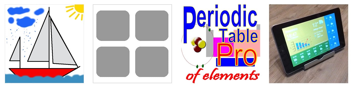
Your app store icon is the only visual element that is seen across the app stores and therefore highly important. The icon is obviously very small, so a lot of consideration must be taken to ensure that the icon design is working as effectively as possible. Unfortunately, even the most rudimentary design principles such as hierarchy, order and spacing are often seemingly ignored. If your icon is overly cluttered it is unlikely to be visually compelling.
![]()
Cluttered, illegible icons lead to confusion.
Similarly, a crudely-crafted icon screams ‘low quality’ and will nix the trust that well-designed visual assets bring with them.
Some very questionable design choices here.
An app icon should be able to strongly stand on its own against the competition. The following apps are all very similar in content (and from different developers) yet they all share virtually the exact same icon.
![]()
Additionally, your icon should only ever appear in the app stores icon area and never, for example, amongst your app screenshots.
Using typography in your app screenshots:
Ignoring the basic typographic pitfalls is a sure-fire way to ensure that app store visitors swiftly scroll past and avoid your app listing. The correct use of type is something that designers can take years to master, but avoiding some obvious errors will go a long way. One of the most common screenshot typographic crimes is use of exceedingly small text with poor color compatibility or lack of contrast. Your canvas is already very small; incorporating tiny text with low contrast will simply not be legible.
 A good place to start is by avoiding unnecessarily intricate typefaces.
Your value proposition text should be always be short and to the point. As we have just seen, it should also be legible. If you write an essay on the confined canvas of a screenshot, viewers are likely to simply ignore your app.
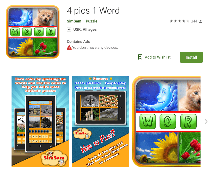
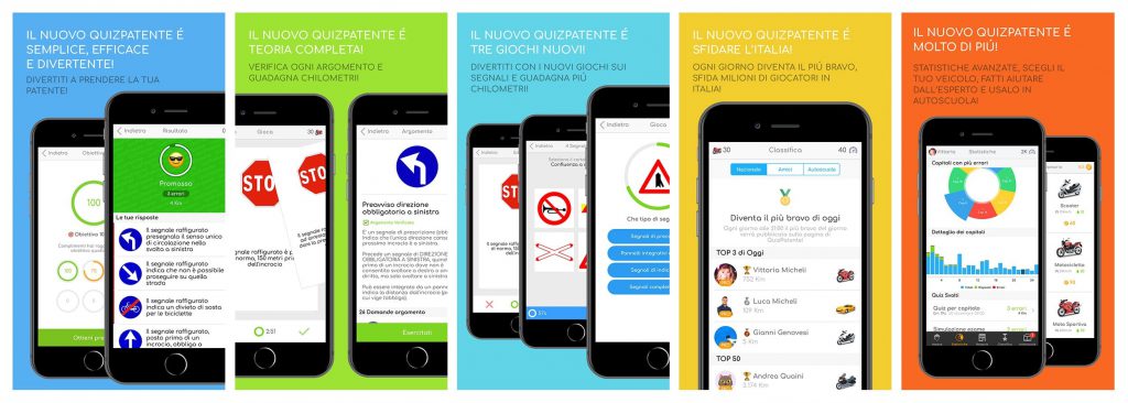
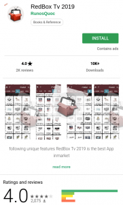
Can you believe this is a real screenshot set?
Where should we be looking here? There is simply too much visual information.
Screenshot design and using device mockups:
With new apps being submitted to the app stores daily, the market is increasingly competitive. Developers therefore do all that they can to set themselves apart from their competitors. The following examples certainly manage to differentiate themselves, but not exactly in the positive sense…
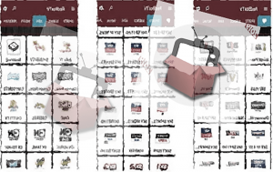
For some strange reason this app’s entire screenshot set is blurred, mirrored and rippled beyond repair:
In regards to device mockups, these in-app screengrabs do not fit the handset that they have been placed into:
We are a little lost for words with this example:

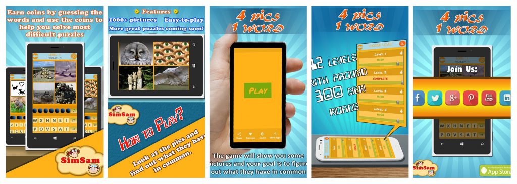
App store screenshots should also represent your app in an honest light and very quickly and clearly communicate to the viewer what the main function of the app actually is. There is no clarity in the following screenshots at all, with the exception of the small white text at the bottom of the first app (which is barely legible) and the title in the second.
The first app is apparently a video editor, though this is far from clear when viewing the app listing. The second screenshot is a mini golf game that contains no actual in-app screenshots of the game.
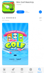
Note the spelling mistake in the first screenshot. Does the mini golf app have any game content other than the splash screen?
Also note that only one single screenshot is included in these listings. Even though most viewers will only take the time to glance at the first 2 or 3 screenshots (a large number of users simply install from search results or app store homepages) you should add more than this to cater for the few that do take the time to look through all of the images. You should, at minimum, add enough screenshots to demonstrate the core features and primary sections within your app.
Using the wrong device in the wrong app store:
Though it is thankfully a rare occurrence, from time to time you will see an iPhone device used in Google Play Store screenshots (or vice versa). The following screenshots clearly show an Apple iPhone used in Google Play Store screenshots.
This app’s screenshots correctly show an Android device, but the video unmistakably features an iPhone:

Localizing screenshots:
Another common mistake is failing to localize your screenshot designs. If you have localized your app titles, descriptions or keywords, why should you exclude your screenshot designs? Many users will not even take the time to read your app description – some viewers have already decided whether or not they will download your app purely based on your icon and screenshot designs. If you have failed to localize screenshot designs you may be missing out on a significant audience.
Even if your app is not available in multiple languages you should still take the time to submit multiple screenshots where the value propositions on each screenshot have been updated to cater for multiple languages. Importantly, don’t forget to be explicit about which languages your app is available in – if you have localized screenshots but your app is only available in English, be clear to allude to that in some way in your store presence. If however your in-app content is available in multiple languages then this should definitely be highlighted.
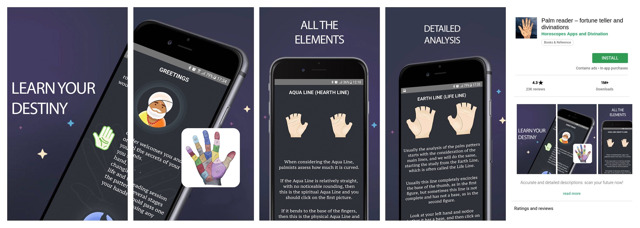
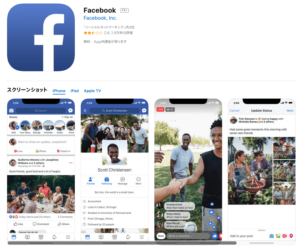
Here, Facebook has failed to localize their in-app screenshots — this is the same screenshot set that is shown in both Japan and The United States.
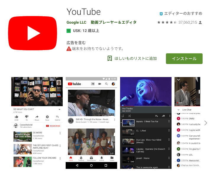
YouTube’s Play Store screenshots have not been updated for many locales, as visible in the below example from Japan. It is quickly apparent that these screenshots have been tailored specifically to the US market. One could argue that as YouTube is such a popular service worldwide they don’t actually need to bother localizing their screenshots, but that is beside the point.
Poster frames:
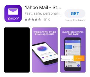
Surprisingly, many app developers still do not take advantage of the still image that they can use as poster frame for their app preview. If auto-play does not start, a poorly considered poster frame may display a partially hidden logo, a halfway point between an animation transition or video effect, or in some cases even a blank screen (see Yahoo Mail below).
Regardless of how well-designed the following previews are, their poster frames have not been set to an appropriate point in the video and therefore provide an awkward first impression.
There are numerous examples of beautifully-crafted designs in the app stores, and while we can learn a lot from looking at those and emulating them in our own listings, we can often gain comparable value from looking at poorly thought-out designs and learning what to avoid. We hope that these design nightmares prove useful as you optimize your own app’s store presence.
Don’t forget to check out the Mobile Growth Nightmares Podcast.