If you’re in the field then you’ve definitely heard the news: later this year, Apple is finally releasing a long-overdue feature that everybody’s been waiting for. The opportunity for A/B testing to be done natively by experimenting with different creatives in an app’s product page on the App Store. With this upcoming feature, you’ll finally be able to work on increasing your conversions by understanding users’ preferences via A/B testing.
With this in mind, it’s never been more important to be on top of your A/B testing game, making sure you use all the new features in the best way possible. In this article, we’ll be sharing the best practices regarding testing: the strategy, what to test, and the best way to use Product Page Optimization (PPO).
Why is A/B testing important?
As we explained above, the new A/B testing features on iOS 15 will finally bring native A/B testing to product pages on the App Store. This will give app marketers an understanding of what attracts users to download the app and what store listing assets influence a user’s decision. If tested and used correctly, this can increase your conversion rate, allowing you to reach your audience in a more efficient manner. Through testing your assets, you can find out which works best for potential users, which can have a huge impact on your overall results.
Now, let’s go through the basics:
How Can You Use Product Page Optimization?
Product Page Optimization (PPO) in the App Store has ultimately the same purpose as its competitor, Google Play. It allows the developer to experiment, analyze, and improve the performance of the app by testing several variants (with a minimum of one variant and up to three against the control variant). Basically, it will give us the opportunity to verify and test your hypothesis in a native environment in the App Store.
What will you be able to test, though? These three different assets:
- Icons
- Screenshots
- App preview videos
Titles, subtitles and descriptions won’t be able to be tested.
The goal of testing the assets is to determine, based on the app creative that the developer would like to test, which variant performs the best on the App Store.
If you’re working with Google Play, you’re probably noticing some differences already regarding iOS 15 – and, in general, there’s a few we should keep in mind.
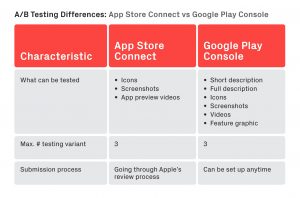
You can see there are some differences, like the submission process or what can be tested, meaning that you can’t just replicate your Google Play strategy (if you have one). You’ll need to adapt and use the new features to your advantage.
For any PPO test, you’ll have to submit your testing variants to App Store Connect and go through the App Store review process to get approval from Apple before running the test. The good news is, you won’t have to wait for a new version to set up PPO as you do now whenever you update the store assets.
All in all though, how can you best use these new features to your advantage?
The Solution: Iterative Testing
Driving users to your product page is only the beginning of your journey. Converting these pages views into installs is a challenging task on its own and, of course, the ultimate goal.
Understanding user preferences is a key point to developing a successful testing strategy that will increase conversions. You’ll need to understand what your users find interesting and iterate it over and over until you’ve reached the most optimal results. For that, at Phiture we normally rely on the Persuasion-Emotion-Trust Design Model (the PET model), which helps us set conversion tactics that we can test out.
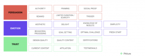
What does this model do exactly? Basically, it helps you pick a conversion tactic that’s clearly defined and unique to test out and create iterations of the same conversion tactic that you can easily and logically compare.
For example, if we look at meditation apps, one of the conversion tactics that they’re using is social proof, meaning highlighting user reviews and using awards to help create trust with the brand and therefore persuade users to download the app.
Another conversion tactic that can be used as an example is aesthetics. Aesthetically pleasing designs will encourage the user to give the app a try. This is something you can test many variations with, as there are different ways to present your app.
Now to get to the practical part: the new iOS 15 PPO functionalities will allow you to test on elements like icons and screenshots (so far) and, as Apple recommends, it’s advisable to test only one element at a time to get more accurate results on each of the change’s effects. You can test up to 4 variations: 1 current variation and 3 new ones.
You can also choose the percentage of audience split that will see these changes. For example, if you’re testing 3 other variations and you allocate 30% of the audience, the split will be 70% for the current variation and 10% for each new variation.
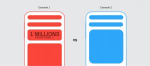
So let’s say you have an app that offers filters and lenses, and you want to change the icon of the app. However, you’re unsure whether it will work or not, and if it will give you better results. This is where the new PPO functions would come in handy, offering you the option to do so.
In this case, you can choose that 50% of the audience who land on your page will see Icon 2, and note that they will see it on their phones when they download the app as well. And usually what you need to do is wait for the test to have a statistically significant number of users before you can make your judgement about whether Icon 2 has performed better than Icon 1. Afterwards, you can easily apply the change without worrying about the effect.
As we mentioned before, meditation apps usually use social proof to increase conversions. For this, you can use tactics like highlighting ease of use, user-friendliness, or user experience and test out screenshots against each other to see which one will convert more users.
You can also highlight features against each other based on the behavior you see on your app. Through this you could, for example, observe that more users are using maps to locate restaurants around them than they’re using the search. Knowing this, you could test out placing the maps in your first screenshot, as opposed to having it as the fourth.

By using all this, you’ll be able to create the ideal product page for your audience, increasing your conversion rate. It’s important to test all different assets one by one, step by step, and to have a strategy in place towards this. After all, it’s only by knowing your users’ preferences that you can actually increase conversions and ultimately better present your app for potential installs. By using the above best practices, you should be able to achieve exactly that. As always, feel free to reach out with any questions.
Conclusion
By comparing what we call the Control (the existing creative asset) variant with the testing variants you’ve created, you’ll be able to understand which one works best. This can help you to move forward with a strategy that will enable you to have a direction for your next steps.
App Store will offer you the possibility to run tests for up to 90 days for specific countries.
You can adapt the creative assets ( icons, screenshots and app preview videos) to be relevant to your target audience, enabling you to leverage this interest and ideally generate conversion.
By using all this, you’ll be able to create the ideal product page for your audience, increasing your conversion rate.
Regarding testing results, we’ll be releasing another article soon on how you should interpret the different metrics, and which ones are most important.
If you need specific advice regarding App Store Optimization or conversion rates, feel free to reach out!
Table of Contents