 Ever gotten a push-notification and, a few clicks or swipes later answering your preferences, found yourself returning to an app that you haven’t used in ages? If so, you’ve probably noticed how natural and completely streamlined the experience was. Little did you know that these pop-ups may not be part of the app—they are, in fact, multi-screen in-app messages.
Multi-screen in-app messages (IAMs) may seem like a bit of a dark horse, but they’re an essential component to your overall mobile customer engagement strategy. It’s no secret, though, that they require a lot of prep-work to create: you need coding resources, product development alignment, and quality assurance before you can launch the final version.
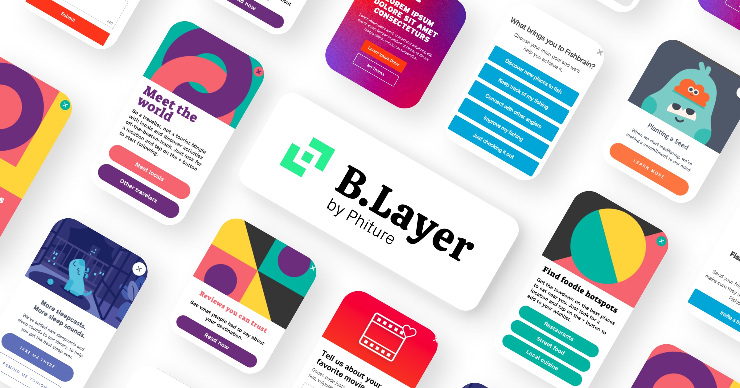
Three months ago, we launched Blayer, Phiture’s In-App Studio. It’s a Braze extension that makes the creation of in-app messages easier than ever before. An in-app messaging studio, This in-app studio allows you to create custom in-app messages without any coding required. Using this in-app studio, you can create modals, fullscreen, and simple surveys that fit their precise design specifications, creating the perfect in-app message for your product.
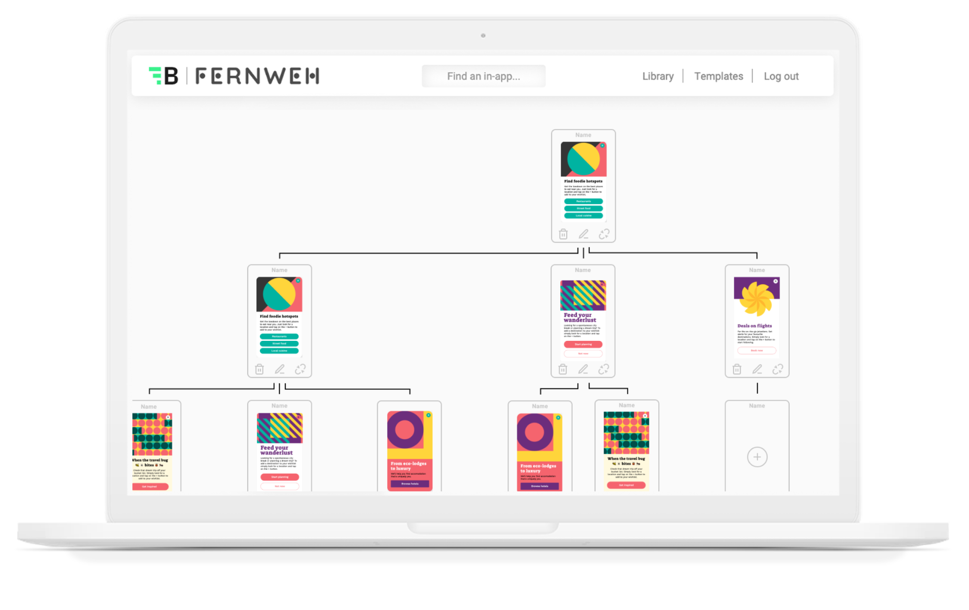
Today, we added multi-screen in-app messaging updates to provide critical assets to your activation and engagement strategy, making the process even easier. Our new updates allow your CRM team to build entire messaging flows in seconds on their own—without needing resources from your developers. What was usually a very complex piece of code is now an effortless task in our brand new template editor.
Our in-app studio now offers two new updates to its templates to facilitate the deployment of multi-screen in-app messages:
1. Pagination. Our new update features multi-screen in-app-message templates that allow you to build onboarding flows, feature tours, thank you screens, and feedback screens within seconds. Create templates to onboard users, introduce new features, or recommend content aligned to the user’s preferences.
2. Surveys. Our new update also features surveys and questionnaires that are compatible with multi-screen in-app messages. Create extensive surveys, onboarding funnels, and quizzes with ease.
What does this mean for your CRM Conversion Rates?
You may be asking why these two new features matter, and how they can drive impact for your KPIs. There are three major ways multi-screen in-app messages can boost your CRM program performance:
1. They’ll increase user activation
Our new templates help make your onboarding communications easy. As users are highly motivated, the onboarding stage is a critical moment for you to both prompt permissioning and collect information. At Phiture, we leverage onboarding to:
- Prompt the user to tell us about the main reason why they downloaded the app. We call these prompts use-case surveys.
- Prompt users to opt-in for push notifications.
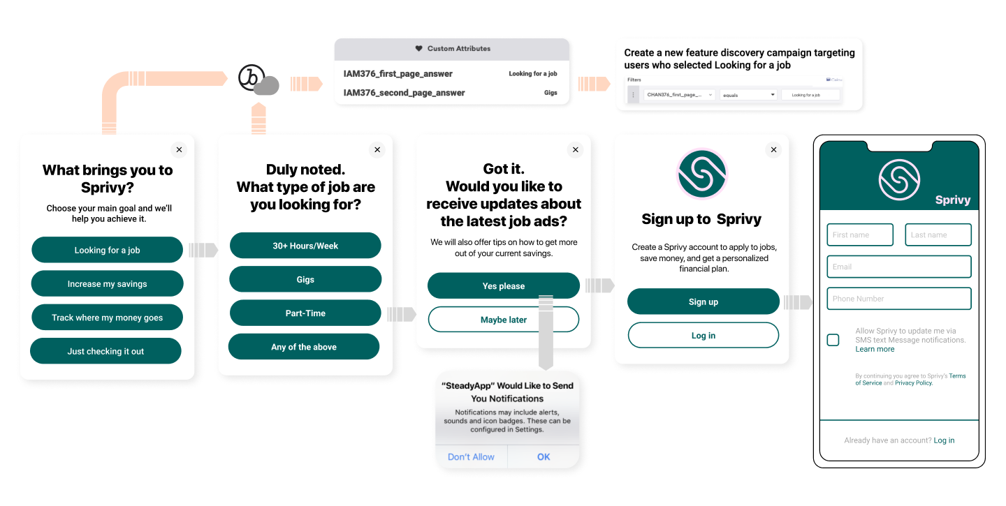
Push pre-permissions directly impact your opt-in rates. But how do you prompt both a use-case survey and push pre-permissions during onboarding? You can’t trigger one in-app message on top of another. The solution is thus to use a multi-screen in-app message. The icing on the cake? The last screen channels users to features that they’ll be most interested in in your app, based on their use case.
Here’s an example below for a finance app:
2. They’ll increase user engagement
By enabling the use of surveys and questionnaires, these multi-screen IAMs templates refashion user engagement. Questionnaires and surveys can be used in a variety of ways:
-
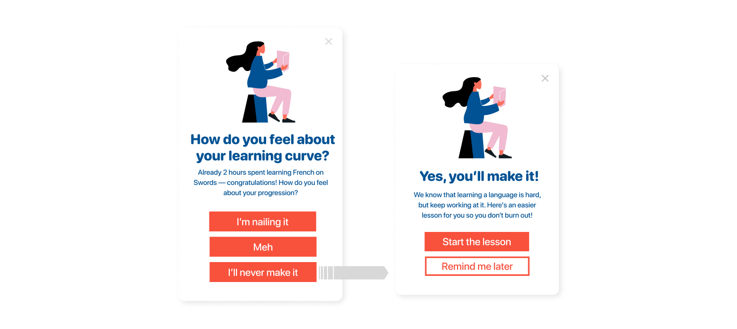
- To understand the intent of the user. Questionnaires are a great way to get a flavor for the user’s motivation. Consider the example of Duolingo: a simple question, such as “how do you feel with your learning curve?”, can be used to gauge customer engagement. If users are happy, teams can leverage responses to congratulate them, all the while suggesting tougher courses/new challenges. Conversely, if users are unhappy, teams can prevent them from churning by following up with motivation communications. All of this can be done with the use of our multi-screen in-app templates.
- To create feedback screens. Feedback screens improve the user experience and increase engagement, as well as communication. Let’s take a musical instrument-learning app as a model: similar to our Duolingo example, an in-app message appears and asks how the user feels with their progress. If the user answers “I feel satisfied with my progression,” a subsequent screen can appear with the following copy: “Congratulations! Keep up the good work. How about a more challenging lesson?” Conversely, if the user answers the other way around, another feedback screen can assuage them by saying: “Sorry to hear that! We know that learning a language is hard, but keep working at it. Here’s an easier song for you so that you don’t burn out!”
-
- To make quizzes. How about a quiz for your users? If you have a sport/food/language/media app, a great way to engage users is by giving them a short but enticing quiz about a certain subject relevant to your app. Imagine an e-commerce company that specializes in food delivery. An in-app message screen could prompt the user to answer the following questions in quiz-format: “How many hamburgers are eaten a day?” “What is the most popular cuisine in the world?” These quiz questions engage the user through multi-screen in-app flows, making them return to your app time and again.
3. They’ll monetize the user journey smoothly.
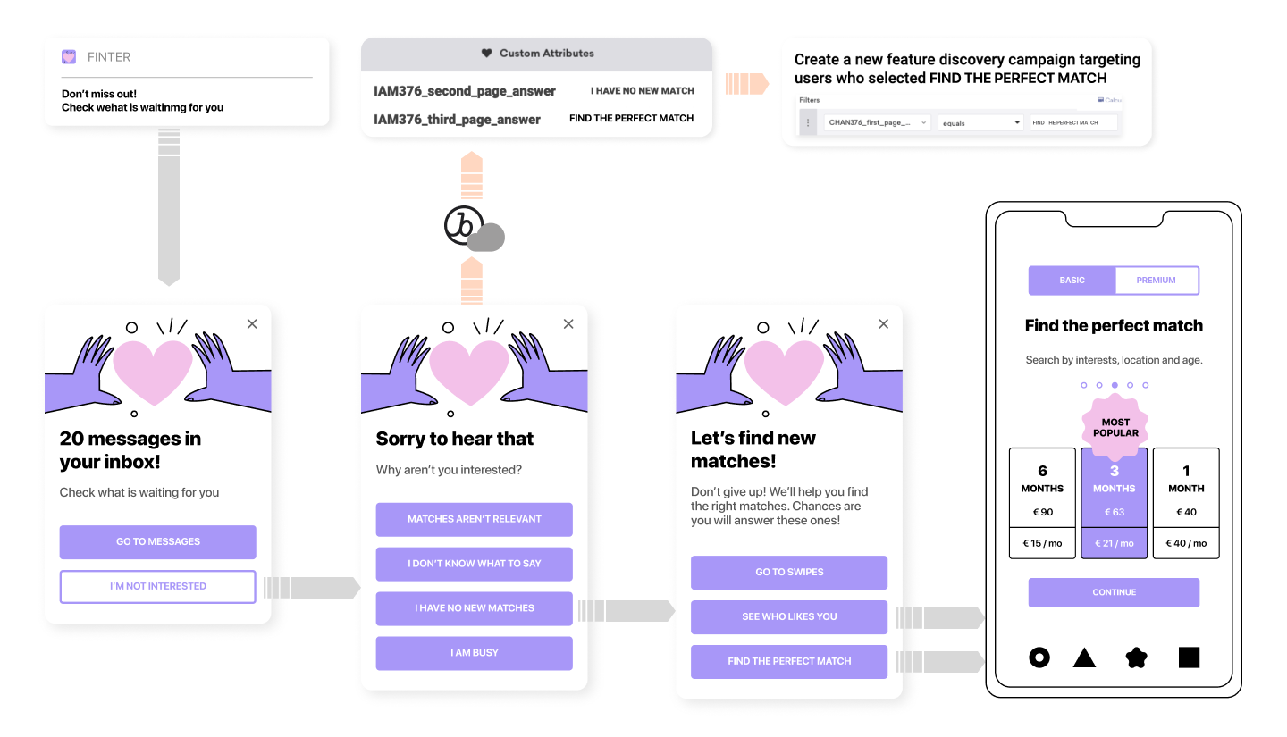
At Phiture, we’ve had tremendous impact using in-app messages to leverage our clients’ revenues. But how do multi-screen IAMs fit into the picture? One good strategy is to tie your user’s intent to an upsell in-app message. Let’s take a fitness app, for instance: let’s say this app has several paid features, including meditation packs, training packs, and AI to help you get into shape. If the user taps on meditation packs, they receive an in-app message mentioning the benefits of this specific feature. Two options then appear: a “Subscribe Now” button triggers an in-app purchase, while a “Learn More” button leads to a second screen that gives you the details of all the features the paid subscription can provide. The use of multi-screen in-app messages helps you make both options readily available to the user. (See the dating app example above)
Another strategy to increase monetization is by preventing users from unsubscribing. In order to prevent unsubscription, you first need to understand why users are canceling subscriptions in the first place, after which you can segment your canceling users based on their reason for doing so. Within these segments, you’ll also be able to suggest potential solutions to the user so that they don’t churn—and you can also save their information for campaigns later down the line. All of this is doable with multi-screen IAMs.
These new multi-screen updates are available for all Braze users. Our team will help you set up your initial templates following your design requirements.
Create multi-screen in-app messages that fit your design portfolio now, and start deploying killer in-app messages campaigns tomorrow. https://www.blender-inapps.com/

