Editor’s note: this article was originally given as a presentation at the 2022 ASO Conference, but was written in long-form due to popular demand from attendees. This is the first of a three-part series of the workshops given by Phiture Consultants at ASO Conference 2022.
When working with ASO, one quickly realizes how important it is to understand the user’s decision-making process when downloading specific apps in order to contribute to a sustainable conversion rate uplift. In this article we aim to showcase how user research can inform you on why people are – or aren’t – converting into installs.
How is User Research applicable to App Store Optimization?
As we have highlighted in a previous article about the Conversion Rate Optimization Loop and in our ASO book, conducting research is the important first step to increasing conversion rates via app store optimization.
A/B testing on its own isn’t sufficient to answer why certain ASO assets convert at a higher rate than others.
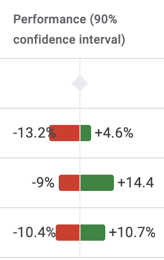
When A/B testing, we look at the confidence intervals. A confidence interval of between, for example, -1% to +8.1%, means the conversion uplift is 90% confident to land within a -1% and +8.1% range. In even the best-designed experiments, it’s difficult to know exactly why users decided to download at a higher or lower rate, or what could help raise the lower limit of the confidence interval for stronger results.
Confidence interval -1% to +8.1%
in the Google Play A/B testing tool.
Similarly, when testing out three different variants, the actual assets may convert at drastically different ranges, even if the variants are testing out minor or subtle changes.
Confidence intervals of three similar variants in the Google Play A/B testing tool.
In terms of ASO, Qualitative User Research can give us specific insights on:
App/Play Store user experience
- Search Results Page (SRP) attention – important details on the search result page
- App store components – title, star rating, top chart ranking, etc.
- Defining the visibility “fold” – to what level of information depth do users go?
App perceptions
- App components – app-specific information e.g. features, price, etc.
- Specialization – do users prefer specialized or a broad set of features?
- Brand influence – influence of the brand on a user’s decision to download an app
App marketing asset perceptions
- Images vs words – the importance of screenshot captions versus the imagery
- Asset design – influence of design/color/branding of screenshots
- Asset content – do users focus workflow outcomes or the available features?
- Keyword relevance – visual word recognition
The user journey
In addition to understanding how users formulate their opinion of your app in the App or Play Store, it is fundamental to understand the user’s journey and pinpoint the areas where your Product Page listing could stand out against the competition. The following steps showcase vital areas within the decision-making process while users embark on their journey to search for and download an app:
For most, it begins outside of the store
- Particularly for branded searches, the app is usually recommended by a trusted other (friend/family/influencer)
- Some users begin their evaluation process with a Google search/YouTube video
Apps are narrowed in the Search Results Page
In the App/Play Store users type in their own various keywords (usually generic) and select apps based on certain key elements:
- Star rating & total reviews
- App keyword position (most users only scroll through the top 5-10 ranked apps)
- Total downloads (in the Play Store)
- App title
- Editor’s choice
- Screenshots/video (in the App Store)
- App evaluation
Users consider limited inputs, such as:
- Visual assets (Screenshots/Preview Video)
- Long description (usually only skimmed over, feature and keyword recognition was important)
- Reviews
- App age/release frequency
- App size
Decision finalized on several key criteria:
- Ease of use of the app
- Visibility of price & free features
- Visual word recognition of key features
- Reviews (users read through these to check for bugs/unforeseen issues, clarification on unanswered questions, validation by experts or “someone like me”)
Most often, 3-5 apps are downloaded for comparison
- Downloading 3-5 apps is most common to confirm the app was easy to use for their key workflow and did not block them with payment walls
- Only a couple of users say they would try one app at a time which is usually connected to limited storage capacity on their phone
Striking differences discovered between user perceptions on the Google Play Store & the Apple App Store
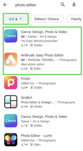
Through conducting user research, we have discovered that users in the Play Store rely more heavily on the average star-rating and total downloads when evaluating apps in the search results page. Several Play Store users applied rating filters to searches to exclude apps rated below 4.0 or 4.5 stars. We have seen that users are more willing to click on ad results as they are less blatant than in the App Store and they are more likely to rely on text assets as, other than the icon, there are no visual assets visible in the search results page.
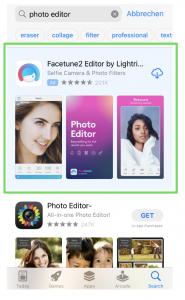
On the other hand, users in the App Store are more likely to skip ads as the ad is more visible due to the different background color. They are more likely to rely on total star ratings over the top chart rank and rely more on visual assets, due to the visibility of the preview videos and screenshots in the search results page. Additionally, some users install directly from the search results page.
How to get started with User Research for ASO
In order to conduct effective user research for ASO, it is important to implement the user research learnings into the ASO strategy, measure its impact and recalibrate. For guidance on implementing a successful user research workflow, we have created the User Research Loop:
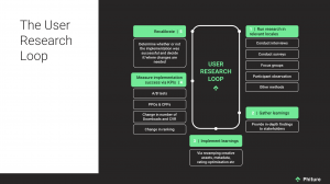
Image description: User Research Loop. Click here for full-size image.
Although there are various methods that can be used to conduct user research, we have been able to gain great user insights by using:
- User interviews
- User surveys
Using user interviews to gain qualitative insights and backing these insights up with data from the surveys allowed us to dive deeper into illuminating the decision-making criteria and context for decision-making for prospective users. Depending on your research focus, another option could be to start with the surveys and follow up on insights with targeted interview questions.
In addition to this, if working with multiple apps, it is a best practice to follow a waterfall approach, rather than working on everything in parallel. This allows for the opportunity to transfer learnings from one app to the next, while still moving forward with strong momentum.
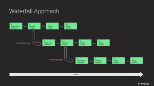
Image description: Waterfall approach when conducting user research for multiple apps. Click here for full-size image.
Depending on the number of apps and intensity of the project, the timeline will differ substantially. Below is a recommended timeline for working with up to five different apps and up to three different locales per app:
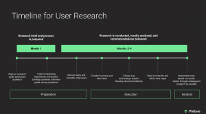
Image description: User Research timeline example. Click here for full-size image.
If you need some guidance in the actual creation of the interviews and surveys, the following structures can provide you with a solid starting base:
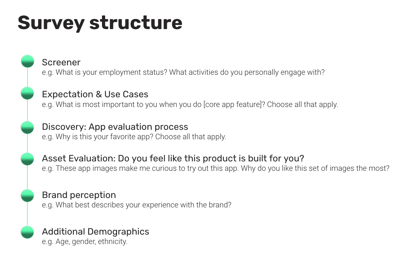
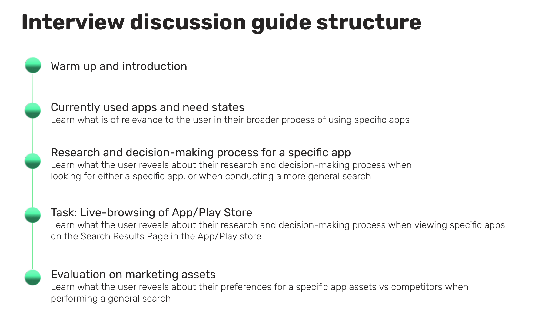
It is no easy affair to take on such a project but the learnings are enthralling and simply open up the desire to dig deeper and deeper. One question leads to the next and before you know it, the interviews/survey respondents have dictated your testing roadmap to you.
If there are any enthusiastic, potential User Researchers for ASO out there, we’d love to hear from you!
Before you go
- This article was originally given as a presentation at the 2022 ASO Conference, and the presentation can be found here.
- The question and answer session at this year’s ASO Conference was one of the highlights, with members of the ASO Community posing questions to the team here at Phiture. Although we fielded a variety of questions there was one topic in particular that saw the most airtime, localization. Here you can read the questions and answers to these popular topics.
- Qualitative research has never been more important to direct and complement experimentation efforts. In this article Phiture alumni Mateusz Wrzeszcz introduces the Product Page Analysis Cheat Sheet with a Heuristics Analysis Model as a means to structure this crucial research; the inward-looking part of the CRO feedback loop used by the Phiture team of ASO consultants.
Table of Contents


