Performance marketing has long been a numbers game. However, with an increasing number of automated solutions to manage campaigns and deliver assets, it’s the creatives that we have the most control over to drive the most impact.
The myriad placements and ad formats across various channels provide an excellent opportunity to enhance personalization and differentiate yourself in the digital space. In this article, we’ll dive into the creative ideation process for Google App Campaigns, which can be employed for other channels such as Facebook, TikTok, and more.
What are App Campaigns?
App campaigns on Google provide the advertiser with an opportunity to promote their Android or iOS app across its properties such as Google Play, YouTube, Google Display Network, and Discover on Google Search. App campaigns simplify the process, so the advertiser just needs to provide different asset types such as text, banners, videos, and HTML5 assets for the algorithm to work with; these are then shown across those networks to drive installs or other in-app actions. The process utilizes machine learning, and the crux of the campaigns are the assets.
The App campaigns algorithm is a “black box algorithm“, which means that one of the challenges with it is that we have no say in where the assets are shown. The placements are automatically decided based on your set targets and other variables. We can, however, exclude certain placements on the backend and run video or text-asset only campaigns.
When it comes to supplying assets to the campaigns, we might be tempted to throw caution to the wind, add a bunch of creatives at random, and let the algorithm do the work. Perhaps we’re pressed for time, or maybe our creativity isn’t flowing as freely as we’d like. The issue here is two-fold:
- We are not sure how to approach creative testing
- The creative ideation process is sluggish and needs more vigour
Either way, it makes sense to approach the ideation and reiteration process systematically since the performance of the campaign rests majorly on the creatives. The idea of ‘systematic creativity’ might sound paradoxical; however it serves only to bring structure and coherence to the creative process. Following this approach with clients has helped us become more mindful of the steps that lead to the creation and iteration of assets, helping us test a wide range of creative elements to understand what drives performance without getting overwhelmed.
Framework for building your hypotheses
-
Define Objectives
Essentially, we need to be mindful of our objectives (app installs, purchase, or subscription etc,) and whether we are just launching these campaigns or have already run these campaigns before and trained the algorithm. In the former case, it’s best to optimize the campaign towards installs; and in the latter, we can focus on an in-app action depending on where the user is in the funnel. By selecting an appropriate goal to optimize for, the algorithm is powered to target users likely to perform the intended action and gather conversion data that will provide a base for further optimization decisions.
Generally, you should start with an install campaign with a budget that is at least 50 times greater than the target CPI and then launch an actions campaign with a budget of at least 10 times the target CPA once you have at least 10 users that are completing the target in-app event daily. It is a best practice to allow the campaign to gather at least 100 conversions before making any changes and to collect enough data to optimize for performance. It is also advisable to launch a different campaign for different goal events instead of modifying the target in the same campaign.
2. Determine Value Proposition
Once we have an objective in mind- driving app installs or subscriptions, we need to think of the benefits that users could gain from the app that would compel them to download it or perform a specific in-app action. Each unique value proposition can then be treated as a separate ad group to facilitate the testing and iteration process. This helps us to narrow down which value propositions resonate with the target audience, which ones don’t, and then iterate accordingly.
Some questions we could ask ourselves at this point could be:
- What are the app’s key features?
- Which features do users respond positively to? Which features of competitor’s apps do they respond negatively to?
- What are the key user motivations —are they looking for a challenge or are they seeking relaxation and a way to escape and disconnect?
- And what would the creative implications of that be?
3. Develop Creative Assets
After identifying the key value propositions or themes, we should think of the ways in which we can convert them into our creatives, i.e. thinking about what creative elements we can incorporate into the assets, such that the user is compelled to download the app or perform an in-app action, such as purchase or subscribe. A couple of broad hypotheses to test at this point would be sufficient.
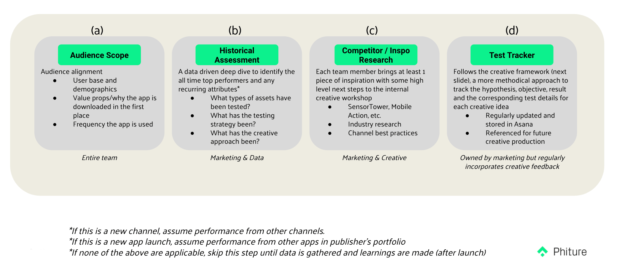
This process can also be inspired by looking outwards (market and competitors) and inwards (core USPs—unique selling propositions). Analyzing industry developments and the conversion tactics that competitors are employing in their creatives will help inform the overall strategy and how we can position ourselves in the market. Having a clear grasp of our core USPs will help us highlight them better in our creative assets by drawing attention to the relevant features of the app. Another aspect to consider is looking at the data and identifying what has worked in the past and taking note of recurring attributes when it comes to creative strategy.
Here we’ve highlighted what the creative ideation process might look like internally:
 4. Test Creative Assets
Now, certain creative variants can always be tested irrespective of the app category. Based on user motivations, the market, and the competitive landscape, we could tap into various elements such as challenge, relaxation, escape and disconnect, feature highlights, etc. These variants will also help us test what tone of voice works well for a specific audience segment — formal, casual, inspirational, informational, playful, inclusive, nostalgic, challenging, etc.
The Persuasion-Emotion-Trust Design model, a simplified version of the traditional PET model, provides the various angles you can explore to ‘sell’ something. In our case, we are essentially selling the idea of our app through the creative assets. We can design our assets for persuasion, emotion, and trust, and employ the right message by using some of these principles. Below, we touch upon each element briefly and explain how we can incorporate them in our assets.
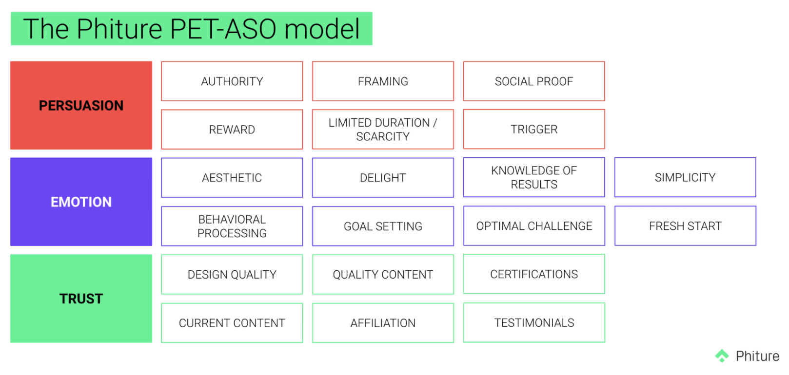 Persuasion: We can leverage the following principles to compel an app store/play store visitor to install the app and/or encourage them to perform a certain action within the app.
| PERSUASION | Principle | Why? | How? (Examples) |
| Authority | Use of a credible figure is more likely to persuade users to install the app | Images, statements of/from authority figures, use of influencers, experts recommending the app/product (to drive trust) | |
| Reward | Completion of a task leading to a reward (extrinsic motivation to download the app, however, people might be easily swayed and it would be less enduring than intrinsic motivation) | Free content, access to discounts, free trial | |
| Limited Duration/Scarcity | A limited time to respond or low supply indicating that other people have already acquired and/or the object might be hard to get in the future
|
Indicating limited period offers or low-supply of items like clothes, sold out items, tickets | |
| Framing | Framing the app in a specific context to control the way it is perceived by app store visitors | For instance an positioning itself as being environmentally conscious, or that it protects user data (presenting context that will be perceived positively) | |
| Trigger | Small nudges placed on our regular paths to remind and motivate us to take action | Graphs or daily streaks, reminders demonstrating what progress looks like | |
| Social Proof | When uncertain, we take cues from others | User reviews, testimonials, awards to raise trust |
Emotion: We can leverage the following principles to elicit an emotional response from the user such as empathy, achievement, nostalgia, relief, or surprise leading to an app install.
| EMOTION | Principle | Why? | How? (Examples) |
| Aesthetic | Aesthetically pleasing designs will encourage the user to give the app a try | Creative, clean, consistent designs keeping in mind the aesthetic tastes of the target audience | |
| Delight | We remember and respond favourably to small, unexpected, and playful pleasures | Personable text, images, elements, etc, that portray what a user might look forward to and respond positively to, such as humor | |
| Knowledge of Results | We continue our actions if we are shown evidence of their success | Depicting what the end result might look like, helping with goal setting, showing examples of success | |
| Behavioral Processing | Objects or products are better if they support human tasks and behaviors as intended. | By showcasing the ease of use (as it relates to the value proposition) of an app, we can increase conversion. Example, ‘meditate just a few minutes a day’, ‘listen on the go’ etc. | |
| Goal Setting | We can increase a user’s desire to install an app by showing that app as a useful companion for setting, progressing and achieving goals. | Example, counting calories, fitness plans, finance trackers etc. | |
| Optimal Challenge | We like to be challenged and tested, but not too much | Providing users with achievable challenges to maximize intrinsic motivation and engagement. Example, ‘hit every muscle in 7 minutes’, ‘meditate just a few minutes a day’ | |
| Simplicity | We often prefer simple actions, designs, and messages | Emphasizing the simplicity of actions through simple, concise design and text | |
| Seasonality | Designs that reflect the current holiday or seasonal trends will gain more attention and also show that the app is keeping up to date | Capitalizing on a particular time-sensitive mood, season or period of the year: holidays, seasons, festivals, fresh start (new year resolution) |
Trust: We can leverage the following principles to establish credibility and confidence.
| TRUST | Principle | Why? | How? (Examples) |
| Design Quality | We perceive value in the things we see | Well-designed, high-quality assets to draw users in | |
| Current Content | Up-to-date content indicates freshness and responsiveness | Promoting trust by providing new, up-to-date content | |
| Quality Content | We trust an authority that is full of knowledge | “Award winning” content, content curated by celebrities and influencers, ability of user to personalize content to their preferences | |
| Affiliation | Consumers tend to have more trust
in an app when it’s backed by a credible organization |
Affiliation with prominent artists/figures and influencers or collaboration with reputable organizations | |
| Testimonials | We trust organizations who trust and value their customers’ opinions | Mass media testimonials such as in Techcrunch, Times, Mashable (to be localized) |
Finally, when building our hypotheses, there are various creative variants, in no particular order, we can consider playing around with while taking into account Google’s best practices around creative assets and being mindful of the conversion tactics we would like to employ based on the above model:
| Element | Variants |
| Intro Optimization | Animation, logo card, chopping up shorter versions of longer videos, etc |
| Content | Gameplay or in-app footage |
| Messaging | CTA and/or copy (placement and length), localization, social proof, use of question, statistics and numbers, etc |
| Buttons/Logos | Placement and size |
| Sound | Music, influencer, voiceover, etc |
| Colors | Background, text, CTA colors |
| Graphics | Minimalistic or heavy, usage of ‘human’ element or cartoonified |
| App UI | Displaying various elements of app UI |
The focus here would be to test different concepts to generate creative hits and then iterate on the wins to keep the cycle going.
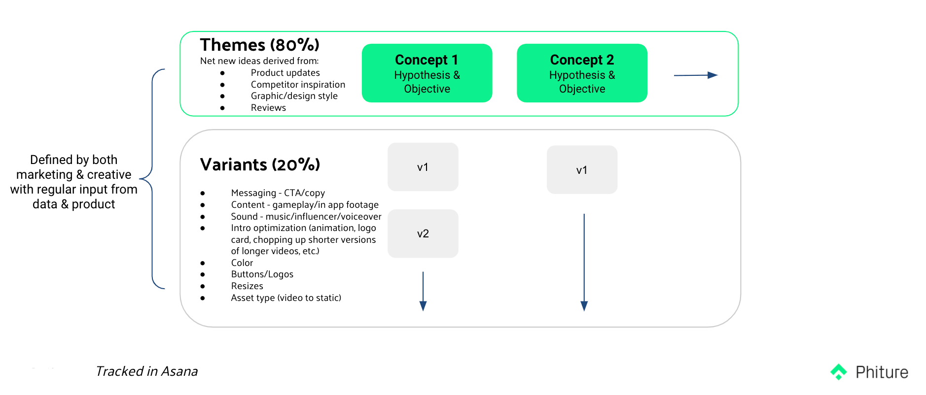 This process should be able to breathe life into your creative ideation process and provide you with ideas to test through your creative assets. Finally, when building a hypothesis, make sure you specify an action, result, and reason. An action is what you’d like to change; the result being what you expect out of that change; and a reason that is backed by a research e.g., Since content creation is the core value proposition of the app, it’s likely to appeal to the target audience and have the best chance to scale leading to higher conversion rates.
Table of Contents

