iOS 15 was finally released this week, and Apple’s new operating system update will bring big changes for product page optimization (PPO), allowing marketers to A/B test the visual elements of their product page – namely icons, screenshots and app previews. These new features will be out later this year, meaning it’s important to know how to use them best now.
In the App Analytics, we’ll be able to look at metrics and compare the original asset with its variants, with tests that can go up to 90 days. With this comes, of course, the necessity to actually have an efficient method in place for creating and testing your app’s calling card: the screenshots. And this is where the Flywheel comes in, our method for creating screenshots intended to be localized for different markets at once.
Before we get into that, though, it’s important to answer one question: why is testing screenshots important?
Screenshot Testing: The Why and How
The answer to the why is fairly simple: the right screenshot can improve your conversion rates (CVR), and only through testing can you actually gather country specific learnings. What kind of backgrounds do users in the US like? Colorful or simple? And what about Japan, what kind of iconography do they prefer? These questions can only be answered by testing, and only with that can you get better results in different markets – ultimately, raising your CVR.
The testing itself can be complex, however, with all the different elements at play. Which is why we have best practices for all of them, like for example:
- Color scheme: Keep the brand consistent but allow yourself some flexibility
- Screenshot content: Showcase content that’s clear and easy to understand
- Copy: Keep it short and readable
- Screenshot order: Put emphasis on the feature usage on your app
The best way to test all these? Iterative testing, aka testing each different element separately, this way finding which version is the best and the impact it has. This in itself can (surprise!) also be a challenge. Screenshot designs for the same app can begin to look very differently in each country at some point, for example, since we’re constantly adding and testing different elements – which can raise issues regarding branding, if you ever want to rebrand or re-align the look and feel of your screenshots across countries.
So, how can we:
- Re-align countries once designs have strayed?
- Improve CVR in multiple countries?
- Generate market specific learnings?
Simple: through our Flywheel approach.
The Flywheel Framework
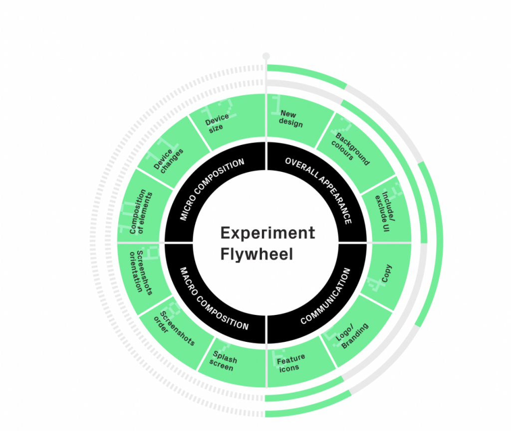
The experiment Flywheel framework is the method we’ve developed to help with ASO, specifically for testing and localizing screenshots in multiple markets at once. It consists of four main elements, which together make a testing cycle:
- Developing a new design:
In this first step, we work on the new design that we want to test, including all its elements. - Iterative testing on multiple elements of the design:
Next, we test each one of these elements separately, this way making sure what exactly makes a difference. - Gathering learnings:
Once the testing has been done, we look and interpret results. - Creating a new design reset after all testing has been completed and running through another round of tests:
Basically, repeat all the above!
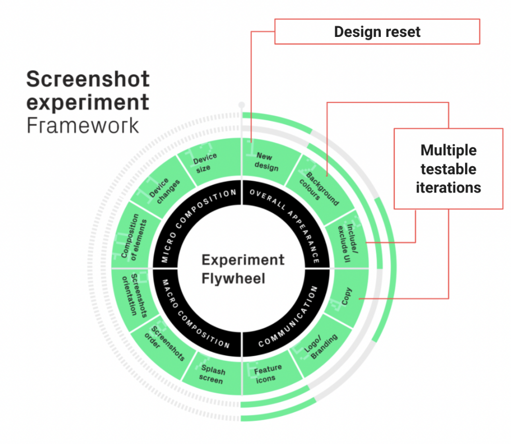
After each cycle you should gather stronger and stronger learnings – thus the name, Flywheel.
Using this method makes testing systemic and simple, tackling the biggest challenges and creating a uniform method. Now, let’s go through each Flywheel step individually:
Step 1: Developing a Design Reset
First thing to do is to settle on a new design you want to implement. For this, it’s important to keep some key points in mind:
- It’s OK for the new design to be completely different from the old one
- Don’t forget to include elements that have proven to increase CVR and fast track any new trends you think could work well for your app
- The objective is to create a design to implement in all countries
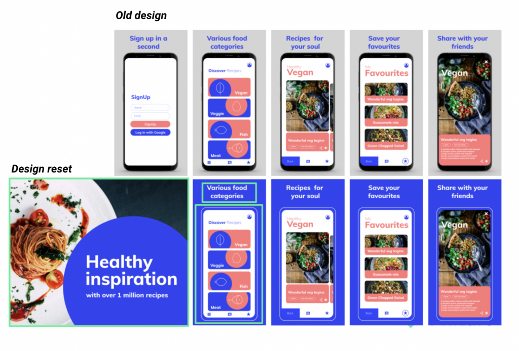
Look at all the elements separately, thinking strategically about what can make a difference. Implement a new color? Improve the value propositions?
Once this is done, you’ve tackled one of the biggest challenges in the testing: how to re-align countries once they have strayed.
Step 2: Testing Different Elements of the Design
Screenshots are made of different testable elements, and we’ve identified many of the ones that are likely to impact performance. From here, we split them into four separate categories:
- Overall appearance
-
- Elements that contribute to the overall look of the screenshots upon first impression
- Communication
-
- Everything that has to do with communicating with the user
- Macro composition
-
- Elements that alter the screenshots themselves (orientation, order, etc.)
- Micro composition
-
- Elements within the screenshots (screengrabs, devices, etc.)
This step will act as your testing roadmap, and it’s here that you’ll decide which elements to test and in which order. Each iteration chosen will be tested in step 3 in all countries you are trying to optimize screenshots in.
An example flywheel cycle could look like this:
Design reset → Iconography → Background color → Value prop copy → Screenshot order
Step 3: Putting It All Into Practice
Finally! You’ve got your assets, the order you want to test, and now you just have to start the process.
Once again: make sure to test one element at a time, and to implement the new design step by step. Stop and analyze each element and its impact in each market after each testing cycle.
Let’s look at an example, like this design reset:
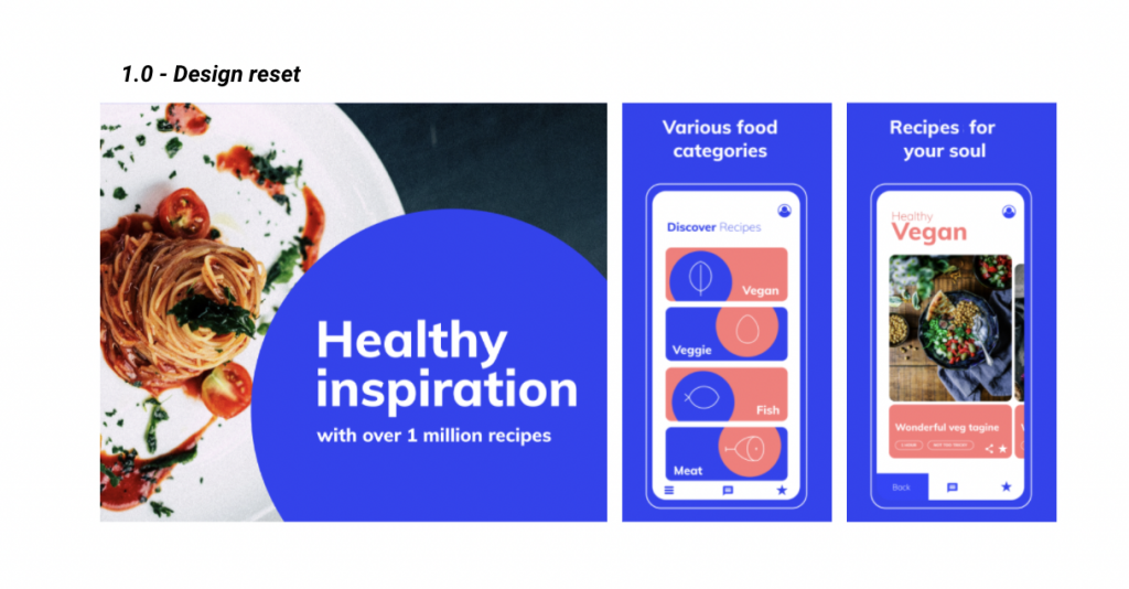
Let’s add icons, for example, in two markets and then look at the result.

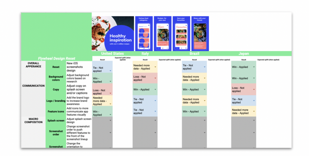
Looking at the results, we can see that adding the icons resulted in an uplift in one of the markets, but not the other – meaning that we’ll implement it in the one where it worked, but not the other. After this, we carry on testing.

Next up, we changed the background color and looked at the results. Just like with the icons, it resulted in an uplift in one of the markets but not the other, meaning that we’ll implement it in one of the markets, while leaving it the same in the other.
You continue this on and on, until every element is tested and, after that, you restart – gathering even better results than in the previous cycle.
And after this, we get to…
Step 4: Tracking Results and Gathering Learnings
Make sure to keep track of your results for each step of testing for future reference, and to use them in following testing cycles.
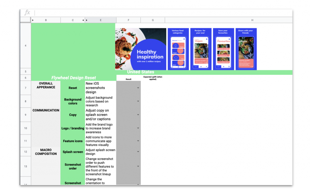
Once you’ve finished a round of testing, you’ll have a bit more insight into what works and what doesn’t in each country. You’ll want to carry these learnings over into the next flywheel cycle to revalidate these learnings and test some new hypotheses.
After you’ve gained some solid learnings, you can even create design resets with minor differences between countries based on what has proven to perform better; after all, even the smallest detail can have a big impact. After each cycle, you carry on testing, getting better and better results from each cycle, resulting in better and better assets and, ultimately, an increase in your CVR.
Conclusion:
Screenshot testing can sound complex, overwhelming and difficult, but with the right approach and the correct framework, it can also be systemic, simple and efficient. The Flywheel approach guarantees exactly that, enabling you to achieve the best results possible.
And, apart from that, it’s flexible. We intentionally made the flywheel flexible enough to fit different apps, different goals, different timeframes, etc. You could actually even use it for other creative ideation and testing, and not just necessarily for screenshots. There are no limits as to how many or how few iterations you need to test and iterations themselves can be tested in any order, meaning you can use it for a different range of objectives. Internally, we’ve seen both designers and ASO consultants begin to adopt the framework for different clients with positive results.
Feel free to adopt the framework or adapt parts of it to your own screenshot testing workflow and let us know how it works out! With the new iOS 15 features, testing will be more important than ever – so make sure to use this framework to have a good method in place. As always, feel free to reach out with any questions.
Table of Contents


