 Although the pandemic has challenged many businesses, mobile gaming has grown in the past year and is taking over much of the gaming industry. According to Statista, the mobile gaming market will reach $121.5 billion by 2022 as more and more people opt for this channel for entertainment and social connection.
Mobile games now make up nearly a quarter of all iOS App Store apps, so marketers must consider which elements can effectively drive installs. In an effort to investigate this question, we’re diving deep into the top mobile game publishers to see how they use gamers’ motivations to build creative store assets that boost conversions.
Why do people game?
According to Google Human Truths Qualitative Research, gamers can be largely divided into two categories, casual and core, depending on the amount of time they devote to playing and their motivations for exploring the world of games.
Core gamers are willing to spend time (7+ hours per week) and money (on paid games or in-games features) on mobile games. They play to entertain and challenge themselves, bringing out their competitive side. Core players actively seek out new games via search in the app stores, ask friends for recommendations, and peruse other channels to find suggestions.
On the other hand, casual gamers make up the non-paying part of the gaming community. They play to relax and relieve boredom, dipping in and out when they need a distraction. They discover new games via passive encounters such as ads or family recommendations.
Core players immerse themselves in games and are thus attracted to creatives that allow them to “feel” the dynamics of gameplay…
Thus, the group’s differing motivations demand different creative assets to attract each audience and drive installs. Core players immerse themselves in games and are thus attracted to creatives that allow them to “feel” the dynamics of gameplay, for example, customization details, characters, maps, levels, etc.
On the other hand, casual players, who delve into gaming out of boredom, choose games that seem easy to play and show straightforward actions and messaging that focuses on relaxing and taking a break.
To showcase how these differences impact store creatives, we’ve analyzed visual patterns used in the top App Store and Play Store games by downloads. Even though there’s no one-size-fits-all approach, these findings provide solid ground for further experimentation.
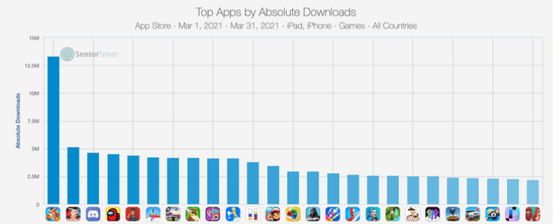
Source: SensorTower
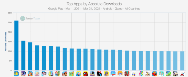 Source: SensorTower
Here are some of the top creative approaches that publishers use to attract core gamers:
Focus on visual patterns to create an immersive experience
-
Highlight progression and leveling up
Highlighting progression and game levels ensures that players have a clear goal and are motivated to conquer the game’s challenges (the very essence of core gamers’ motivation).
The idea of progression delivers excitement and anticipation; once the level/challenge is completed, players feel a sense of pride and accomplishment with a quick hit of the feel-good hormone dopamine. Creatives that display progression thus act as positive reinforcement to install and play.
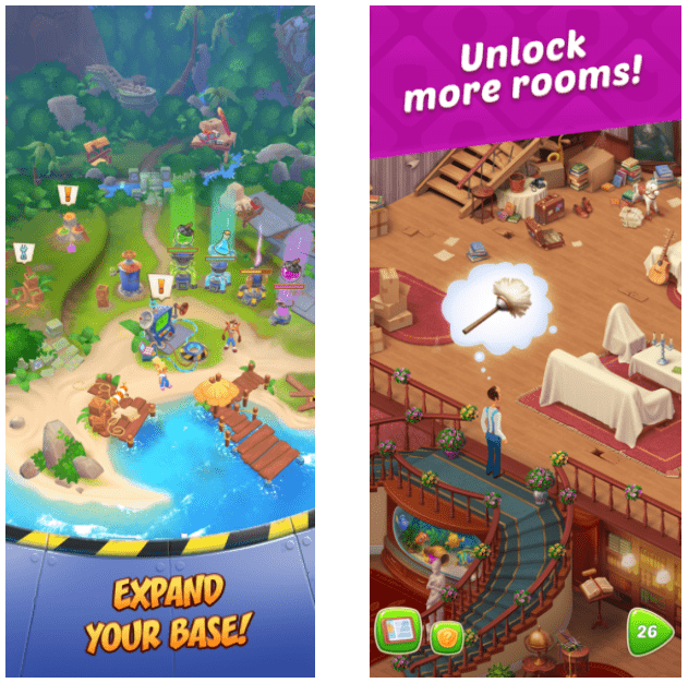
Crash Bandicot and Homescapes emphasize leveling up by showing gameplay with advanced options (expanded base, more rooms) and corresponding captions.
Source: App Store (Crash Bandicoot, Homescapes)
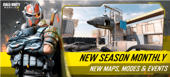
By highlighting new features (seasons, maps, modes, events), Call of Duty underlines their constantly updating content and communicates to their players that there are always new challenges to conquer.
Source: App Store ( Call of Duty)
-
Demonstrate what players can control
To attract core gamers, emphasize aspects of the game that players can control by pointing out the variety of features and showing gameplay. This variety highlights multiple chances to participate actively in the game narrative and bring out players’ skills and competitive side.

Project Makeover shows the variety of creative controls in the app by showing four different gameplays (makeup, dress up, renovate, decorate).
Source: App Store (Project Makeover)
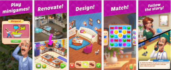
Project Makeover showcases four different gameplays to highlight the combination of challenges (play minigames! & match!) and creative controls (renovate! & design!).
Source: App Store (Homescapes)
-
Employ a strong call to action that implies a challenge
Optimize visual and textual messaging to reflect users’ desire to be challenged. The best practices among the top games include wording that invites players to perform a feat or implies that the action requires thought and skill to be completed successfully.
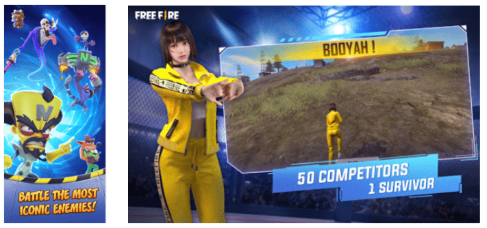
Crash Bandicot and Garena Free Fire emphasize challenge by using the war-like wording in the captions: battle, enemies, competitors, survivor.
Source: App Store (Crash Bandicoot), Google Play (Garena Free Fire)
- Showcase customization and characters
Communicate that the player is an active creator and contributor to the gaming process, rather than a passive “consumer,” by displaying customization and character choice features.
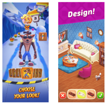

Crash Bandicot, Homescapes, Call of Duty, and Roblox highlight customization by showing options to choose from and using corresponding messaging that implies choice and customization (choose, design, customize, be anything).
Source: App Store (Crash Bandicoot, Homescapes, Call of Duty, Roblox)
Here are some of the top creative approaches that publishers use to attract casual gamers:
Focus on simplicity and the emotional need for a distraction
-
Emphasize simple, straightforward actions in text and images
Use simple, straightforward messaging to describe in-app actions that the player can perform. This highlights how easy the app is to use and implies that the game doesn’t require specific skills/prior gaming experience and that the game could be quickly enjoyed during a 10-minute break.
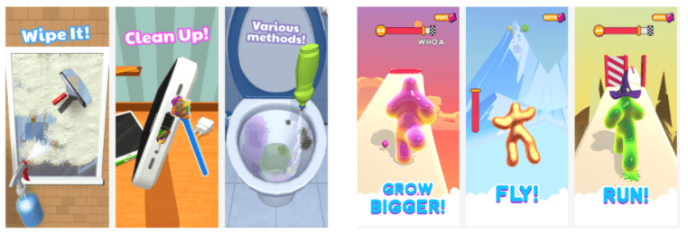
Deep Clean Inc. 3D and Blob Runner 3D use the direct short wording in the captions to emphasize the simplicity of actions in the game (wipe, clean, grow, fly, run).
Source: App Store (Deep Clean Inc. 3D, Blob Runner 3D)
-
Highlight limited choice
By conveying a limited choice (one or two options) in text or images, games imply that the player can enjoy the app without expending much effort. This indicates that the game provides a challenge, while still keeping the process simple, relaxing, and easy to dive into.
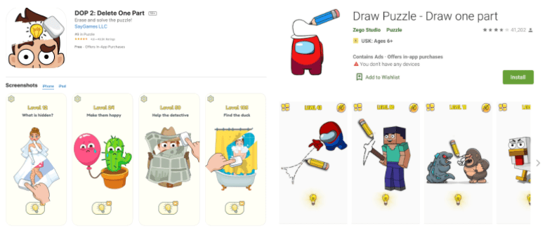
Dop 2 and Draw Puzzle highlight minimal effort by highlighting ‘one’ in the app title.
Source: App Store (Dop 2: Delete One Part), Google Play (Draw Puzzle – Draw One part)
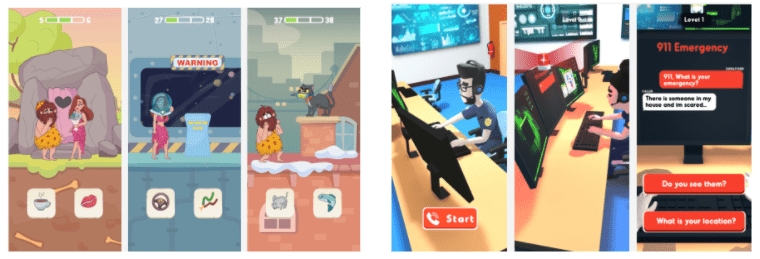
Comics Bob and 911 Emergency Dispatcher highlight minimal effort by showing a choice between only two options in the screenshots.
Source: App Store (Comics Bob, 911 Emergency Dispatcher)
-
Focus on bright images that distract from the real-world
Bright images and colors that greatly contrast real-life surroundings not only catch the eye but also stimulate the nervous system to create the illusion of energy and velocity.
This correlates well with casual gamers who look for simple yet colorful and quick-to-play titles that can distract them from the real world, help them stay sharp, and provide quick bursts of entertainment.
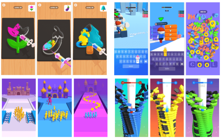
Jelly Dye, Happy Printer, Join Clash 3D, and Stack Ball use bright neon colors that contrast with real-life to trigger the eye and create an anticipation of quick entertainment.
Source: App Store (Jelly Dye, Happy Printer), Google Play (Join Clash 3D, Stack Ball)
-
Use fingers or hands to demo display (for screenshots only)
The use of hands emphasizes ease of use and conveys that the game requires no specific equipment. In other words, users can enjoy the game anywhere and anytime, even on the go, which pairs well with the casual approach to gaming.
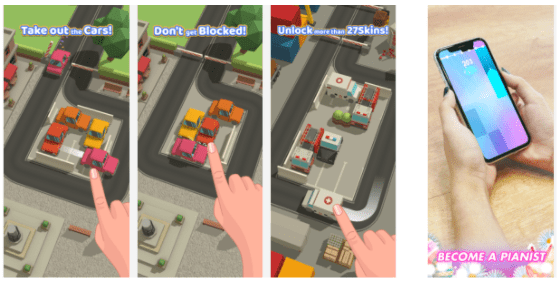
Parking Jam 3D highlights the ease of play (no additional equipment needed) by adding hands to the gameplay. Magic Tiles 3 also uses the hand trick and puts the device (with the game UI) in the typical real-life environment to emphasize that the game can be played anytime and anywhere and encourage this type of use.
Source: App Store (Parking Jam 3D, Magic Tiles 3: Piano Game)
Experimentation is key
There is no one-size-fits-all approach to generating creatives for mobile games, but the creative approaches mentioned above provide a solid starting point for experimentation. Try various calls to action, combine challenging and relaxing elements to attract different types of gamers, keep testing to find the right balance between audiences, and finally, identify the right install triggers. As long as you build and test creatives with players’ motivations in mind, you’re well on the way to driving your game’s conversions and installs.
Table of Contents


