 Strong-performing creative assets are a common theme in scaling mobile user acquisition campaigns. Creative success often leads to both an extended audience reach and improvement in your overall campaign performance.
The graph below illustrates an example of daily spend and CPA when there is a creative hit. Spend will significantly increase, while your CPA will remain relatively low. Once the creative begins to fatigue (the creative lifecycle will vary per channel and depend on the app vertical, audience saturation), you’ll likely have trouble maintaining scale and keeping your CPA low.
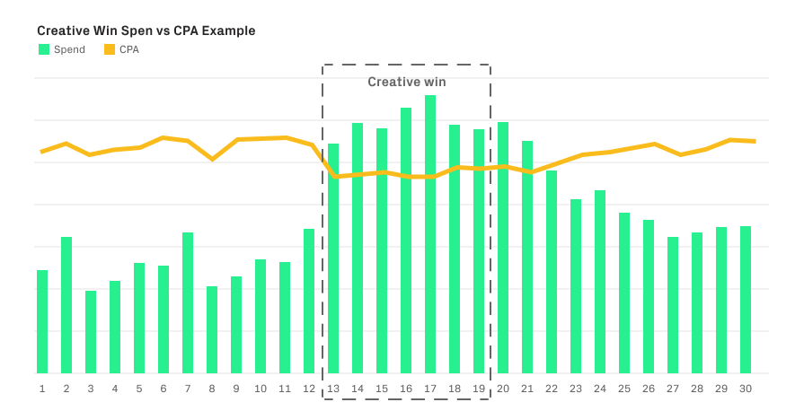 The data illustrated above is for purposes of conveying what a creative win looks like with spend and CPA trends
Performance marketing teams should spend time testing a wide range of creative theme ideas in order to diversify their ads, because algorithms are always evolving. There are many articles that introduce the idea of creative ideation and production, but this blog post covers the importance of cross collaboration between marketing, creative, data, and product teams.
Think of how much more powerful your creatives would be if the marketer and designer (who are the ad network experts for creative ideas and best practices) collaborated directly with a product manager for the latest features and updates on the app roadmap. Combining those skillsets with an analyst to provide data on audiences, in-app actions, and drawing correlations in between will ultimately level up your creative approach. The rest of the post will cover creative planning (specs and ad types such as statics vs video), as well as different test strategies to help your team build upon your own user acquisition creative roadmap.
Set up a creative workshop
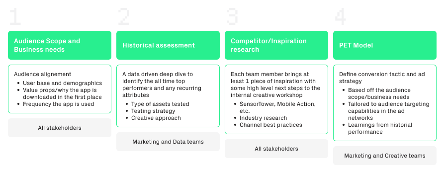
We’ve developed a four part approach to creative ideation for your team to follow in a recurring monthly workshop.
-
- Audience scope to fully understand the product and the audience.
- Historical assessment of existing channels (if this is a brand new app then use a competitor for inspiration).
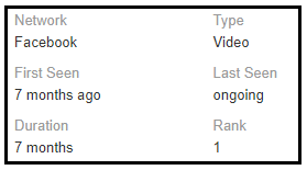
- Research competitors and other related verticals to draw inspiration from what is already working, from which you can create assumptions based on the lifetime impressions and ad lifetime on tools such as SensorTower (see screenshot to the right).
Identify the different design styles and gather ideas on repeated ad creatives so that you can test those elements in your own ads (or find competitive advantages to styles that haven’t been tested). The competitive (and non direct competitive) landscape can be extremely telling but is often overlooked.
– It may be worth investing in third-party tools such as SensorTower, Mobile Action or AppTweak for competitor intelligence. Otherwise, you can use Facebook Ads Library; it doesn’t have the best source of competitor data but is better than nothing. - Persuasion-Emotion-Trust Design Model (the PET model) will be the final piece to your ad strategy that focuses on your actual conversion tactic. The model was created to capture all of the main techniques you can incorporate into your creatives to successfully “sell something”.
It’s been re-introduced by the Phiture ASO team for building strong converting screenshot designs, and we’ve carried it over to our ad strategy on the performance marketing team. Read more about each conversion strategy below in the PET glossary published by Human Factors.
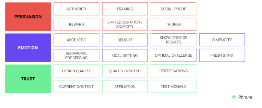
Every month, the team should schedule a ~1 hour workshop for parts A-D and prepare a batch of test ideas for the coming month. The marketer will lead the meeting and rely on input from the rest of the team. Together create a test tracker with all of the ideas and include a short hypothesis on the conversion tactic and ad strategy. You can read more about formulating a strong hypothesis on Scribbr.
Then, in your objective, detail the approach and the designated audience. Both the hypothesis and objective can be more or less detailed depending on how deep your team wants to get into the test tracker.
As the team comes up with creative ideas, keep in mind that most of your tests should be fresh, original ideas, rather than iterations. Try to follow the 80/20 rule below to dedicate 80% of your ad production efforts to net new, fresh ideas and 20% to iterating on existing ideas. Eric Seufert illustrates great examples of the creative testing framework and how to focus on concept testing in this post on Mobile Dev Memo.
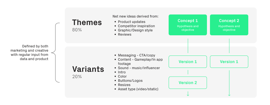
Once you have your ideas, it’s time to start production. Considering all the different assets in motion, the best way to keep the marketing and creative teams organized and on a regular testing cadence (especially with multiple countries and localization involved), is to start with one asset in one size per theme. Take a look at the scenarios below for recommended sizes to start with.
 Note that this is an initial recommendation; the size to start with should certainly be tested over time across the channels to find what works best per channel and for your app.
Scenario 1: Since Snapchat only allows portrait videos, the recommendation for operating in all four main channels would be 9:16.
Scenario 2: If you’re not running in Snap, but you are running in TikTok, you’re limited to 3 sizes. Portrait, landscape, or square. Portrait looks most native in TikTok, but you can still test square and landscape down the line to see if you notice any difference in performance.
Scenario 3: If you’re only running Facebook and/or Google, you have many more options with sizes and placement.
Again, start with one size per concept. Then, once it’s proven itself, you can resize to all possible specs. The point here is to move quickly to streamline production and testing because with bigger budgets, you’ll burn through creatives faster. After your new ads spend a few hundred dollars, it’ll be obvious whether it’s promising and profitable.
On the other hand, you may struggle to get the new ad to spend at all. Be sure to stay on top of testing and have a regular cadence to launch new creatives (cadence will vary per channel and depends on factors such as rate of creative burnout i.e TikTok is at least 2x faster than any other channel, app category, audience saturation, ad frequency, etc.)
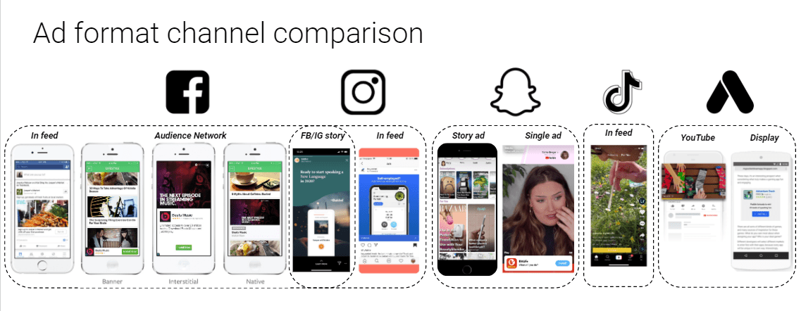
Between Facebook and Instagram, there are 6 potential placements in various sizes you can test. Snap and Google have 2 placements for video and statics and TikTok has in-app feed ads (aside from other paid formats like hashtags and top view ads). With that being said, starting with one size per idea may go against certain ad network best practices, but don’t feel obligated to fill all available asset slots in channels like Google’s 20 image/20 video/10 text recommendation & Facebook’s AAA campaigns 50-asset limit.
Especially if you have lower budgets, test around and see if you can force creatives to spend by only loading a few assets at a time. Learn from them and then reload again/iterate with size, etc.
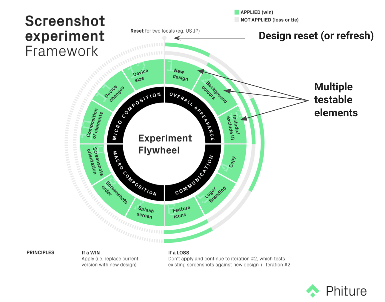 To drive the “one size fits all” approach home, Phiture created the Flywheel (pictured above) for ASO screenshots intended to localize multiple markets at once. However, it can actually be applied to any creative work, including ad creation. Overall, this cyclical approach allows us to use a similar base design across all channels and then iterate individually based on specs, text placement, buttons, CTA, etc.
What about statics?
Static images can be valuable for incremental scale depending on the channel and your app category. For a simple approach, produce one size for every video idea. Alternatively, you could create static images for only top video performers. If you find it challenging to see any spend on statics, then dedicate creative resources to video production and only test statics every so often on concepts that have proven themselves.
What metrics do I look at and how do I know if a creative has proven itself?
Creative success, which can be referred to as “a creative win” in the industry, will be extremely obvious. The ad will own the majority of the spend (could account from anywhere to 20-40% of total account spend), and it’s very likely you’ll be hitting your KPI.
When you launch a new creative, bear in mind that it’s normal to see it either not spend at all, spend very little, or be extremely costly. This simply means that it’s likely not a creative win, and there won’t be much you can do to force it to become one.
However, you can attempt to retest a few times with slight tweaks; try changing the thumbnail, text copy, trimming the video to start at a different point, etc. You may see it work with increased spend and promising metrics. If nothing helps after a few failed attempts, move on to the next idea.
Unless you have a dedicated analyst on your team to set up a way to statistically assess each creative, monitor vanity metrics like CTR, IPM, CPI, frequency, etc., relative to other creatives in the account and decide which ads are worth re-testing. Again, you want to spend more time on the creatives that do perform, rather than trying to force wins on creatives that don’t (after testing them in some of the variations mentioned above).
How should I launch new creatives?
Every marketer will have their own approach to testing, but I’ve summarized the options below, with caveats of iOS 14 in the next section:
- Launch in an existing campaign, in either a new ad group or an existing ad group
- Pros: you can see if the new ad performs against evergreen creatives. If you’re all about structure and account cleanliness, this will be the approach to follow.
- Cons: if the creative takes off in spend and has poor CPA and ROI, you may have shot your performance in the foot. And if you use a new ad group and your reporting is set up on a campaign level, it’ll be difficult to get granular by ad group to compare performance.
2. Create a separate campaign and use either a new ad group or an existing ad group
- Pros: you can see if the new creative ad group outperforms the evergreen ad group.
- Cons: if you’re reporting on a campaign level (especially with iOS 14) there’s no way to get granular by ad group to compare performance.
Similar to everything in UA, your testing should be agile. If something isn’t working, try something new. iOS 14 is certainly going to make testing new ads more difficult. If you’re running in multiple markets and testing multiple campaign types, you’ll quickly hit iOS 14 campaign limitations. Thus the strategy for a separate creative testing campaign in iOS may not be feasible.
Some solutions to consider with advertising in an iOS 14 world:
- Take your time when it comes to launching new creatives in iOS. If you’re using an existing campaign/ad group, only launch a few new creatives at a time. Monitor how the CPA/ROI changes 1-2 weeks after you launch, and then make the decision to either pause or keep the ad live. The challenge is going to be the 24h timer logic and loss of user-level granularity (industry expert Eric Seufret assumes the opt-in rate for IDFA tracking will be ~10-20%), which means we won’t be able to receive creative level performance postback. You’ll likely have to rely on top of the funnel and vanity creative metrics instead, so moving slower and covering a wide range of ideas will allow you to better monitor and correlate +/- performance.
- Use Android as your creative testing grounds, while keeping in mind Android and iOS aren’t 1:1. If similar creatives perform well in both OS historically, this would be a great solution. However, we generally see user behavior differ per OS. It’s likely you’ve already observed the difference through something as simple as creative screenshot optimization on the App Store vs Google Play Store. Even so, without Android campaign limitations (not enforced yet but Android is expected to follow suit within the year), mass creative testing on Android may be a possible workaround to prioritizing your iOS creatives. To summarize, you can try testing as many new creatives as you want in your Android campaigns while taking your time in iOS 14 campaigns, and as soon as you find a creative win in Android, you move it into your iOS 14 campaign.
Final takeaways
It’s good for marketing, creative, product, and analytics team members meet regularly to workshop creative ideas. Marketing will bring expertise on the channels (nature of algorithms, what works historically, ad network best practices), whereas a designer will be able to provide input into what is actually feasible and how to make the ideas come to life. The product team members will have valuable input into new features and gain insight into what features resonate most with users through your acquisition channels.
Your analyst will be able to share insights into historical reports, statistically significance, and perhaps even draw correlations into your tests. No matter the approach you take, always be prepared to test and adapt to a new strategy because the algorithms change frequently, so something that worked yesterday may not work tomorrow.
You should also regularly ask for feedback from your ad network partners to make sure you’re complying with their best creative practices (ask for specific feedback on videos, statics, themes, CTA, messaging, and length). You could even schedule quarterly creative workshops with each ad network representative you’re working with to receive competitor benchmarks and see how you’re progressing against your peer set.
Table of Contents

