It goes without saying that the app market is incredibly competitive. In order to produce a successful app, it’s essential to ensure you’re pursuing as many avenues of ASO as possible, and in particular, that your product page is fully optimized. This is crucial for targeting your desired audience or market, and increasing conversion.
What’s the difference between CPPs and PPOs?
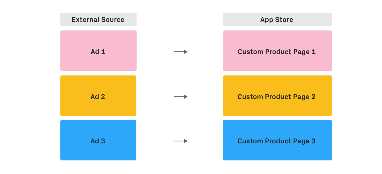
Custom Product Pages (CPPs) are additional product pages that showcase different features or content inside the app with unique URLs. In a nutshell, users click on ads and come to your landing pages with unique URLs.
Product Page Optimizations (PPOs) are similar, but users can either come from paid campaigns (GAC, ASA etc.) or organically through search or browse traffic.
Using CPPs will allow mobile marketers to direct users to a specific landing page of their choice, based on what they want to communicate or test with this specific group of users.
For example, if your app is a streaming service that features different types of content (sports, movies, documentaries, etc.), CPPs will allow you to create a landing page for each in which you highlight a specific type of content that matches what was communicated in the external source (ads, links, etc.). This way, you’re creating a seamless experience for the users from the beginning of the acquisition funnel and you’re setting expectations properly in a way that would help you to increase conversions.
The good news is that both CPPs and PPOs can be launched separately from the product releases.
The best ways to develop your CPP
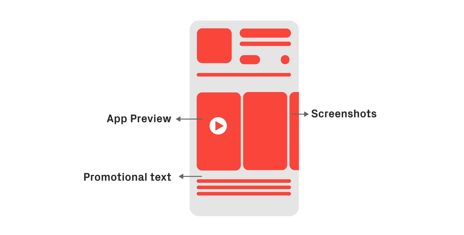
With a maximum of 35 CPPs, Apple provides an extensive possibility for developers to target specific user bases throughout the product page. The platform offers the opportunity to test various features from the app to collect enough data from its users and optimize the app accordingly:
App Preview
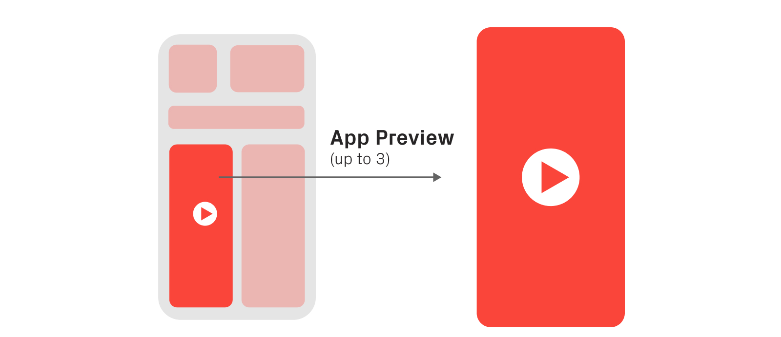
The App Preview is a great asset to showcase to your user the functionalities which can be found in your app and how they work.
The App Store only allows a maximum of 30 seconds of video, so make sure you capture the essence of your app to catch your users’ attention. It’s important to note however, that App Previews are always muted.
Screenshots
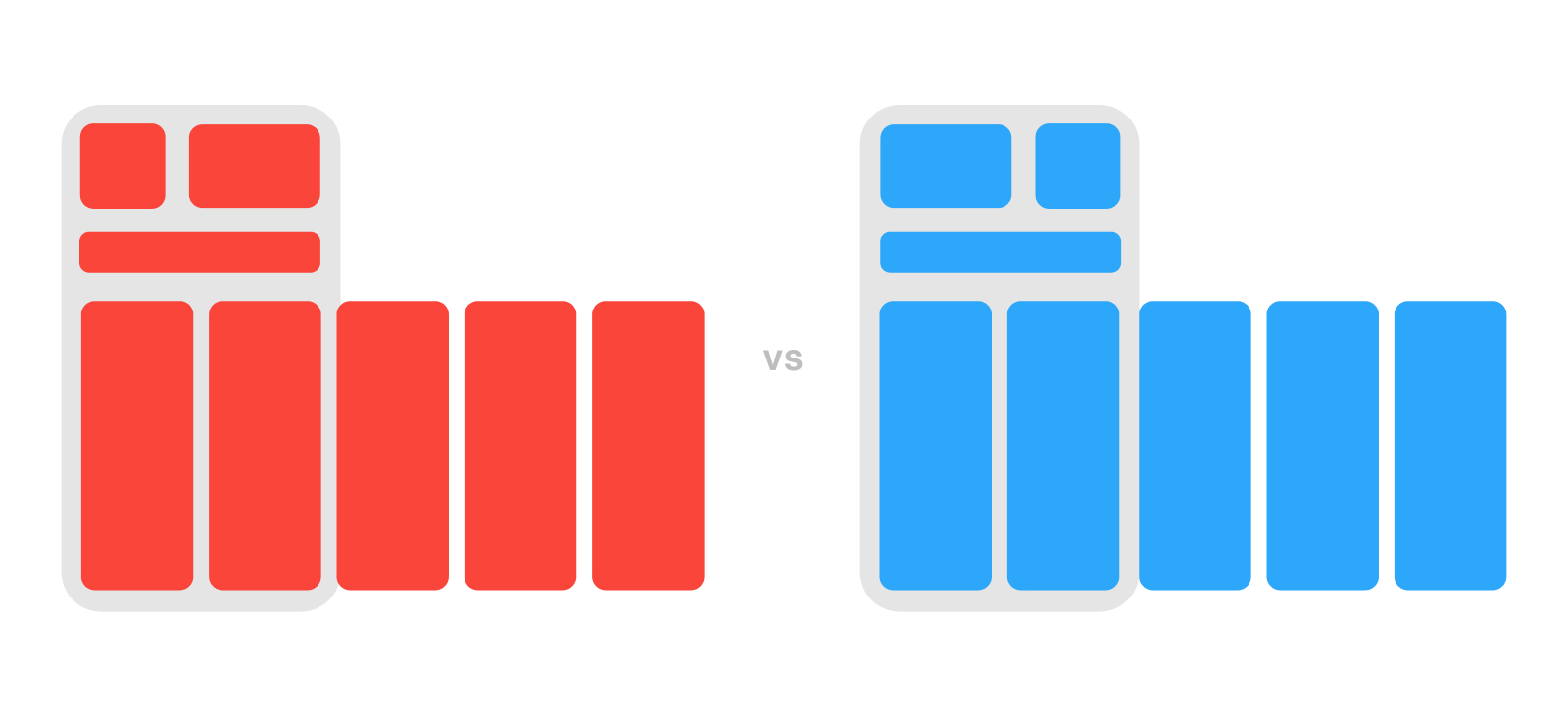
Your screenshots should capture visuals that will appeal to your audience.
As with the App Preview, your screenshots will need to capture what your app has to offer in terms of UI, workflow and experience. The first screenshots in particular, as they are always the most looked at by users.
Your screenshots can be shown in landscape or portrait mode. Also, depending on if you have an App Preview available, your first screenshots will be the first visible assets.
Promotional text
The promotional text should share with your users the latest updates from your app. This includes upcoming events, sales, features, etc.
Promotional text always appears at the top of your description and the App Store only allows you to have up to 170 characters.
Maximizing results
To make sure you’re covering all your options, you need to get your audience data from your current user base. This way, you’ll avoid designing a CPP that isn’t relevant to your audience.
If you’re launching your app for the first time, we’d recommend waiting until you have some data from users. This will allow you to formulate proper hypotheses that are worth testing.
Below are the four best aspects to consider when testing:
Demographics
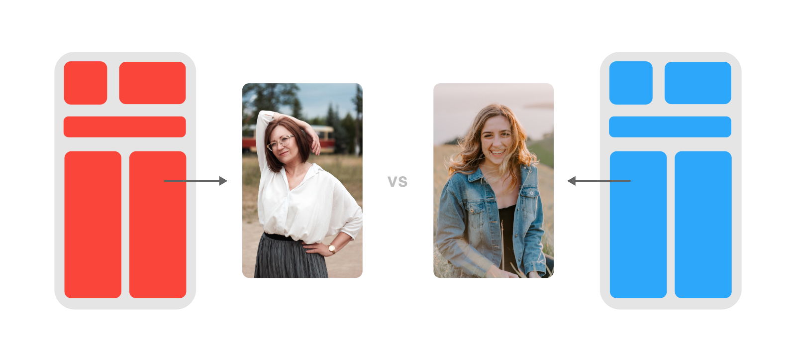
Would using a picture of Elvis Presley work better than one of Billie Elish? Why not both?
Understanding the users’ age and their preferred gender will help you pick the right tone of voice and visuals to present your app on the App Store. Some research will help you understand what kind of elements you can incorporate (and which ones you shouldn’t), to appeal to your users.
Usage
Many apps have a wide range of features, but not all of them are relevant to their users. They will have different preferences and different uses for each app based on their tastes, preferences and habits.
Let’s take Photoshop as an example: in Asia, there’s a real culture around selfie and collage stickers, while in other regions the interest might be oriented towards landscape photography.
By noticing these two differences, the app can prioritize showcasing the features related to “selfies” to its Asian audience. In contrast, highlighting other features related to “perspective” and “straightening images” would captivate users who showed interest in landscape photography. This way, you can reach both user bases simultaneously.
It’s important to know exactly what you’re campaigning for and to get the product page ready for that audience in particular.
For Photoshop, the team should design two Custom Product Pages. In the first, they should promote the photo editing features, and in the second they should promote the video editing features.
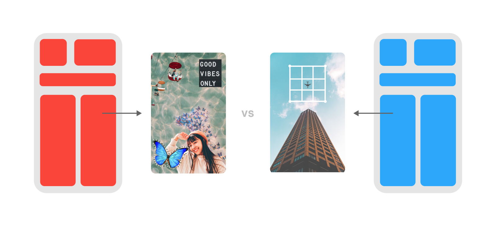
Visual interaction
Let’s say you’re dealing with only one segment of users but you still want to make use of the CPP feature — what can you do?
Imagine you go through other app pages or competitors’ pages and notice that some are using text on top of the screenshots, while others are doing so on the bottom. Which one works best? Also, what colors do users find more appealing and can increase conversions? To find the answers to each question, you need to test both options.

Localized content preference
It’s important for your product page to use the dominant language for each market you’re targeting, e.g. for the UK, your product page would be in english, but for France, it would be in french.
You can also localize the type of content your app features first, depending on the market. Let’s use Uber Eats as an example: to attract more users, the company might want to adapt its product page based on the food habits of its customers according to their location. Showcasing local dishes would likely increase the interest and hence, the conversion rate of the app.
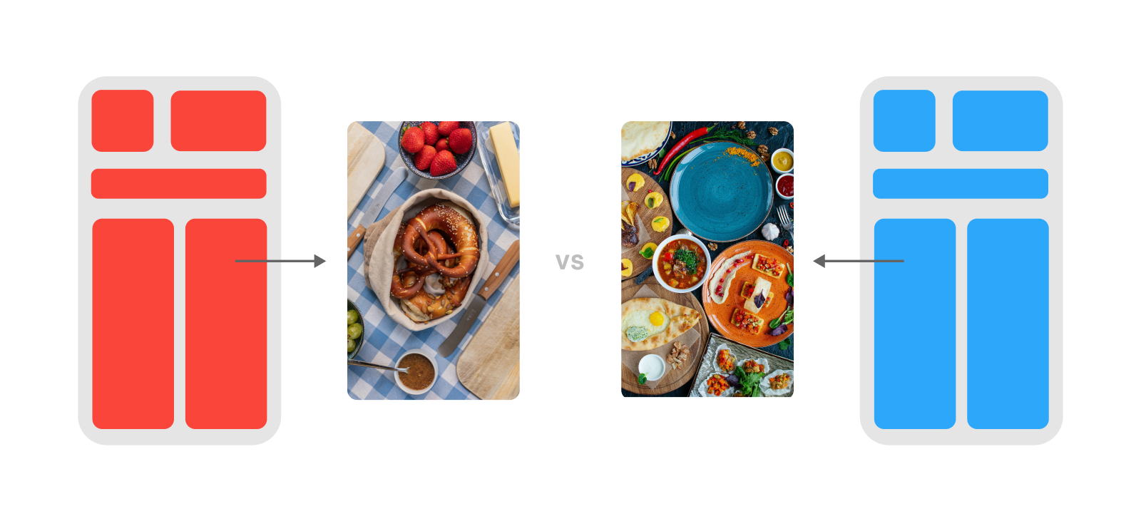
By focusing on these, you’ll be able to reach and convert your audience, aiming at specific user groups. After all, different users have different needs and if your app doesn’t fulfill those, your competitor’s app will.
Conclusion
Using Custom Product Pages is a great way to increase your app’s conversion rate. These are some best practices you can apply throughout your testing:
Segment users based on your current user base on the app to avoid creating extra custom pages that are irrelevant to your app.
Make sure that you’re testing one segment at a time to measure results accurately. One element at a time can also be tested in case you have a small number of segments you can test with.
If you’re targeting several markets, start only with one market and then duplicate the experiment across the markets one by one.
Make sure that the tests are applied in at least the first four screenshots, since they are the most viewed.
Only test segments that have at least 1,000 users to ensure your results are accurate.
We’ll soon be releasing a new article on how you should interpret the different metrics, and which ones are most important for your testing results.
If you need specific ASO advice, you can reach out to us on ASO Stack and one of the Phiture team will be in touch.
Table of Contents

