You’ve already optimized your AppGallery listing for search, but how can you reach a wider audience through discovery?
NB: Phiture is hiring for a key role to lead our evergrowing ASO team. You’ll be responsible for leading and overseeing the success of our App Store Optimization service team and help Phiture to lead the way in mobile growth. Read more about the role here: https://phiture-jobs.personio.de/job/152090?_pc=133127#apply
Skylar Grabecz, an ASO consultant at Phiture, helps companies to optimize the visibility and conversion of their apps in both the App Store and Play Store through Apple Search Ads, CRO experimentation, and keyword optimization processes.
Browse Visibility is the fifth topic in our series on App Store Optimization in Huawei’s AppGallery. In the series so far, we’ve looked at Why Should We Care about ASO for Huawei?, An Introduction to the Huawei AppGallery, as well as The Huawei Developer Console.
In this article, we’ll fill you in on everything you need to know about the feature categories on the Huawei AppGallery so you can start to develop a game plan for making your app more discoverable.
Get more impressions from people browsing the AppGallery
So, you’ve got your app up and running on the AppGallery, you’ve already optimized your store listing for search (assuming you’ve read our last article about AppGallery ASO), and you’re seeing your impressions and keyword rankings jump. But where do you go from here? As we already know from our experiences in the App and Play Stores, search may be king, but skyrocketing impressions usually come as a result of having your app featured in one of the many discoverable sections in the App and Play Stores.
Since the AppGallery feels a lot like a hybrid between the App Store and Play Store, it should come as no surprise that there are similar discoverability boosting factors in the AppGallery as well.
Understanding the lay of the land — what feature categories are available?
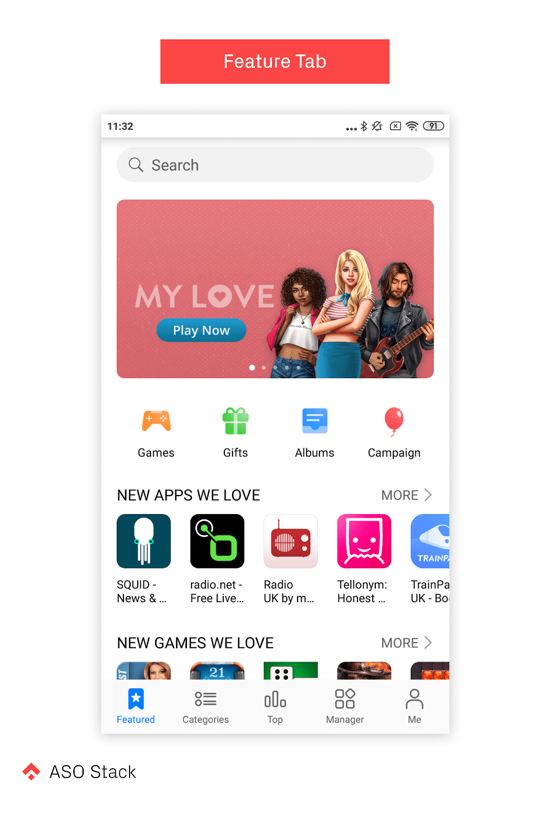
Looking at everything above the fold on the AppGallery home screen (aka the “Featured” tab), we are immediately greeted with an eye-catching banner at the top of the screen that rotates to feature a total of five apps. This is followed by a row of icons, then two single-row sections titled “New Apps We Love” and “New Games We Love”.
Feature Banner
Securing a spot as one of these five apps (especially the first one) will give your app a nice piece of screen real estate that will receive a lot of attention from browsing users. We haven’t yet figured out how these apps are being chosen. However, Huawei has openly stated that they will help developers to promote their app in an attempt to draw more developers to the platform. It could, therefore, be the case that this placement can be negotiated with Huawei directly.
Estimated Discoverability Value: High
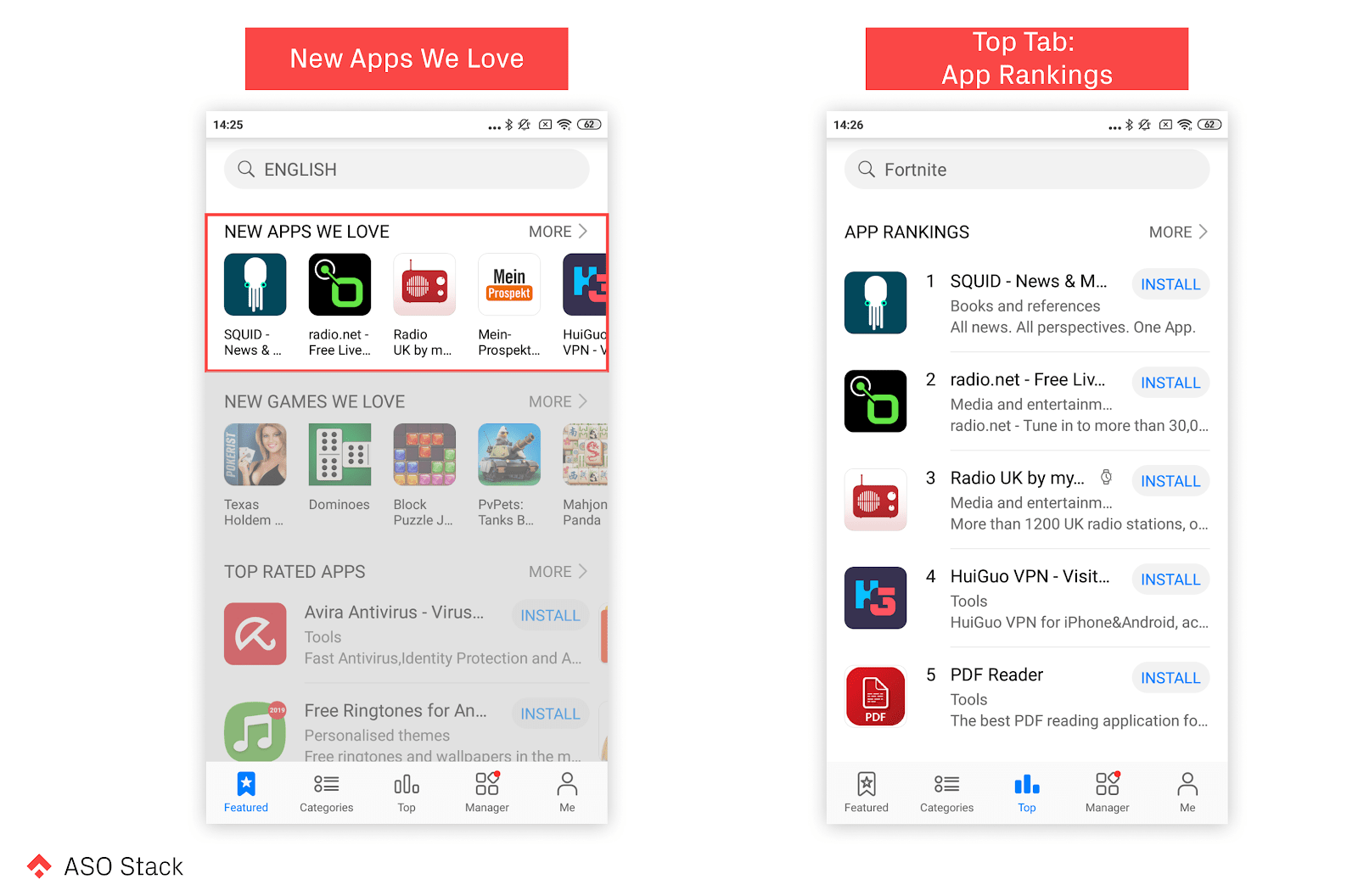
New Apps We Love
While there is nothing more than the app icon and a limited portion of the title in this section, it is still above the fold on the home screen. It is, therefore, a fairly valuable section to be included in. There seem to be similarities between this section and the “App Rankings” section in the “Top” tab, hinting that apps in this section are probably chosen based on their number ranking in terms of downloads in the country of the AppGallery store being viewed.
Estimated Discoverability Value: Mid to High
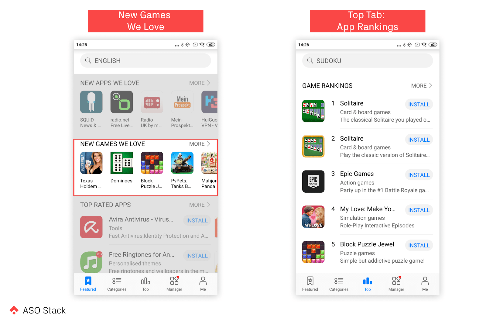
New Games We Love
This section is very similar to the “New Apps We Love” section mentioned above with the exception being that there is less correlation with apps in this section and those in the “Game Rankings” section in the “Top” tab. This means that while a high ranking in terms of downloads will most likely secure your app a spot in this section, there are also other factors at play — maybe even that Huawei “loves” your app.
Estimated Discoverability Value: Mid to High
Moving Down Below the Fold
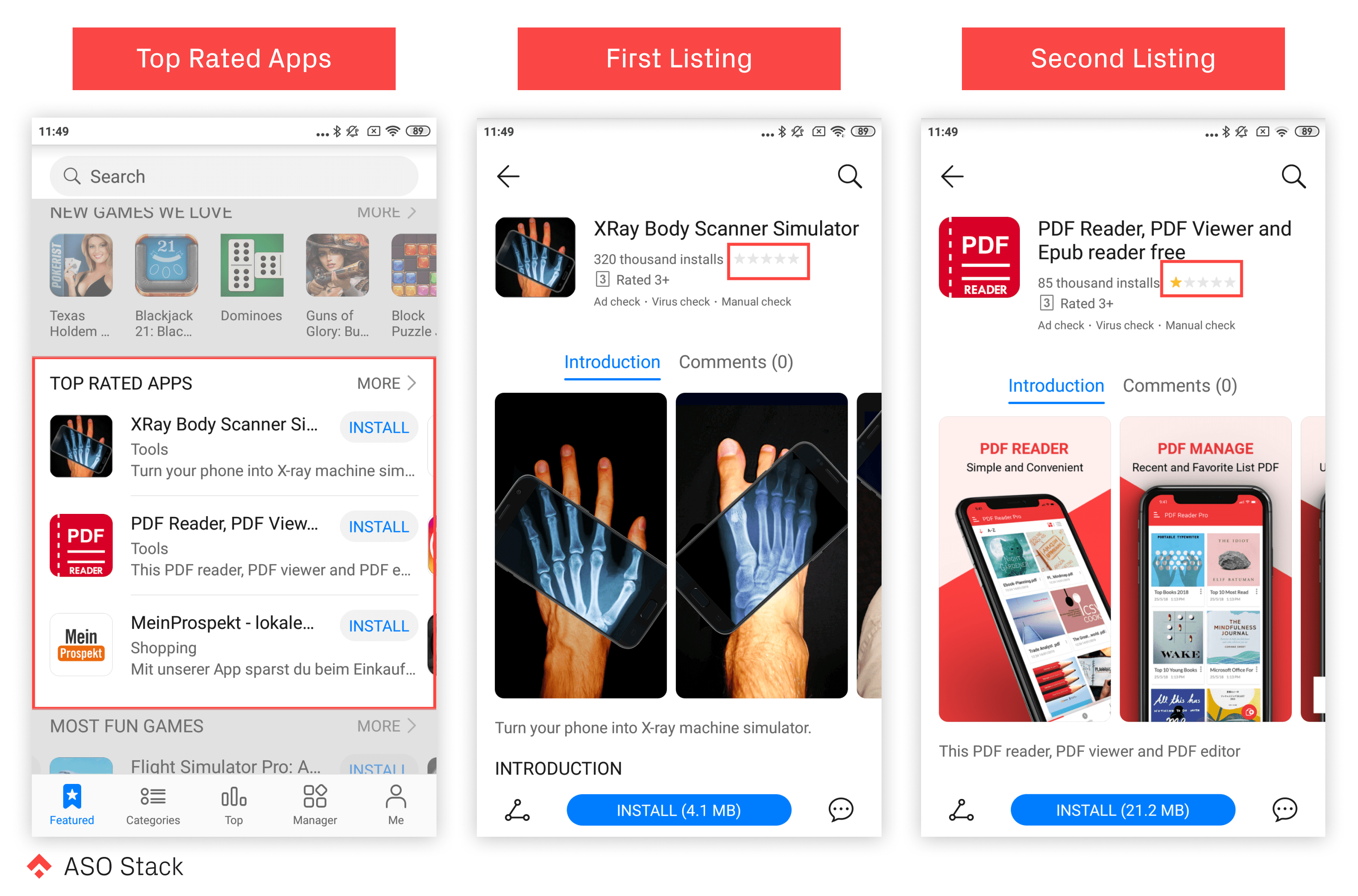
Looking at the next two sections, “Top Rated Apps” and “Most Fun Games”, we are presented with a new format that we haven’t seen in the previous sections. This format is comprised of a block of three apps with a rather descriptive, full-width listing. This includes the app icon, title, category, brief introduction, and most importantly, an install button.
Top Rated Apps
How apps in this section are chosen is a bit of an anomaly because during our research, the first app showing up in this list was not rated at all and another app in the list was rated at 1 star. This is contrary to the title of the section, as apps in this section don’t necessarily need to be “top-rated” or even rated at all for that matter. Regardless, securing a spot in this section is likely to draw some attention to your app and the install button included directly on the listing is definitely a big plus. While you will be paired with two other apps in this section, it seems like apps in this section are grouped at random meaning that your chances of being grouped with a competitor are quite low.
Estimated Discoverability Value: Mid to High
Most Fun Games
This section is similar to the “Top Rated Apps” section and its likely that Huawei uses the same methodology for ranking apps in both sections. The only difference here is that all apps in this section are games, as the name implies, meaning that there will be more competition with the other two apps featured alongside yours if you make it into this section.
Estimated Discoverability Value: Mid to High
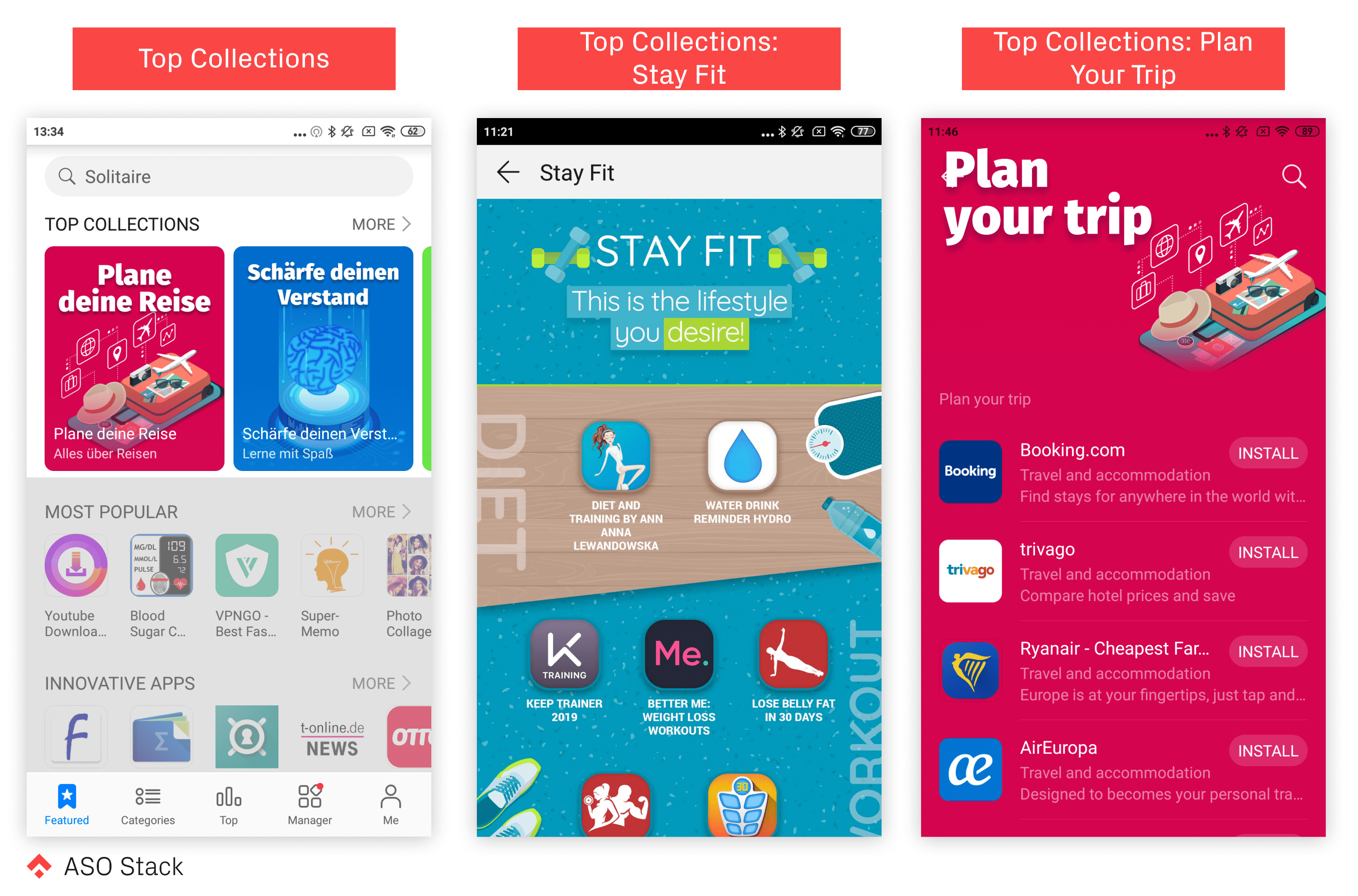
Top Collections
This section is composed of eye-catching half-width feature graphics comprised of a collection of apps that relate to a specific topic. The graphics for this section are specially designed and reminiscent of something you would find in the “Today” tab of the App Store. While these are likely to draw some attention, your app won’t be visible unless a user taps into the collection, and even then it will be grouped with many other similar apps, so competition will be high.
Estimated Discoverability Value: Mid
Most Popular
This section is another single row of different apps similar to the above the fold “New Apps We Love” section discussed earlier in this article. Based on our previous experiences ranking in a similar category, we would expect an app that gets featured here to experience an increase in impressions but not necessarily in conversions. As for how apps are chosen for this category, there isn’t much to go on aside from the title so one possible hypothesis could be that apps featured here have recently experienced a dramatic uplift in installs in the specific country being viewed.
Estimated Discoverability Value: Low
Innovative Apps
This section is very similar to the “Most Popular” section and as we discussed in our previous article about AppGallery ASO, this is actually a section in which our app, Mud, was featured. What we can say from our experience is that impressions skyrocketed (almost 10x more impressions per week than we received through KWO optimization alone), however, we didn’t experience any significant uplift in conversions. Leading up to our feature here, all we know is that shortly before getting featured we began experiencing a dramatic increase in impressions from our KWO efforts. Based on this we think that this could be one of the factors influencing how the apps featured here are chosen.
Estimated Discoverability Value: Low
You May Like & Must-Haves
Both of these categories are full-width, three-app-high listings. As with many of the sections discussed above we have little to go off of other than the title when trying to figure out which apps get featured here. One hypothesis could be that these apps are popular in your country. In the case of “You May Like”, there may be some personalization based on apps that you have searched for or installed on your phone. Interestingly, there are many apps that are actually being featured in both of these categories simultaneously. In any event, getting featured here will put you quite far down the home page, however, the option for users to install apps directly with the install button is definitely a plus.
Estimated Discoverability Value: Low to Mid
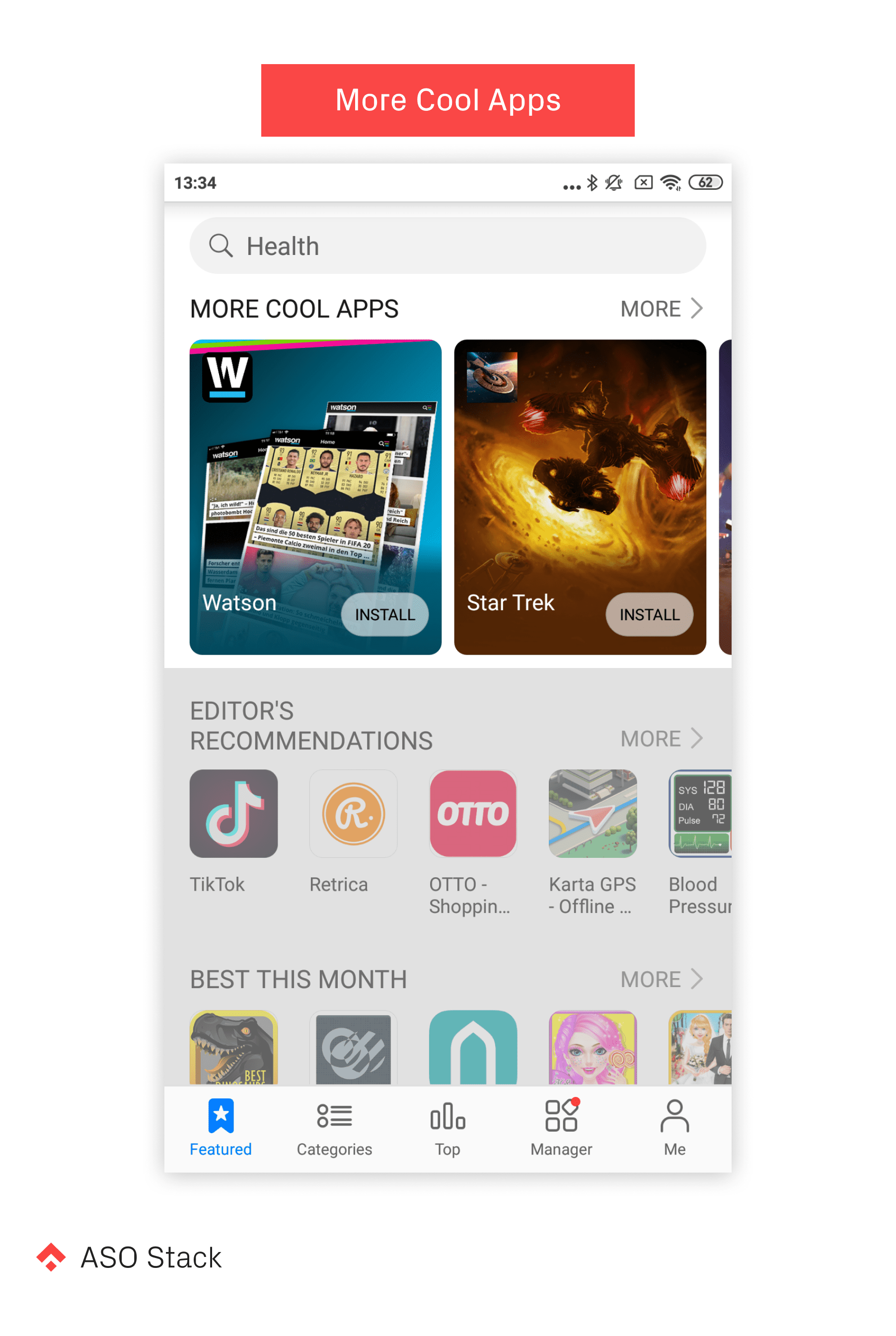
More Cool Apps
Visually, this section looks similar to the “Top Collections” section (i.e. eye-catching half-width feature graphics), except instead of a collection of apps, as is the case with “Top Collections”, each graphic is dedicated to one specific app and includes the app’s name, the icon, and an install button. Since the feature graphics here are customized, it would seem to make sense that getting into this category would involve communicating with Huawei and submitting a set of assets to be used specifically for your app’s feature listing in this section. While this section does do a good job of highlighting the app, it is quite far down the home screen and would require users to scroll all the way down to find it. That being said, your app will be presented well and may lead to positive results if users do actually discover your app via this section.
Estimated Discoverability Value: Mid-High
Editor’s Recommendations & Best This Month
These two single-row sections are positioned at the bottom of the home screen. Judging from the tiles, you might assume that the apps in the “Editor’s Recommendations” are handpicked by AppGallery staff. It could also be possible that there are some algorithmic factors at play here. As for “Best this Month”, this was one of the only sections in which we saw apps displaying app titles in completely different languages. This suggests that this section might include apps from all over the world rather than just apps for the specific country you are viewing. If this is, in fact, the case, then this could be an opportunity to boost your app’s discoverability in new markets.
Estimated Discoverability Value: Mid
Quick Apps
This is the very last section on the home screen and is, as the name implies, reserved specifically for Quick Apps (these apps have a special infinity sign looking character on their icon to signify that they are quick apps). If your app is not a quick app then disregard this section when planning to improve your app’s discoverability.
Estimated Discoverability Value: Not applicable
Categories Tab and Top Tab
There are two more tabs that can impact your app’s discoverability besides the featured tab (aka the home screen). In comparison, these tabs are much simpler and pretty straight-forward.
Entering the “Categories” tab displays a list of eighteen different categories, starting with the “Games” category. All other categories after that are sorted in alphabetical order and include many familiar categories such as “Business”, “Communication”, “Tools”, and more. In the App Store and Play Store, category rankings are based on total app installs, which seems to ring true for the AppGallery as well.
Estimated Discoverability Value: Mid
The third tab and final tab where users can discover new apps is titled “Top” and is split into two categories — “App Rankings” and “Game Rankings”, with each category containing five apps and the option to see other apps in the category by tapping “More”. Based on the titles of these categories, it’s safe to assume that these apps are chosen based on total app installs. Taking a look at how these apps rank in their respective categories confirms this assumption.
Estimated Discoverability Value: Mid
It’s also worth noting that there are additional opportunities to boost discoverability by showing up in the bottom of different app store listings in one of two sections, either the “From the Same Developer” or the “Hot New [category] and [category] Apps of The Week”, much like what is available on the App Store and Play Store.
How can you take advantage of these feature categories?
From what we’ve gathered in our research, getting featured in any of these categories will definitely boost your app’s impressions. The difficult part is actually generating a decent uplift in installs from these features. This means that your best bet will be to make sure that your icon is designed well and conforms to ASO best practices. As far as your title and brief introduction, make sure that these are optimized for conversions (also don’t forget that parts of these may be truncated depending on the featuring placement).
Ultimately, the stores are trying to show off apps that people enjoy. Keeping this in mind, it’s safe to say that your best bet when trying to get featured will be to do as much as you can to increase your app’s quality and performance. As we discussed earlier, it’s possible that a lot of the featuring criteria are based on performance. Another really good option would be to contact Huawei directly since they are really trying to push developers to publish apps on the AppGallery and seem willing to help promote apps as an incentive.
Most importantly, keep in mind that if people really enjoy your app, it will get attention. If you strive for the best user experience possible, then your app is bound to get noticed!
Our Series on ASO for the Huawei AppGallery
- Huawei AppGallery ASO: Why Should We Care?
- Huawei App Gallery: An Introduction
- The Huawei Developer Console
- Search Visibility
- Discovering Apps via Categories and Other Explore Options (this post)
- Conversion: Title, Short Description, and Long Description
- Conversion: Icon and Screenshots
- Getting Featured
- Ads and Gift Centre
- Reaching your Major Markets: Localization
- Ratings & Reviews
- Featured Store Listing
- In-app Purchase
- Listing on AppGallery
- Tools & Metrics: 3rd Party Tools
- Recap: The Huawei ASO Stack

