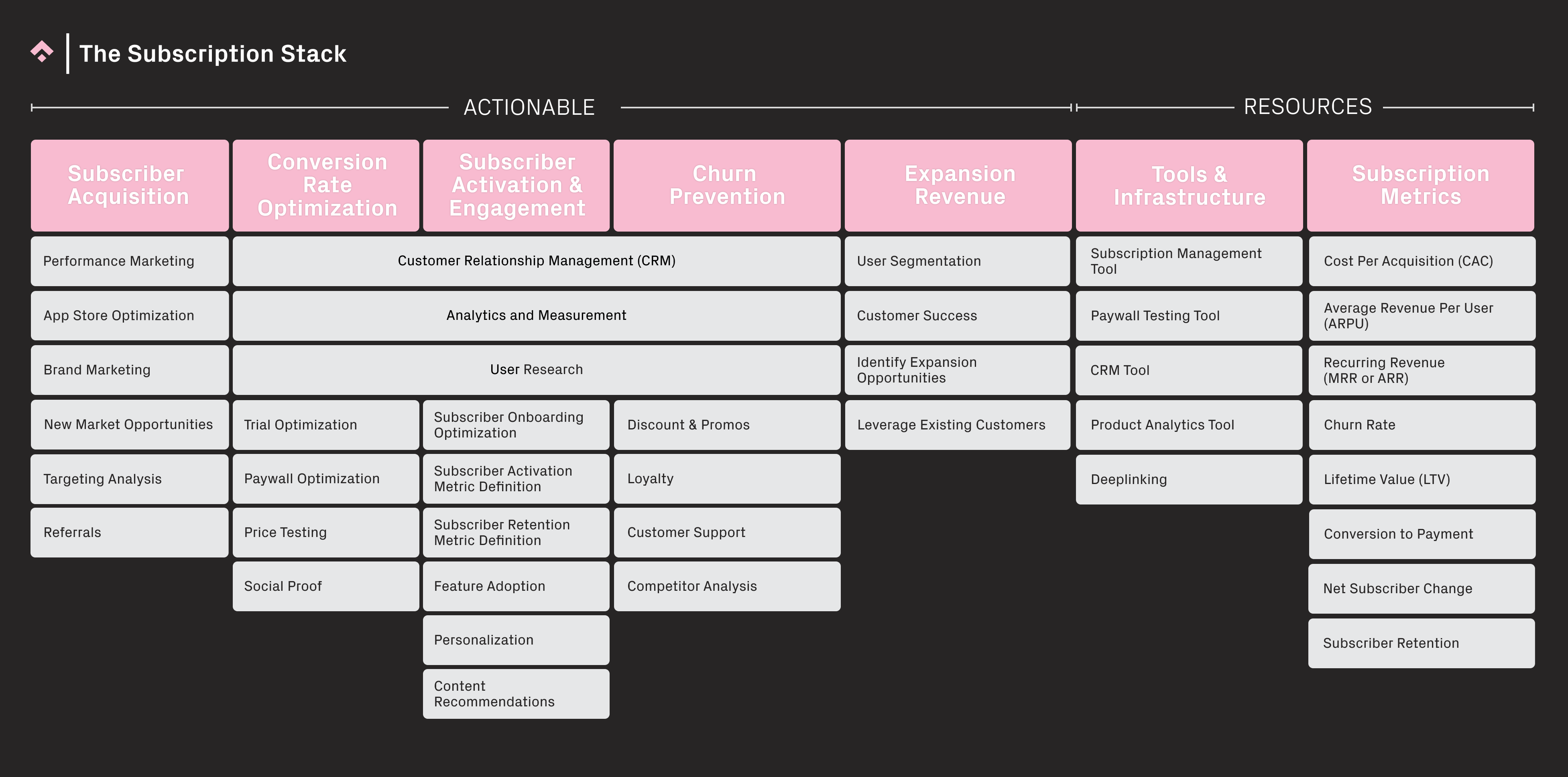
Each blog post in our Subscription Stack series introduces a key layer of the Stack, and deep dives into the importance of that layer to your own subscription optimization strategy for your app or game. Here we introduce Conversion Rate Optimization and the essential activities that underpin Conversion Rate Optimization.
You can read our Introduction to the Stack here.
Part 1: Subscriber Acquisition
Part 2: Conversion Rate Optimization (CRO)
Part 3: Activation, Engagement, and Churn Prevention
Part 4: Tools and Infrastructure
What is Conversion Rate Optimization?
Conversion Rate Optimization (CRO) is the process of increasing your conversion rate for your app’s subscription. CRM, user research, trial optimization, paywall optimization and price testing are all actionable activities you can undertake to move the needle on your baseline conversion rate. Analytics and measurement are tools to help you make better CRO decisions while social proof is incredibly important for new businesses looking to gain trust, and can be incorporated into your CRM and paywall optimization strategy.
It is advisable to move to the Conversion Rate Optimization (CRO) layer of the stack only when your business has found a degree of product-market fit. Up until this point, it’s more important to ensure you have key, basic elements in-place, such as key paywall placements, high levels of paywall visibility, and or a free trial offering. That’s because for CRO, you need high sample sizes in order to make your experimentation worthwhile, so it’s therefore important to get the basics down before you optimize for best results. Nowadays, there are many free online libraries that you can use to essentially replicate paywall best practices, so there’s really no need to reinvent the wheel.
With that in mind, let’s look at each layer in detail.
Customer Relationship Management (CRM)
One of the most straightforward things you can do to increase conversion is to simply engage more with your customers through Customer Relationship Management. Otherwise known as Lifecycle Marketing, this relates to guiding potential customers through the different stages of the customer journey. During the CRO phase of the Stack, this could take the form of onboarding and activation communications that educate and guide the users on the product’s core features. For example, sending a welcome email to educate users on the difference between the free and paid app experience is a typical way to onboard – and activate – new users. Tools such as Braze, CleverTap and Leanplum enable you to send automated CRM comms based on user behavior and preferences.
To leverage potential subscribers, start by onboarding and activating free users so they understand your value proposition and build a habit around it. This could be, for example, a series of emails, in-app messages, and push notifications that educate new users about key product features and nudge them to start using the product.
Once you have a free user onboarding and activation flow in place, you’ll want to experiment with ‘strategic friction.’ This is when you give users enough value from the free experience that they understand what the product does and how it works, but in order to fully solve their problem, they’ve got to convert to premium. An example of this would be allowing free users to sample editing tools in a creative editing app, but if they want to download or save their project, they have to be a premium user.
Analytics, measurement and user research
Analytics and data visualization tools, such as Mixpanel or Amplitude, are powerful tools when it comes to putting numbers behind strategy, for example, the CRM strategies mentioned above. Funnel charts can highlight areas where drop-offs are happening in the user lifecycle, and at this point you can send CRM comm’s to bring users back to the product to complete the action they dropped-off on, or serve survey messaging to gain valuable insights on why this is happening. In terms of optimizing for conversions, these types of insights can uncover whether or not users are dropping out of the onboarding process, the paywall screens, or are simply not activating on the core value proposition.
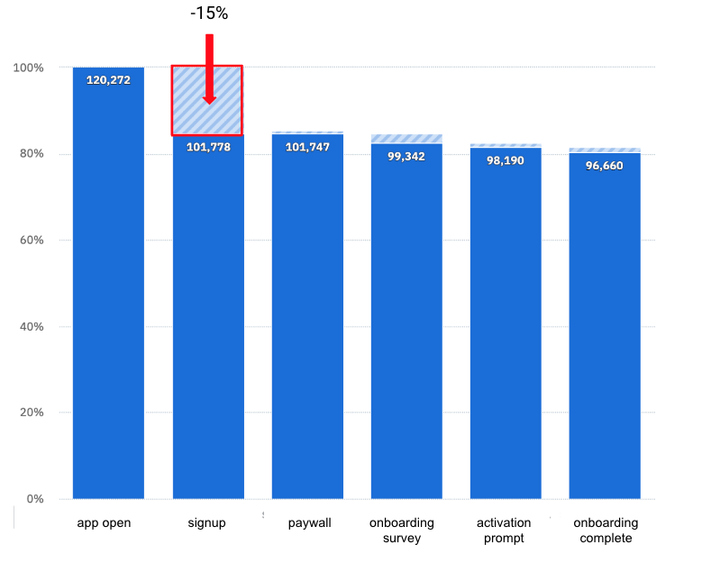 Example of an onboarding funnel chart showing a 15% drop-off between the “app open” and “signup” events
Also, in relation to the Analytics and Measurement layer, it’s advised to understand your product’s Natural Usage Habit before diving into strategies in relation to CRM, trial length, terms, free credits, and so on. The Natural Usage Habit determines how often users have a natural usage or need for your product. This can also help to align your CRM strategy with data, to ensure we’re not over-communicating with users and potentially turning them away. It can also help ensure you don’t cannibalize conversion potential by offering large discounts to high potential users who simply need more time to convert.
User research can take many forms; from in-app surveys, such as NPS or cart abandonment surveys, to large-scale projects such as features-value analyses. It’s recommended to perform regular features-value analyses, as the consumer view and value perception changes over time. So we want to make sure that our subscription offering includes features that people value and are willing to pay for today.
Free trial strategy and optimization
Trial optimization is an effective strategy that can be overlooked. However such a strategy needs to be developed specifically for your product rather than simply copying other companies. A great example of this is when companies have a 7-day trial length but the product’s Natural Usage Habit is monthly. What you might see in this case is that the user has not had enough of a chance to form a habit around the premium experience before their 7-day trial ends. It’s then likely that they would forget about the product, and subsequently churn within the following three weeks. Remember, context is key.
When devising a free trial strategy, make sure it’s a strategy that makes sense for your unique product and user base. Further, recent data from RevenueCat’s State of Subscription Apps 2023 report, suggested that longer free trials convert better than shorter.
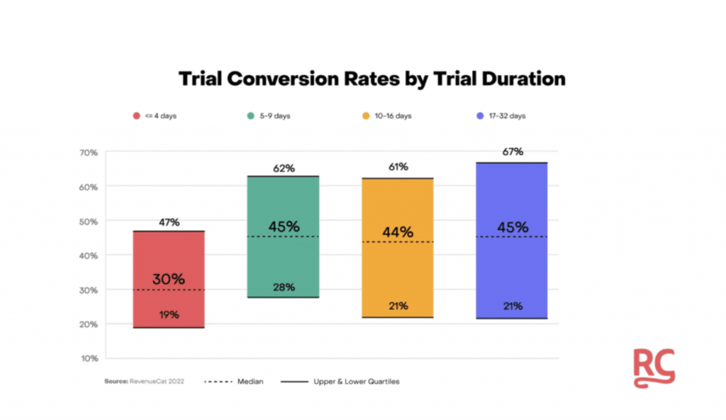
Source: RevenueCat: State of Subscription Apps 2023
There are other aspects of the free trial strategy to consider as well. Such as, who unlocks the free trial? Is it all users? Is it users who have been active for X number of weeks or months but still haven’t converted? Is the whole premium experience available with a trial or are you unlocking certain features that users have been interacting with, but need that extra nudge to convert? These are all things to consider when it comes to putting together an effective free trial strategy. Reverse Trials are also an interesting approach to consider. A reverse trial is when users start off with full premium access. Then they have X number of days to convert, otherwise their access becomes limited. Read more about Reverse Trials here.
And most importantly, measure your current conversion rates against industry benchmarks and if they are ‘reasonable’ or ‘good,’ consider whether you need a free trial at all, since adding extra steps to the conversion funnel may cannibalize revenue potential.
Paywall Optimization
It’s important to think about how and when users see a paywall.
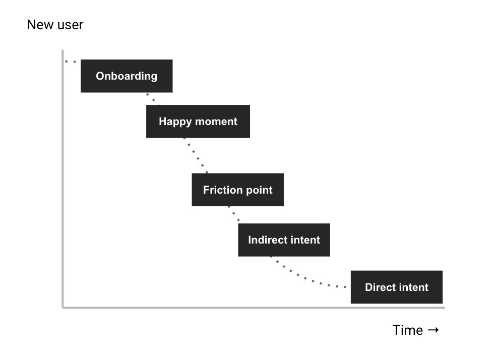
The first point of call is ensuring that everyone who downloads your app sees a paywall, preferably within their first 12-24 hours of launching the app, as this is when we see the most conversions and user intention is at its highest. Track your install -> paywall view to monitor visibility rates over time.
Once you’ve ensured that all users actually see a paywall, then you can focus on engineering beautiful screens.
Here are some of the touchpoints you should consider:
Onboarding: motivation is at its highest at the point of downloading the app or product and therefore users may have a higher intention to start a trial and ultimately subscribe. It’s also not uncommon for many users to churn after download. Don’t wait for users to stumble upon paywalls that are buried deep into the product and may never be triggered.
Happy moments: a ‘happy moment’ in the user lifecycle could be when a user successfully does something for the first time, and therefore understands the value proposition and sets themselves up for success. This could be, for example, a first photo edit or completing a first meditation. A happy moment could also be an initial setup behavior that enables you to successfully use the product, like adding reminders to water your plants.
Friction points: ‘strategic friction’ is when the user reaches a point in the user journey in which they need the premium experience in order to proceed. For example in a dating app, the user may have maxed out the number of profile likes that they can perform within a 24-hour period, and would need to upgrade to premium to continue searching for a match. This can be a very effective paywall trigger as users experience the value proposition in action.
Indirect intent: this is any behavior that indicates that there may be an intention to subscribe, without directly interacting with premium features or clicking paywall CTAs. For example, the user’s engagement behavior may replicate that of high-converting users.
Direct intent: when a user directly engages with premium features, locked content, or triggers steps in the conversion funnel before dropping out. Often when the user shows direct intent to subscribe but continues to drop out of the conversion funnel, it’s because the price is too high for this particular user. Winback discounts can be an effective strategy here.
Paywall A/B Tests
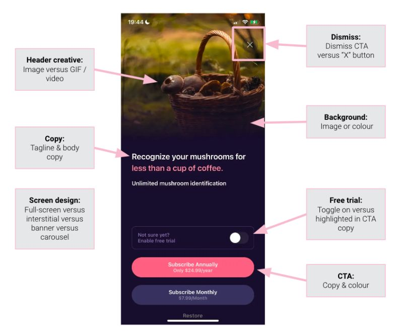
Once you’ve got the right paywall placements, consider the aesthetics of your paywall. There’s a number of standard paywall elements that can be tested:
Header creative: test a static image versus gif or video. Jake Mor from Superwall recently suggested that paywalls that included video screen recordings or explainers worked particularly well.
Copy: A/B test your tagline and body copy and try making them benefits-focused rather than simply highlighting product features. Jobs to be done theory may work well here.
Paywall screen design: paywalls don’t need to be full screen. Try different screen or modal formats from banners to multi-screen carousels. On a recent project Phiture worked on, we found that banners had higher conversion rates than full screen paywalls.
Dismiss feature: test this as either an X button or as a button CTA with “dismiss” in the copy.
Background: try an image background versus block color versus plain white. Recent data from Superwall suggested that white backgrounds with colorful CTAs performed particularly well.
Free trial: give users the option to toggle this on themselves versus the free trial being automatically included and highlighted in the subscription CTA. Another thing we’ve observed apps do successfully is offer a % off the membership price if users choose to skip the free trial. Hootsuite is a nice example.
CTA buttons: copy, tone of voice and CTA color can be tested. You can also have a CTA visible for each bundle or you can choose to highlight your most lucrative offer and hide other offers behind a “see more” button.
Social proof: this is another clever conversion tactic that can be particularly effective when the app or product is fairly new. According to Shopify’s blog; Social proof is a psychological phenomenon that describes our tendency to rely on the opinions or actions of others to inform our own. Also known as informational social influence, it validates a consumer’s choice, saying that the product is worth their time, money, or interest by using other people as proof.
Social proof can be implemented in a number of ways, such as positive app reviews or a large following on social media, but one of the easiest ways to implement it within your app or product is to include social proof as part of your messaging or paywall creative. For example, stating, on your paywall, how many people are using your app on a weekly basis.
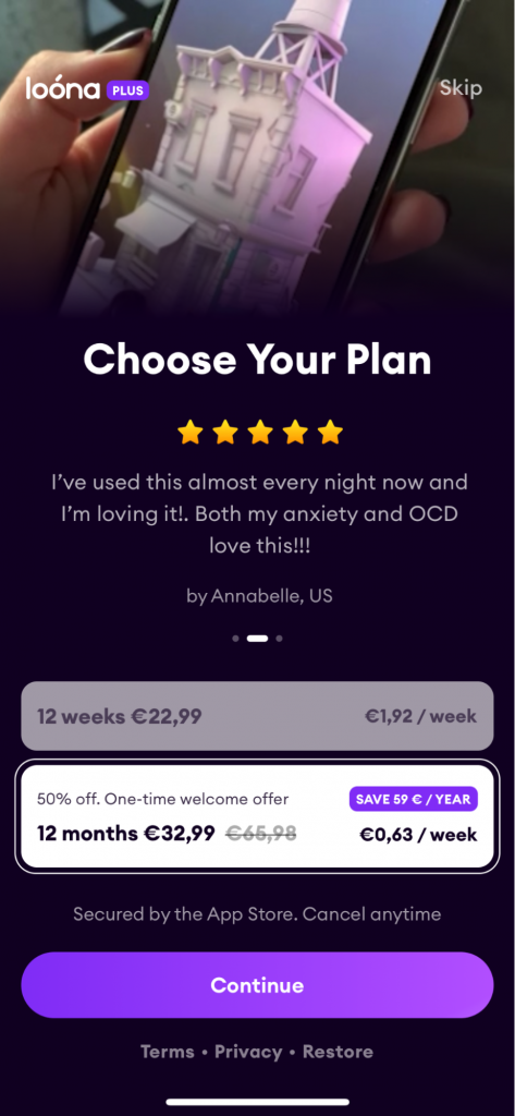
Example of a paywall featuring a five-star review as social proof.
Price testing
Subscription Optimization expert, Jakub Chour, has covered price optimization extensively in his App Pricing Optimization Guide for the Mobile Growth Stack blog. In his guide, Jakub covers key elements of price testing, such as:
- Where and how to start testing
- Tools and measurement. Nowadays, there are tools on the market, such as RevenueCat and Purchasely, which can assist you with price A/B testing.
- How to use the Van Westendorp Price Sensitivity Meter to find price points that make sense for your unique product and user base.
Conclusion
Conversion Rate Optimization is crucial for the Subscription Stack. Bear in mind, pricing surveys and market research can bring incremental gains but if someone doesn’t value your product offering, it’s unlikely that price changes will have much of an impact.That’s why product-market fit is such a crucial aspect of ensuring successful Conversion Rate Optimization.
It should be a rewarding experience as you ultimately convert more users to your product, pulling different levers as you go. To get started, ensure near 100% visibility on your paywalls without worrying too much about paywall aesthetics. Remember, people can’t buy something they don’t see or know about. However, don’t just copy what others in the industry are doing. Use data from your unique product and user base to be the cornerstone of every strategy, whether that’s the frequency and type of messaging, trial lengths and terms, pricing, and so on and so forth. For this, harvesting a deep knowledge of your market will pay dividends, and you should consider regular market and user research as value perception changes over time.
Before you go:
- The first in Alice Muir’s Subscription Stack blog series handles User Acquisition and is a must read as it preempts Conversion Rate Optimization.
- The next blog in the series handles Activation, Engagement, and Churn Prevention.
- Jakub Chour’s App Pricing Optimization Guide in the Mobile Growth Stack blog comprehensively tackles where and how to start testing, tools and measurement, and how to find price points that make sense for your product.
- For a full overview of the Subscription Stack, you can download a handy pdf guide here.
- Natural Usage Habits of your user base should underpin many of your efforts in the CRO layer of the stack. Read here Tessa Miskell’s excellent overview of this topic.
Table of Contents

