Competitive ASO Research Series #1
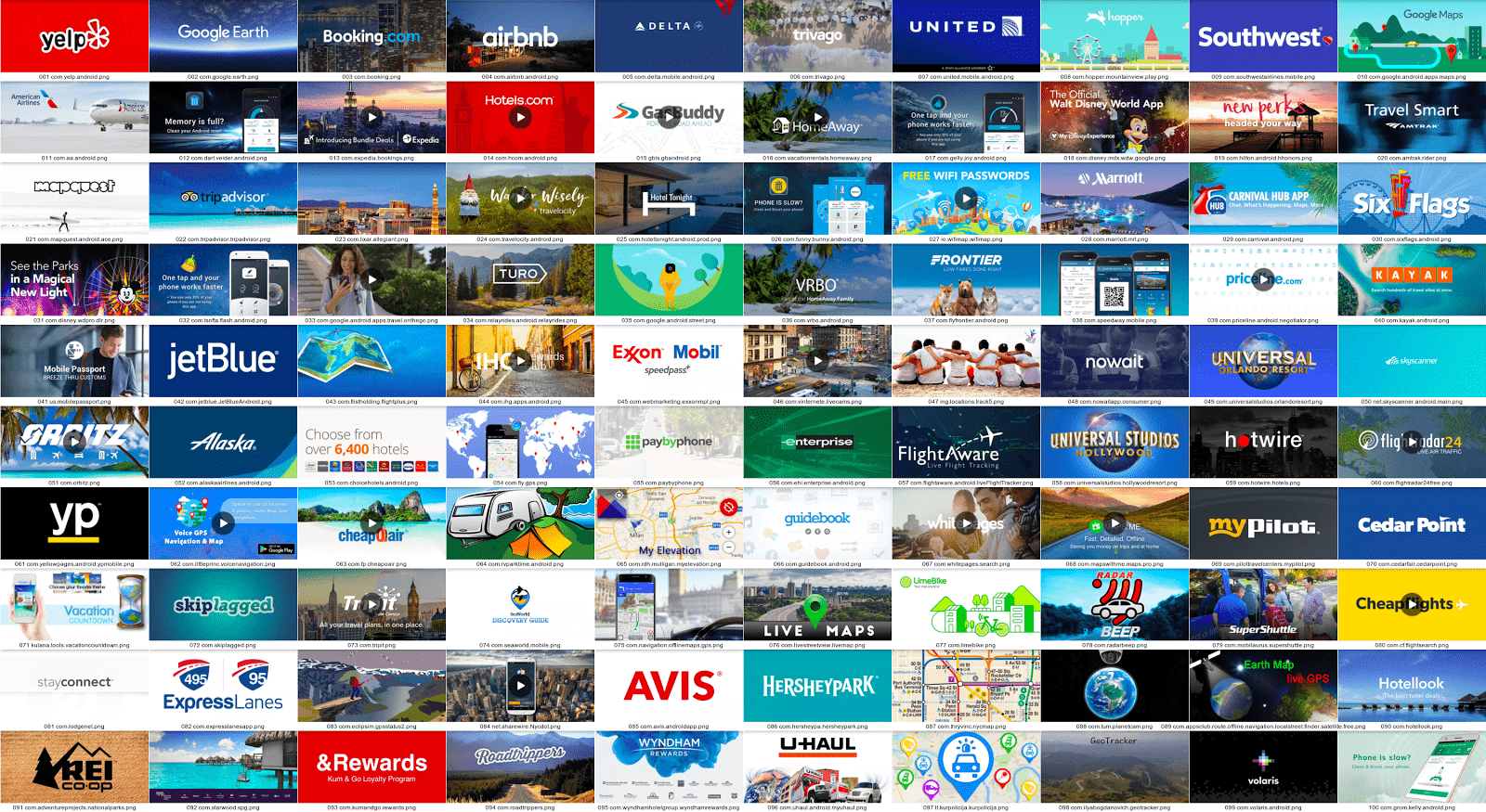
The feature graphics of the top 100 apps in the travel & local category (USA)
In just 7 seconds, a store listing visitor decides whether to download an app. This makes the feature graphic along with the app icon the most important visual ASO asset on the Google Play Store. The feature graphic acts as an Android promotional banner to grab the visitor’s attention, being the first thing that visitors see when visiting the store site. Especially as compared to the App Store, the large majority of users downloading an app on Google Play visit the store page.
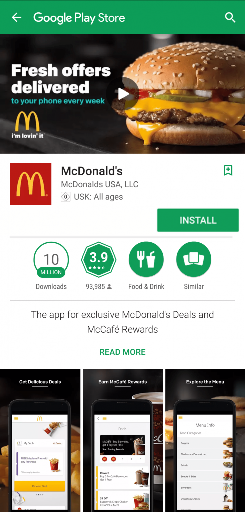
There are many best-practices of how to design the 1024×500 feature graphic. Choice of design can depend on the type of app, typical users and the message to be conveyed. Whether aiming to stand out from the crowd, creating a feel good, convincing the visitor of the app’s usefulness or being fun and engaging, the ultimate goal of the feature graphic should always convincing the visitor to download the app. The Google Developer Console allows for A/B testing of the feature graphic, allowing new designs to be tested as to whether they convert to more installs.
Learning from competitor feature graphics
Looking at what other apps are doing in terms of design can provide inspiration for the visuals for the own store pages. To learn more about the feature graphic, Phiture conducted a visual analysis of the feature graphics of the top 100 apps of each of the 33 Play Store categories in the United States, analyzing a total of 3,300 feature graphics. As none of the ASO tools out there capture the Android feature graphic, we had to build our own tools to scrape, screenshot, crop and analyze the feature graphics directly from the device.
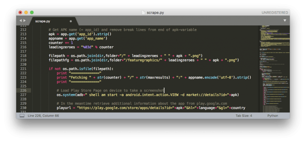 Python script for fetching the feature graphics from the Play Store
On a category basis, we analyzed the following:
- Inclusion of a promotional video
- Display of an app logo and text
- Image type, content and predominant colors
- Other potentially relevant features
While there were a large amount of differing feature graphics, we we were able to spot some particularities of categories as well as common themes across categories. These can help getting an idea of the overall types of feature graphics which an app category contains.
Feature graphics: videos
Although not strictly part of the feature graphic, the promotional video on Google Play is included in this analysis, as when included, a play button is displayed in the centre of the feature graphic.
Across all categories, on average, 26% of apps include a promotional video. Considering that the video is only watched by around 15% of Play Store page visitors (that’s for games and apps combined; for non-games it’s actually a lot lower). Perhaps unsurprisingly, the Games category features way ahead of any other categories, with 74% of gaming apps containing a promotional video. This may relate to visitors interested in Games being more likely to watch a video, as they can easily a feel for the actual gameplay — which may also be fun to watch — before investing time into a new game. In many cases, users just prefer to try the app rather than watch the video (downloading an app often consumes less data than watching their video).
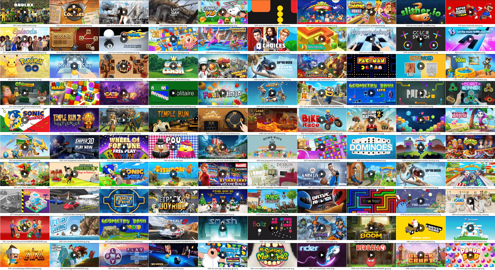
Videos are included in many apps in the games category
The second-largest category in terms of videos is the Education category (45%), followed by the Productivity (37%) and Maps & Navigation (33%).
Comparing these categories to the lowest ranking, Libraries & Demo (2%), Beauty (9%) and Books & Reference (15%) shows that categories that include a lot of simpler utility apps like pdf creators (Libraries & Demo) or e-readers (Books & Reference) have fewer videos — probably due to users not being interested in the video but just installing the app. Also, apps of which images play an important part, for instance Beauty, Comics, Food & Drink, Travel & Local, also seem to include less video.
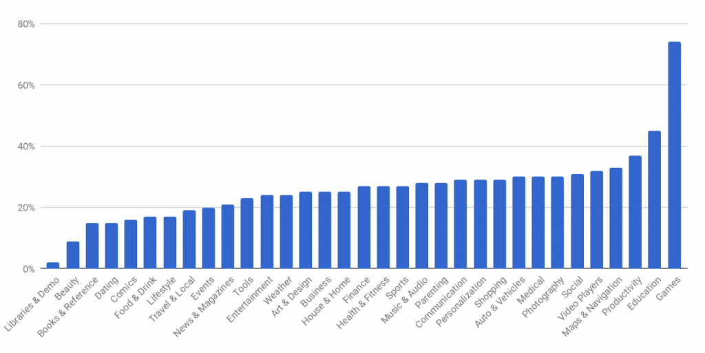
Feature graphics containing video (via Play Store category)
Feature graphics: logos and text
We wanted to get an idea of how many feature graphics included app or company logos. The most logos are included in the Sports category (53%), followed by the House & Home (48%) and Food & Drink (48%) categories. Comics (7%), Beauty (8%) and Art & Design (9%) include the least. Categories like Shopping (24%), Entertainment (26%) and Tools (27%) feature in the centre.
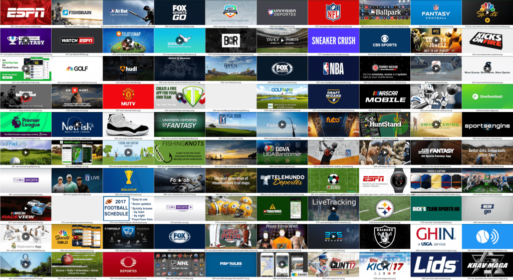
Logos on feature graphics in the sports category
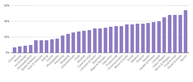
Apps including logos (via Play Store categories)
The feature graphic is not only a great place to strengthen your brand, but it also gives you a lot of space to communicate your value proposition. We’ve counted feature graphics including containing a app title and those containing additional text (e.g. promotional). Overall, the large majority of apps included the title/name of the app in their feature graphic. The games category featured right at the top with almost every app including the app name. The health & fitness category contained a lot of value propositions along with the app title.
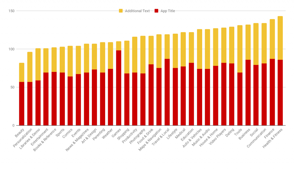
Apps including title text / additional text (via Play Store categories)
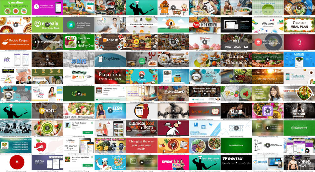
Feature graphics in the health & fitness category
Feature graphics: image colors and types
We found blue to be the predominant feature graphic color of many categories, followed by green, purple and red. As an example, in this collection of feature graphics from the Communications category blue features quite a bit. This was similarly the case in categories like Finance, Productivity, Tools and Weather (possibly related to the sky). Warmer colors like on the other hand could be found a lot in the Food category. Pink was a very popular color in the Beauty category.
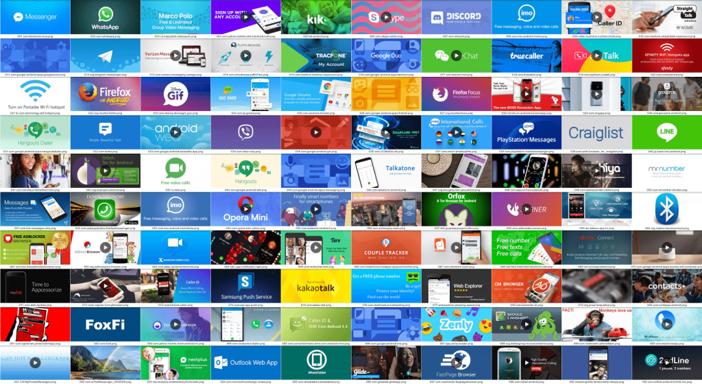
Feature graphics in the communications category contain a lot of blue
When looking at the types of images that were included in the feature graphics we noticed five predominant themes, with images including general graphics, cartoon graphics, illustrations, photographs or a mono/multicolor background. The graph below shows the top three app categories for each of these themes.
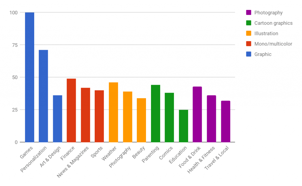
Top three app categories for five different image types
Photographs as feature groahic images are predominant in categories such as Food & Drink and Health & Fitness, where real-life pictures of food or people can help best to confer to the user what the app is about. Naturally, the image type is heavily dependent on the app content. Apps in the games category for instance contain little to none photography in the app, which is why most games apps contain graphical imagery.
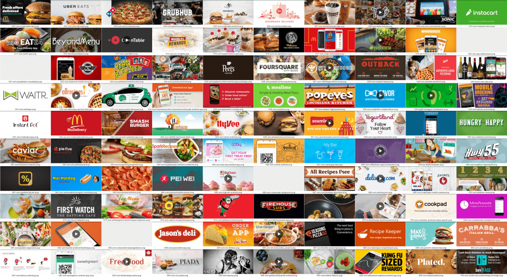
Feature graphics in the food category contain a lot of photography
Feature graphics: image content
We looked at whether the feature graphics contained phone devices, people, landscapes or other objects. Naturally the feature graphics differed a lot regarding this content. We found that the most phones/phone interfaces were displayed in the Personalization category (36%) probably as much of these apps contain functions to optimize/customize one’s phone. Google describes this category as: “Wallpapers, live wallpapers, home screen, lock screen, ringtones”, displaying phones in the feature graphic does make sense. Other categories that included many phones were Communication (28%), Finance (27%) and Business (25%), categories that can maybe be considered more serious.
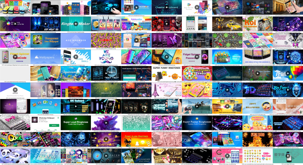
Feature graphics in the personalization category — include many phones / phone interfaces
Whether a category contains people in the feature graphic is again heavily dependent on the type of category. The Beauty (25%) and Dating (45%) categories contain a lot of images with people. In the beauty category predominantly women, in the dating category either couples or women.
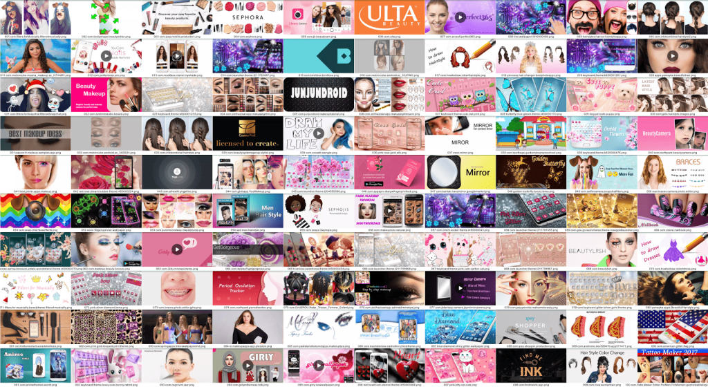
Feature graphics in the beauty category — contain a lot of photography of women
While the Health & Fitness and the Food & Drink categories naturally include a lot of objects around food, the Auto & Vehicles category focuses on cars. Similarly, landscapes can mostly be found in the Travel & Local category and the Weather category (mostly skies and clouds).
Feature graphic optimization — Key takeaways
The Google Play feature graphic or promotion banner is an essential asset to test when running A/B tests on the Google Play Developer Console as it can deliver a lot of impact in terms of improving conversion. Google even suggests that you “test the feature graphic as a priority, as it has such a presence on your store listing’s page”. Although other assets such as the short description and the screenshots can also deliver impact, the Android feature graphic (apart from the app icon) is really impactful.
The analysis shows that there are a few things to consider when thinking about your feature graphic:
- Best practices: Are there any general best practices for your category and what can you learn from other categories?
- Stand out or blend in: Can you visually stand out by for instance including large text on feature graphic? Or does it make more sense to blend in and conform to the category best practices?
- Meeting expectations: What type of images will you be including, would users expect anything in particular from an app like yours?
- Video or no video: Does including a video make sense? How will it influence the design of the feature graphic?
- Optimizing toward all assets: How can you use the feature graphic to make your store page your own, considering predefined (Google icons, buttons etc.) and other own assets (icon & screenshots).
- Being convincing: What type of messaging in terms of text do competitors include? What type of message would convince your users?
As seen, you can enhance your feature graphic with logos, large text, different colors, some of which may be more typical for your app’s category than others. What you include in your feature graphic in terms of visuals should be relevant to your app. However, decisions on whether to include photography or graphics, as well as whether to include phones or not and what types of interfaces can often be based on competitive intelligence. Considering what your competitors are including on their store pages, getting insight from other categories and apps can help in gathering ideas around what might deliver impact and would thus be worth testing. This can not only provide you with a better understanding of what works in your category, but what can make the app stand out from the crowd and drive conversion.
Many thanks to Oksana Iarosevych for her help with analyzing the data for this article.

