How to get users to download your app by optimizing your store’s creative assets?
Maggie Ngai is a Senior ASO consultant at Phiture and she helps companies to optimize the visibility and conversion of their apps in both the App Store and Play Store through Apple Search Ads, CRO experimentation, and keyword optimization processes.
Following Conversion (Part I: Textual assets), in this article, we will have a deep look into the creative assets, namely icons, screenshots and Immersive App Details Page (we called it the featured store listings in previous articles). By optimizing store assets, you can receive more downloads and hopefully more revenue down the funnel.
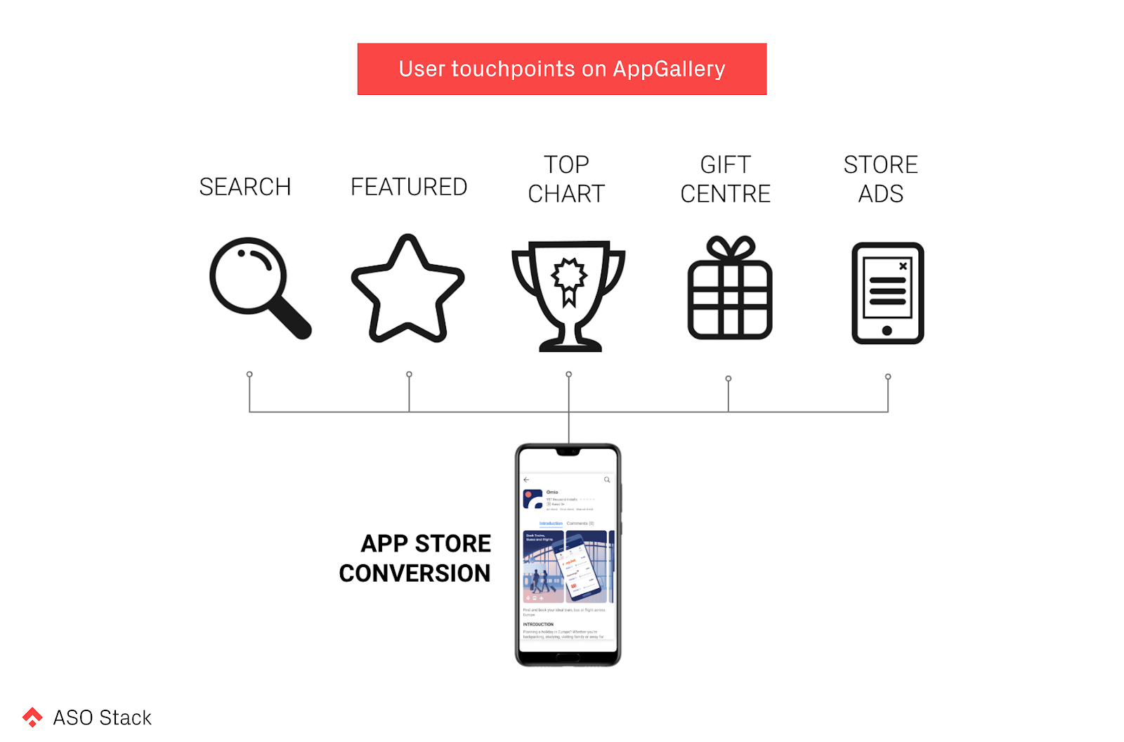
It is important to understand which creatives are visible across user touchpoints. While AppGallery has similar layouts compared to Google Play, adopting learning from Google Play will help you improve the conversion in no time.
Icon
The AppGallery has a similar layout to Google Play in multiple user touchpoints. That includes the Feature Home, search result and Top Chart.
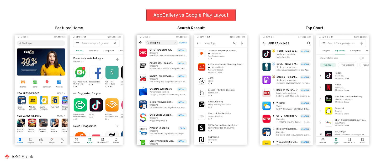
The app icon is visible across all user touchpoints. Therefore, the icon is one of the main factors (besides the title) that drives downloads. The similar layouts suggest that learnings from running icon experiments on Google Play could be applied to AppGallery. You may then ask “but how can we optimize the icon without changing the logo?”
![]()
Game developers are very creative. I have seen developers testing different characters and features in the app icon. Putting a Christmas tree in the icon can also hint seasonal in-app events. Below I show the examples of icon testing variants of the two games Gardenscapes and Harry Potter: Hogwarts Mystery on Google Play over the past 90 days. It’s amazing to see how the latter game incorporates seasonality elements in the icon.
![]()
I understand that it might be a complicated process to update the icon for regular apps, especially for big brands. We have three key ideas for changes that are minimal, but can still easily push your conversion rate up a few crucial percentage points.
They are:
Screenshots
Once visitors arrive on the product page, screenshots become the most prominent creative assets, occupying a third of the whole screen. The color of the screenshots will, without a doubt, catch visitors’ eyes and encourage them to start reading the captions and looking at the UI.
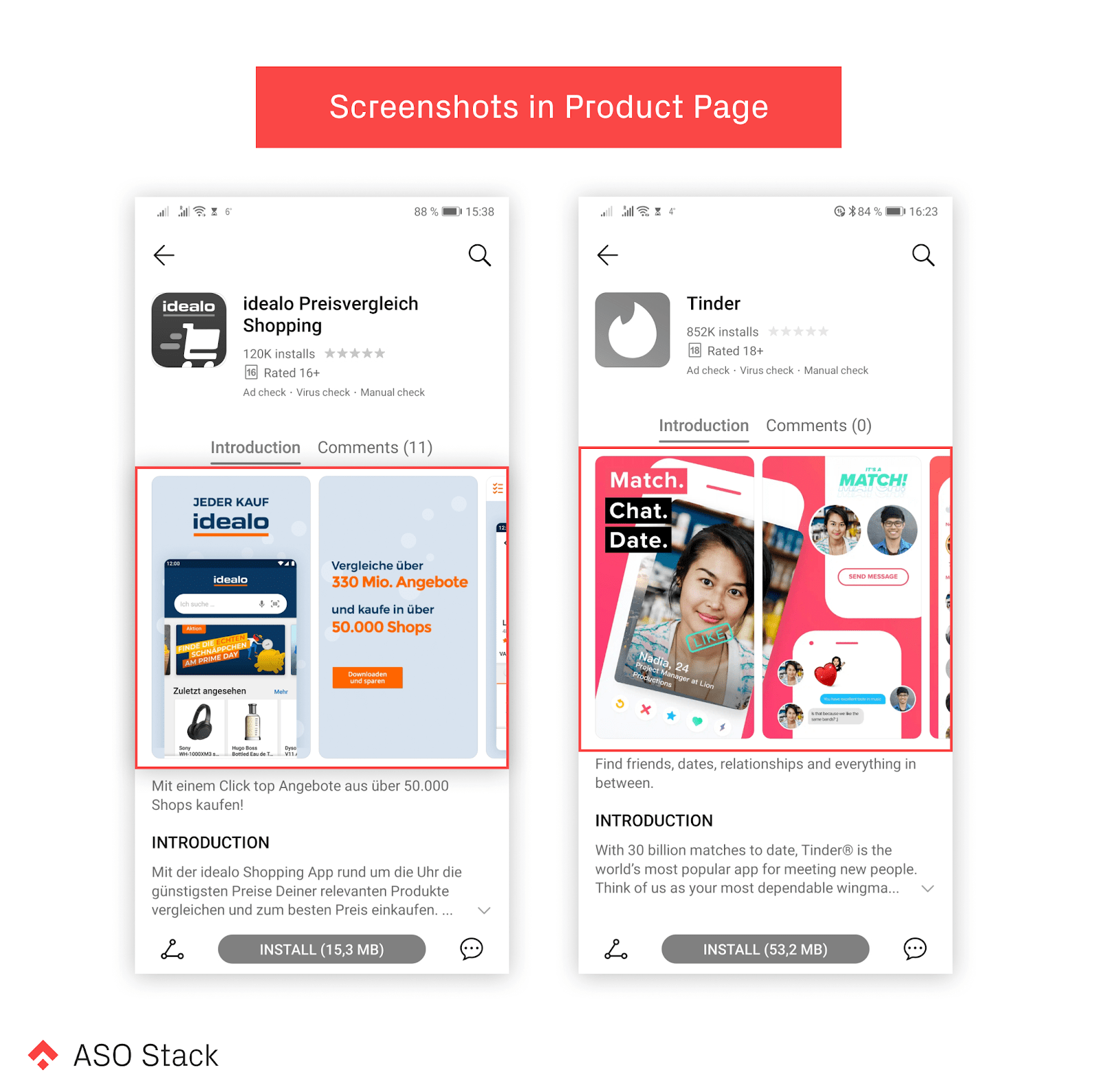
Regardless of the platforms, there is no secret to creating engaging screenshots aside from testing creative assets based on user research and hypotheses. At Phiture, we have a systematic approach for optimizing any assets. Jump over here and read more.
Unfortunately, AppGallery doesn’t have a native A/B testing environment (though I have heard the Huawei team is building that soon). Your best chance is therefore to, once again, adopt your learnings from Google Play, which is the only one with a fair A/B testing tool, among the 3 stores (App Store, Google Play and AppGallery).
We can share a few best practices when creating screenshots. Obviously, there are a lot more than just these, but we find these key points crucial to making a great first impression on your visitors.
- Resonance with visitors by talking about value propositions from a user perspective (e.g make tracking your diet easy), instead of stating a list of features in the app (e.g. counting calories…).
- Prioritize the most popular features and content in the first three screenshots. Only a limited amount of users scroll through all the screenshots before downloading an app.
- Use social proof (e.g., 50 million downloads) to make a powerful impact by increasing trust.
- Localize the messaging and UI to impress your visitors. Pay careful attention to language, demographics, and cultural norms.
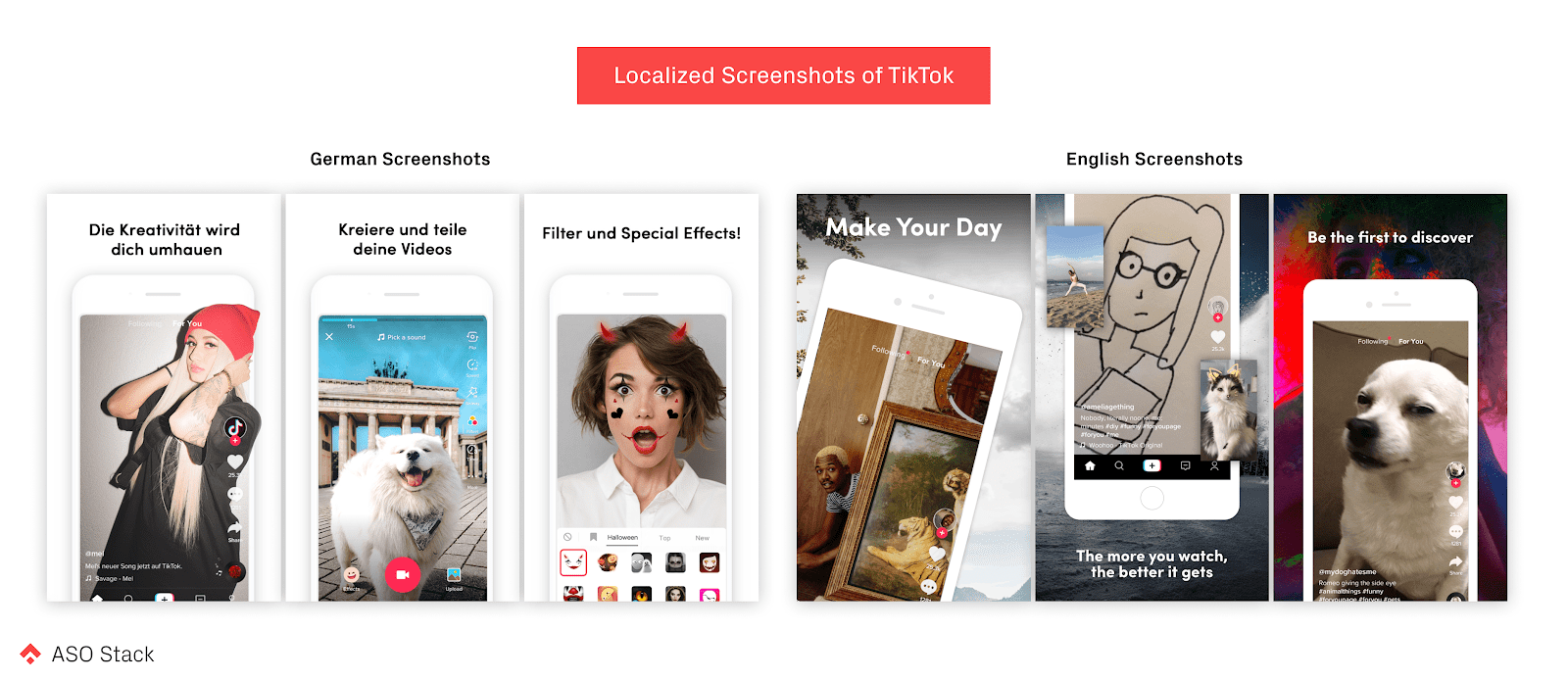
Localization is a big topic for improving conversion. Mere translation of the captions and UI hardly does a good job when the app is competing against home-grown local apps. Successful apps, like TikTok, manage to truly localize the store listing focusing on three aspects:
- Messaging and Language (DE: Creativity will transfer you vs UK: Make Your Day)
- Features & Content (DE: showing filter and special effects vs UK: be the first to discover new content)
- Layout & Aesthetic (DE: clear white background with pop-up UI vs UK: photography background with devices in different angle)
Immersive App Details Page
In our second article, we mentioned that AppGallery offers fully customized store listings with a featured graphic and custom colored background. It might be more powerful than the feature banner in the App Store, as developers have full control of the background color tone.
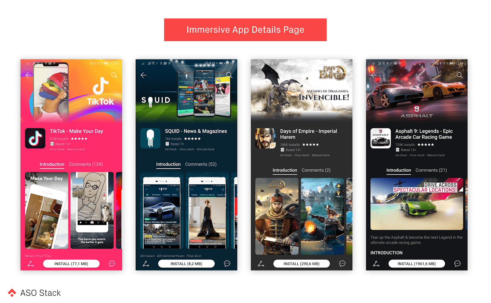
Unfortunately, this customized product page can’t be set by developers at this moment. According to Huawei, it is part of the joint operations services and it is only available to apps and games that have integrated HMS. If you are interested in getting this benefit, check out their website.
Final Note
Visitors generally make their decision on whether or not to download an app or game in the first few seconds. Clearly then, communicating the value of the app will help your app stand out among an ocean of competitors. Here I have a little cheat sheet about the impact on conversion of all assets. I hope this will help you to prioritize your conversion efforts and wish you get more downloads than you already have. Share your thoughts and your success stories with us in the comments!
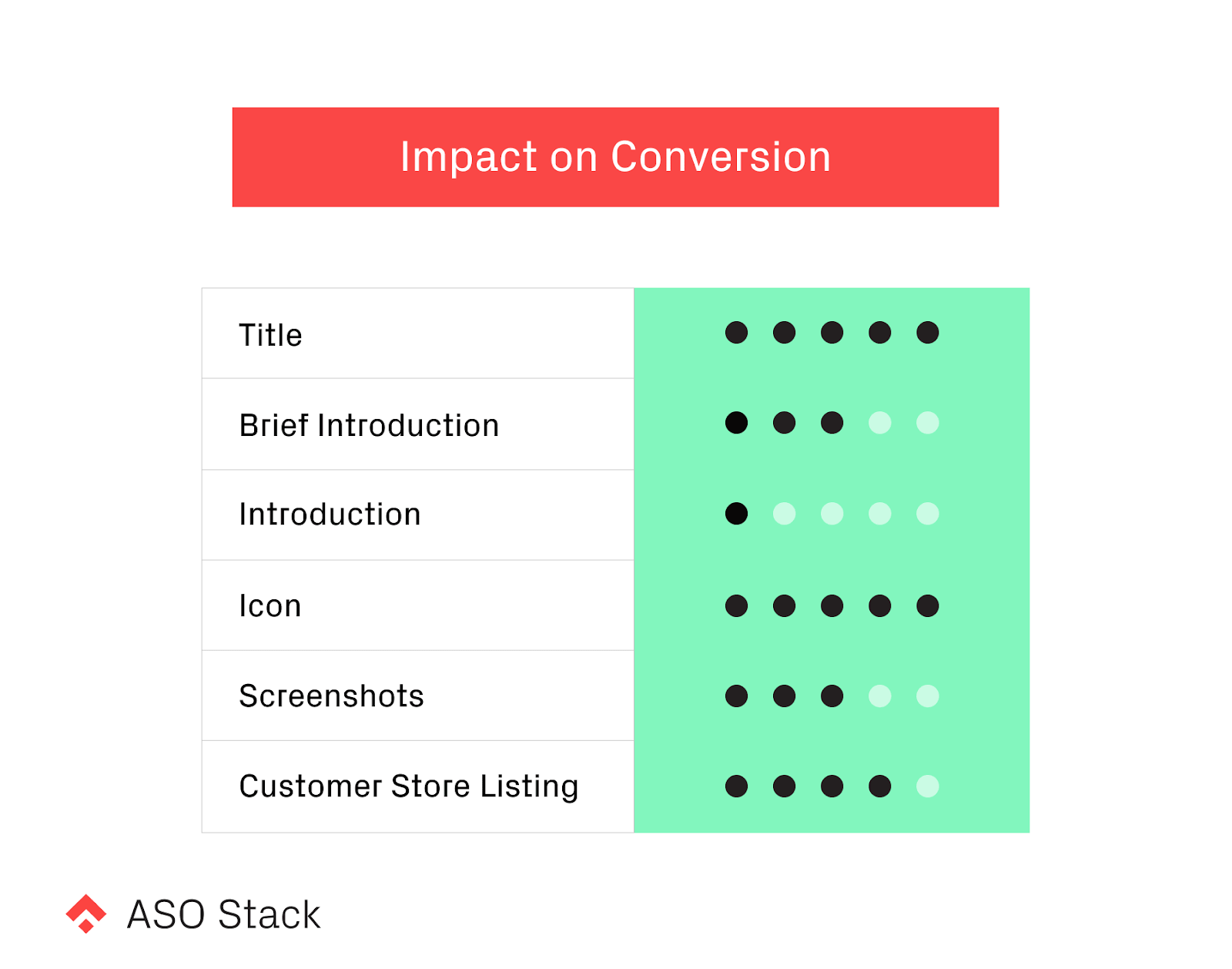
- It would be amazing if developers can upload videos to AppGallery. I believe videos will have a massive impact on conversion, especially for games.
Our Series on ASO for the Huawei AppGallery
- App Store Optimization on Huawei AppGallery: Why Should We Care?
- An Introduction
- Listing on AppGallery: a step-by-step guide and a glance at the Developer Console
- Search Visibility
- Discoverability
- Conversion (Part I: Textual assets)
- Conversion: Icon and Screenshots (this one)
- Getting Featured
- Ads and Gift Centre
- Reaching your Major Markets: Localization
- Ratings & Reviews
- Featured Store Listing
- In-app Purchase
- Listing on AppGallery
- Tools & Metrics: 3rd Party Tools
- Recap: The Huawei ASO Stack

