Andrew Hart is an ASO Consultant at Phiture helping companies to optimize the visibility and conversion of their apps in both the App Store and Play Store through Apple Search Ads, CRO experimentation, and keyword optimization processes.
Creativity can be a fickle beast, flowing lavishly one day and merely dribbling out like sap from a tree the next. In the world of ASO, creativity plays a huge role in the ideation of experiments, helping uncover variants that can increase conversion rates by double digits and then some.
As publishers, ASO consultants and app marketers, we all need to question what to test next. Broadly speaking, we have two options: messaging or aesthetics. This question can largely be answered using Phiture’s CRO Loop, however, I’d like to focus on the messaging aspect in particular and a methodology that has helped me create over one hundred experiment ideas in only a few hours.
“Don’t sell the steak, sell the sizzle”.
– Elmer Wheeler
Users don’t care about features unless they can solve a problem. If you’ve got their attention you’ll win their hearts by communicating emotionally and in their language. That’s what Elmer Wheeler was talking about with the sizzle and it’s the rare occasion steak can be relevant to App store optimization. Building an emotional connection with users, even for a split second, will help bring your brand to the front of mind the next time they’re thinking about your product’s category.
The creative matrix is a framework that can help build this connection by providing a scaffolding to guide the ideation process, just seeing intersections of the matrix alone can be enough to help us come up with ideas we may have been overlooking.
To begin, you add an important value across a horizontal axis, some related, equally important, value down the vertical and start filling in the crossroads. It’s a simple concept that can do wonders for your experiment roadmap, helping to expand ideas and foster divergent thinking.
Let’s imagine for a moment we work for the health and fitness app Strava, we’ve been tasked to create new messaging to bolster the release of the company’s new branding and screenshot designs. We need to let the customer know we can solve their problem whilst finding a sweet spot that emotionally links the brand and its features with a user’s values.
The horizontal
Start with the horizontal axis. These are the pillars of truth that fortify the strength of your app: the value propositions. For Strava, these are likely to be improved performance, better health, community, competition and knowledge (of routes and performance for example).
The vertical
In the vertical lies product features. For Strava we’re talking about activity tracking, performance analysis, training plans, fitness objectives, competitor insights, and social networking.
Here’s what we end up with:
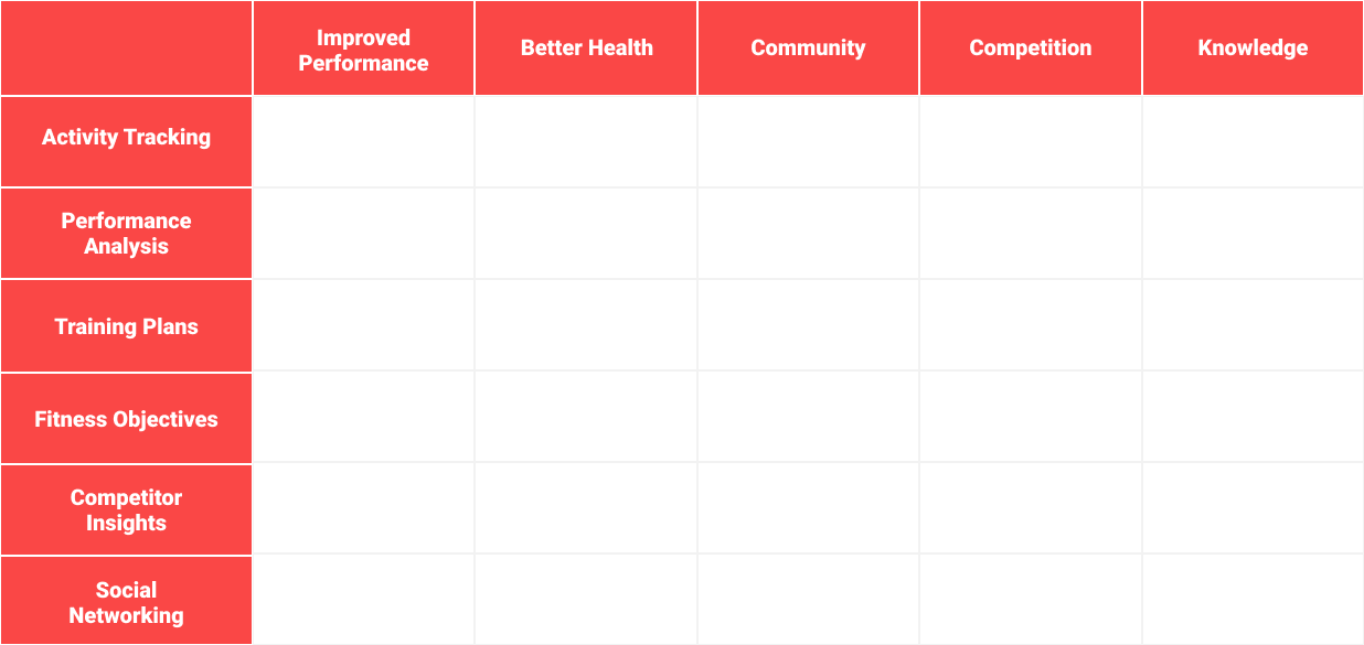
This matrix alone is enough to start getting some ideas down, however, if we introduce a third dimension, we diverge from traditional creative matrixes and start to build more ideation velocity.
Communication technique
This our fuel, the energy we need to create messaging that truly resonates with the innate desires of users. There are many ways we can steer communication: posing questions, using colloquial language or stating the facts but appealing to a user’s internal drivers will trigger a deeper connection that helps to cut through the noise.
Appeals
Appeals sit at the heart of any creative message worth its weight in salt, they connect a brand to the consumer’s wants and needs. When utilized, appeals can elevate the impact of messaging campaigns by creating deeper connections with users, activating different parts of the brain that can help with things like brand recall¹.
Emotional
Emotional appeals like fear, envy and sexual desire stir feelings around a brand’s offerings and speak a cross-cultural language, universal amongst all human beings. Thanks to brain imaging and neuroscience we’re also starting to learn how emotional messages hit the brain’s limbic system and help influence consumer decision making and brand recall².
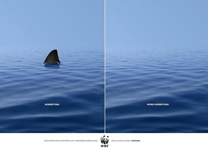
WWF “Horrifying; More Horrifying”, DDB&CO., Istanbul
Rational
Perhaps our users are logical creatures focused on the functional benefits of a product. Rational appeals such as efficacy, convenience and performance will reach these consumers and emphasize the utility of a brand/product.
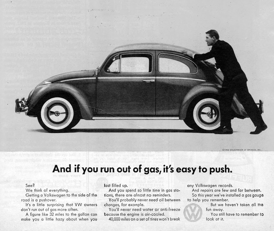
Volkswagen, DDB New York
Social
Human beings are social creatures, we are the only species on earth to communicate with language, the purpose of which largely revolves around social gossip and sharing information³. We rely on each other for survival cues, mating signals and even on help deciding which brands to align with and where to spend our money. Social appeals such as status, affiliation and belonging sing to these human necessities and provide powerful links to user desires.

Diesel “Be Stupid”, Anomaly New York
If we combine these appeals and list them below in our matrix, we’re given a bountiful resource from which to draw inspiration. As an example, let’s take a look at the intersection of competition and performance analysis. We could simply state: “Get ready for any competition with performance analysis” and although this is somewhat of a rational appeal, we can make it more powerful using emotional language through an appeal to status: “Become the best, analyze your performance and gain an edge on the competition”.
With this in mind, let’s take a look at the creative matrix and how the various appeals guide the language used at each crossroad.
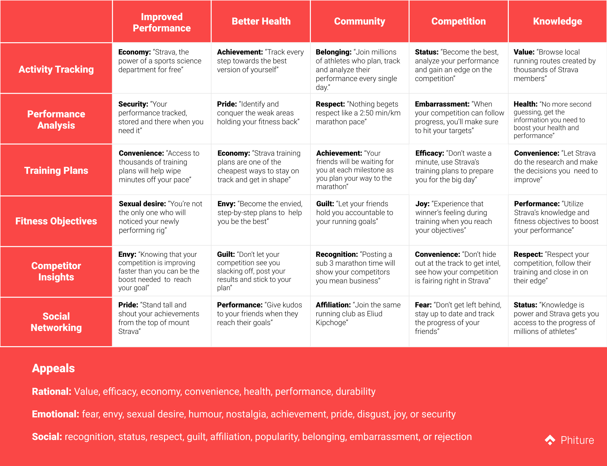
Click to enlarge
Completing the matrix we now have 30 robust directions to explore with our communication. Bolster these messages with visual representation and the strength of our screenshots really starts to take shape.
It’s also entirely possible that your product may not be as well developed as Strava, perhaps product features aren’t as clearly defined or you would like to leverage recently acquired market research around your user segments. No problem, we can change up the principles on each axis to target different ideas. For example:
Value propositions vs customer segments
Value propositions vs cultural components (food, arts, politics, etc.)
Value propositions vs behavioral motivators (urgency, reward, achievement)
Value propositions vs appeals (use product features as communication cues)
Value propositions vs phrase formulation (CTA, questions, explanations, etc.)
There are no real limits here, the aim of the game is to generate ideas and therefore anything helping to spark creativity will have utility on one axis or another. Once you have your ideas, the next step is to prioritize, create and test, test, test.
References
[1] Ambler, Tim & Ioannides, Andreas & Rose, Steven. (2003). Brands on the Brain: Neuro‐Images of Advertising. Business Strategy Review. 11. 17–30. 10.1111/1467–8616.00144.
[2] Pradeep, A. K. (2010). The buying brain: Secrets for selling to the subconscious mind. John Wiley & Sons.
[3] Dunbar, R. I. M. (1996). Grooming, gossip and the evolution of language. London, Faber, and Faber.


