Note from Andy Carvell, Editor of Mobile Growth Stack: We don’t cover UA topics so often in the MGS blog, mostly due to the lack of deep domain experience on this topic within our team. We’re happy to present this guest post by Payton O’Neal from Bamboo, an SF-based agency that focuses on paid social advertising, sharing some key UA learnings.
Too often we see advertisers getting caught up in crafting beautiful ads and perfecting minute details instead of building holistically effective ads. They get trapped in vanity metrics like click-through-rate (CTR) instead of focusing on actions that provide business value.
This is what it takes to make a high-converting ad:
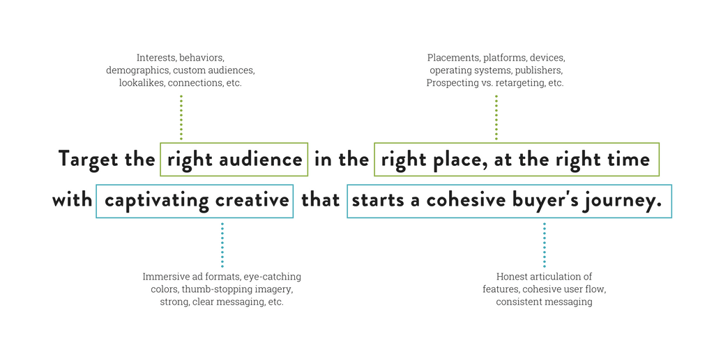
With each part of this ‘formula’ in mind, I analyzed 150 of Bamboo’s clients’ top performing ads to highlight some common trends. Here are the tactics that helped those ads outperform the rest.
Targeting the right audience
The perfect advertisement served to the wrong audience benefits no one. In this post, I’ll dig into all aspects of what made these ads convert better than others.
Starting with targeting the right audience, here are a few things the top-converting ads have in common:
Combined Lookalike Audiences
If you’re not familiar, Facebook’s lookalike (LAL) audiences give advertisers the ability to target broad user groups based on existing knowledge of your customers. You can create lookalikes from any kind of existing audience to build larger pools to target.
For example, let’s say you have a subscription media streaming app targeted at parents with young children. You might build the following lookalike audiences:
- A list of people who have been subscribed for more than a month
- A list of people who have streamed >10 titles
- All the followers of your page on Facebook
- A list of people who follow related Facebook pages or people
- People who have watched >50% of a video you posted on Facebook recently
Since many of those LAL audiences are high performing and likely overlap with other LAL audiences, try combining them to cast a wide net and avoid competing ad sets. Stick to 1–2% LAL for best performance.
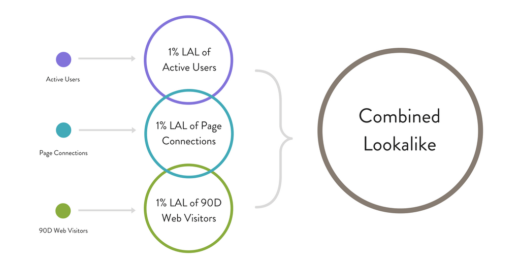
Lookalikes, in one form or another, are widely used, accounting for about 45% of total budgets on average, and are often the best performing audiences.
Optimized Cost-Per-Impression Campaigns
Optimized cost-per-impression (oCPM) targeting works by optimizing ads for high business-value actions like making a purchase. Of all the ads we analyzed, over 90% utilized an oCPM bidding strategy.
oCPM campaigns can optimize for anything from top-of-funnel actions like landing page views, down to the bottom of the funnel events like to purchases. Facebook app event optimization (AEO) is a great strategy for mobile advertisers to attract high-quality users.
Keep in mind that there are also some disadvantages to oCPM; this tactic works best with audiences larger than 1 million, and the event you’re optimizing for should frequently occur (at least 25–50 times per ad set per week) to gather enough information to fuel the algorithm. If the most downfunnel event you want to optimize for doesn’t occur frequently enough, try optimizing for an up-funnel event like ‘add to cart,’ or utilize your business intelligence to identify other events that positively correlate with business value.
Exclusions
While this tip isn’t necessarily strategic,100% of top-performing ads we analyzed exclude current customers or subscribers.
Unless you’re upselling or cross-selling, always make sure to regularly pull lists of your subscribers or customers, uploading and adding them to your audience exclusions. Also, keep in mind if you’re running retargeting campaigns alongside prospecting campaigns to exclude the former from the latter.
Depending on the platform and the campaign goals, here are a few standard exclusions we typically employ:
- Existing customers registered users or subscribers
- Page connections or followers
- Employees, board members, partners, etc.
Serving ads in the right place, at the right time
Targeting your most relevant audience is a good start, but the best ads don’t stop there. Successful selling is serendipitous, reaching potential customers at the right place and at the right time.
Here are a few placement and timing best practices to optimize your ads:
Separating Placements
Facebook often recommends keeping your ad placements together (mobile and desktop, Facebook and Stories, in-stream and Stories, etc.) and allowing the algorithm to figure out ideal combinations. They even make it easy to add Instagram-friendly creative to single ad sets to encourage advertisers to keep them together.
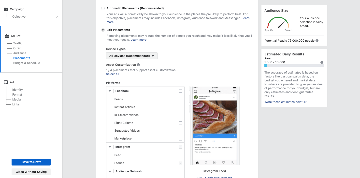
More advanced advertisers should start challenging that approach under the assumption that users behave differently in different places.
Here’s what we mean. Mobile users might be less inclined to make a $100+ purchase than when they’re on a desktop. Instagram stories placement lends itself to view-through conversions more than in-stream ads.
So, whether you just want to learn more about behavior, expectations, or even successful creative across placements, separate them out. If you determine that the same ads and targeting strategies work across each, then go ahead and bring them back together.
Thoughtful Retargeting Strategies
Retargeting ads can have fantastic ROI, and yet it’s a strategy that’s often forgotten or mishandled. Whether you’re retargeting existing customers for an upsell, or app downloaders that haven’t yet purchased, make sure you have a deliberate strategy for your most essential use-cases.
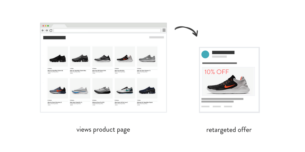
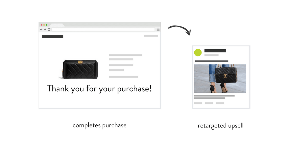
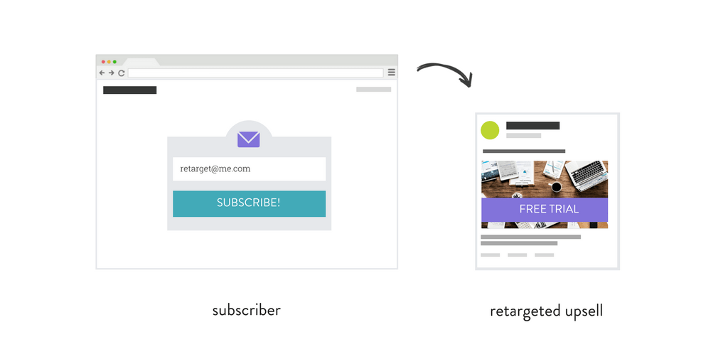 Start by splitting out your retargeting and prospecting campaigns (with the right exclusions, of course). Then split out your buyers’ journey into distinct segments and develop ads for each.
There are endless ways to slice and dice your current customers or web visitors to retarget, and we typically recommend spending a good portion of your budget on remarketing. We devote about 13% of our total budgets on retargeting while the rest is devoted to reaching net new users through prospecting or user acquisition campaigns.
Unique Strategies for iOS and Android
We’ve also found that separating iOS and Android is a good way to scale more efficiently. Across the top-performing ads, we analyzed, about 80% of our campaigns separate out iOS and Android. Why does this work?
At the bare minimum, make sure your app is available on each OS and to only target devices that meet the minimum download requirements.
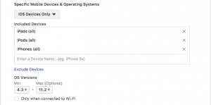 Going a step further, take into consideration what kinds of devices your users are on; if you are selling a luxury good you might want to target higher-end devices and visa versa. Furthermore, Android and iOS users often represent different demographics, and thus may need different bidding, targeting, or creative strategies.
Designing captivating creative
Designing captivating ads is just as important as reaching the right audience. Now that it’s easier and cheaper than ever to produce a high-quality image or video assets, there’s no excuse for advertisers creating ugly ads.
External Validation
Quotes, user reviews, logos. However you do it, leverage existing trust and relationships to your advantage. We’ve all heard of NPR, Oprah, TechCrunch, etc. and trust what they have to say. If NPR (or other reputable sources) has ever so much as mentioned your brand, drop everything you’re doing and make an ad with that quote as your ad copy.
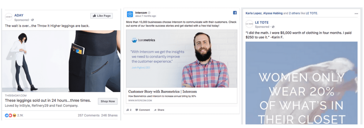
Similarly, logos, user reviews, and even app store icons tend to increase conversions. Ads implementing this strategy have up to 27% lower acquisition costs.
Illustration and Emojis
A quick way to increase your CTRs and in many cases improve conversion rates in certain demographics is the use of emojis in ad copy and images. Illustrations work similarly, communicating product features and benefits or to express your brand’s general vibe.
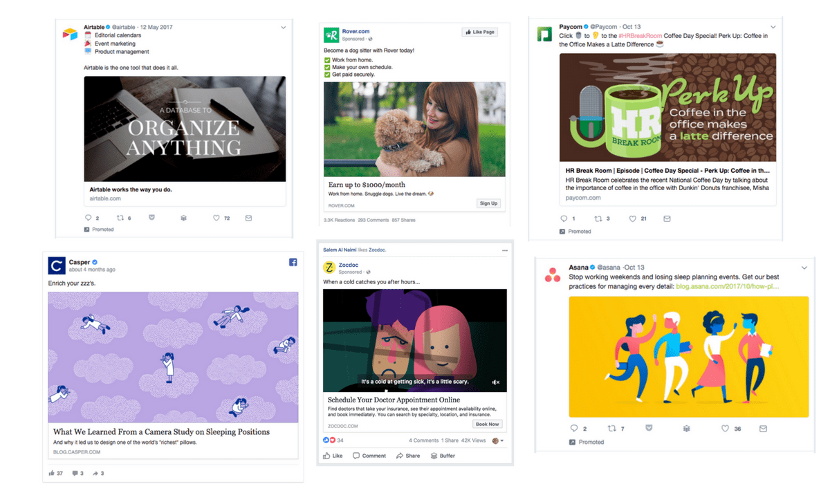
For one client, ads with illustration had 24% improved conversion rates. Bamboo recently named illustration as one of the top Facebook ad design trends utilized by top brands.
In-Image CTAs
In-image CTAs are a Bamboo favorite. Whether placed in a video end card or a static image, CTAs within images have on average, 38% better conversion rates.
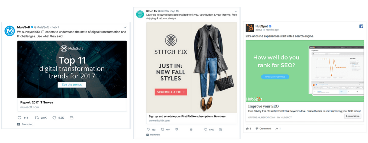
It might seem simple, but they work wonders at grabbing attention, inciting clicks, and most importantly, setting straightforward expectations about what you’ll be redirected to, which leads us to our next section.
Starting a cohesive buyer’s journey
You might be scoring CTRs over 2%, but without conversions, what does it matter? The last part of creating a top-converting ad has less to do with the targeting or the ad, and more to do with starting and completing a cohesive dialog.
Here are a few tips to set realistic expectations upfront and a cohesive purchase journey.
Consistent messaging and imagery
False advertising is undoubtedly the worst marketing offense. A lesser offense is creating an inconsistent story or having disjointed imagery. Digital advertisers often get caught in the pitfall of taking liberties with ad copy or imagery, or making silly mistakes.
Here are a few not-so-harmless mistakes:
- Promising a discount in an ad without applying the discount on site/app or in the cart. This is a huge faux pas that can result in detrimental friction.
- Advertising individual products that lead to generic web pages. We’ll discuss this concept more in the next point, but remember that deep linking is your friend!
- Promoting products that are actually sold out. This happens a lot with dynamic ads; make sure to keep your product feed up-to-date to avoid this mistake.
- Using inaccurate or confusing CTAs (i.e. ‘Learn More’ on a very obvious e-commerce ad. Just use ‘Shop Now). We’re all for testing different CTAs, but don’t forego logic or honesty for an incrementally improved CTR.
- Click-baity titles and ad copy for content that doesn’t quite make good on those claims.
- Going overboard with connecting to something seasonal or geographic when the product or service has little to do with either of those things.
As a rule of thumb, follow logic and stick to your brand guidelines and construct a consistent narrative starting the moment someone sees your ad to the moment they make a purchase (and beyond).
Product-specific landing pages
If you’re advertising a specific product, no matter the ad format, you should direct your browsers to that product’s page. It may seem like a no-brainer, but the effects can be impactful; the ads we analyzed that led to geographic or product-specific pages had on average 53% better conversion rates.
What’s more, make sure that the product page isn’t a dead end. Give them inroads to other products, and make it easy for them to create their own experience or to stay in touch.
Have a backup plan
If your primary goal is to acquire purchasers, your advertising strategy should aim at doing exactly that. Of course, not everyone will purchase, so it’s your duty to do all you can to keep them in your buyers’ journey and give them chances to convert in the future.
Whether that’s an email subscribe pop-up, push notifications, or just capitalizing on your retargeting strategy, never give up. Side note: If you do invest time and resources in this backup plan, be sure to capture data with reporting Pixels or SDKs and be sure to measure results — or they didn’t happen.
No matter how many thousands of dollars you spend on photoshoots and graphic designers, your ad needs to convert. And to convert real people into valuable customers, your ads should combine thoughtful and accurately-timed targeting with captivating and consistent messaging.
Thanks to Andy Carvell.
Table of Contents

