This article was co-written with Stuart Miller, Design Lead at Phiture.
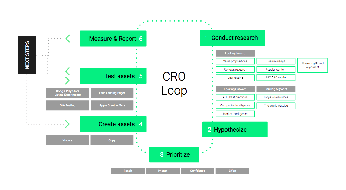
At the end of 2018, we introduced the Conversion Rate Optimization Loop. This framework is meant to help ASO practitioners to improve the conversion rate of their app’s store listing through 6 different steps. Looking back at this a couple of months after, we realize that an important step is missing. If you have invested time and energy in researching for experiments and transforming these ideas into hypotheses, you will have gathered an extensive list of things to test. However, we discarded the complexities of the day-to-day optimization workflow: what should you start with? The order in which you will test your experiments, or how you will prioritize them, deserves as much thought as the research itself.
In this article, we will explain how to focus on the high-impact experiments likely moving the needle and avoid running the risk of being overloaded with poor quality ideas, as well as prioritizing low efforts initiatives as time is often an issue with prioritization. To simplify this App Store Optimization process, Phiture has built a conversion rate optimization experiments prioritization sheet.
Building a scoring system: Combining the RICE and PXL models
So what process should you use to prioritize your ideas? We decided to consider product prioritization methods. One of them is the RICE scoring model, a framework developed by Intercom (a messaging software) to help its own product managers determine which initiatives to prioritize on their roadmap. The model consists of scoring each initiative based on 4 different factors forming together the acronym RICE: reach, impact, confidence, and effort. The article published on Intercom’s blog is a good summary of the method. Let’s now discuss how this can be applied to ASO, and how we derived our own framework for road mapping.
Reach. The goal is to understand how many people will be affected by the change. We all know how challenging estimating precisely its traffic can be, so we’ve decided here to use the simple way and to attribute a multiple-choice scale: 5 for a global action, 3 for an action on the markets we’re primarily targeting (tier-1 markets), and 1 for an action on non-targeted markets or secondary localisations.
Example: Should we have a hypothesis related to screenshots in the United States, we will score it 3. If this experiment is related to the Spanish American localization (es-US), we will attribute a 1.
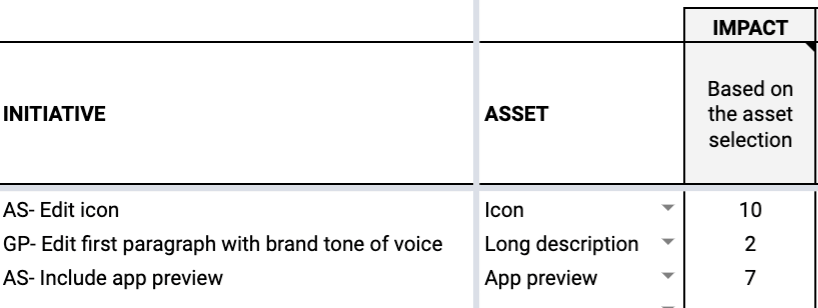
Impact: To focus on the experiments which are more likely to have a noticeable change, we want to estimate the potential impact of all assets. Changes on the icon or title, visible at every touchpoint in the stores, are more likely to move the needle as they should be noticed by more people.
We arbitrary attributed the following scores:
- 10 for Icon, Title: These assets are visible everywhere on the store
- 8 for Subtitle, Developer name: These assets could be visible everywhere on the store, but less prominent than the icon or the title.
- 7 for First screenshot, App preview (App Store only), Feature graphic: Above-the-fold on the product page and dominating attention or appearing in the search results.
- 5 for Short description, Promotional text: above-the-fold, but less visible than other elements. (Note — recent changes to the Playstore have seen the short description become even smaller, arguably reducing its effectiveness). We have only considered the promotional text in the context of the product page and excluded the fact that it sometimes appears with the Search Ads. This asset could be prioritized depending on the traffic you are getting through this channel.
- 4 for Video, rest of screenshots: above-the-fold, requires an action from the user to become visible
- 3 for “What’s new”: below-the-fold
- 2 for Long description: below-the-fold, requires an action from the user to be seen
Example: The hypothesis is that pushing forward a screenshot showcasing a feature liked by the users will increase conversion. Should the idea be to switch screenshots #8 and #5, we will score the impact of idea with “4”. If it’s #8 and #2, the score will be “7”.
Confidence: In the RICE scoring model, this item is supposed to factor in your level of confidence about an initiative, with a multi-scale percentage. Our issue here was that this left too much room for interpretation and didn’t give the team an objective way to evaluate the potential of each idea. The PXL model, a scoring method elaborated by Conversion XL, aims at eliminating as much subjectivity as possible by raising questions which can only be answered in binary. We, therefore, decided to borrow their idea by transforming our confidence level into a sum of the scores of a given set of questions. The two first questions are coming directly from the PXL model:
- Is the change noticeable in under 3 seconds? It is suggested here to show someone your control variant and then the variation(s) and base the score (0 or 2) whether they can tell the difference after a couple of seconds. Should your assets not yet be created, it should be relatively easy to answer this question based on your idea.
- Does your idea add or remove elements (0 or 2)? Conversion XL explains that “bigger changes like removing distractions or adding key information tend to have more impact”.
The following questions should be scored 0 or 1, and have been adapted to match the research made in Step 1 of the CRO loop:
- Correspond to an ASO best practice?
- Unique in comparison to the competition?
- Designed to increase user motivation? (such as elements mentioned in the PET glossary)
- Addressing an issue raised in user testing or reviews?
- Addressing insights found via previous experiments?
- Conforming to brand or marketing guidelines?
Example: Including the name in the icon is noticeable within 3 seconds (scored 2), adds an element (scored 2), corresponds to an ASO best practice (1), but is not designed to increase user motivation (0) and doesn’t match the popularity of feature usage (0), etc.

Example of scoring for “Confidence”
Effort: Estimate the amount of work required by all members of the ASO team, from design to copywriting. For the ASO manager, this should also include the negotiation time needed to validate an icon for instance. This will ensure that you can prioritize projects which allow you to move quickly while driving impact. Unlike the other criteria, the effort impacts negatively the overall score.
We chose again a multi-scale score: A week is 5, a day is 1 and an hour is 0.15.
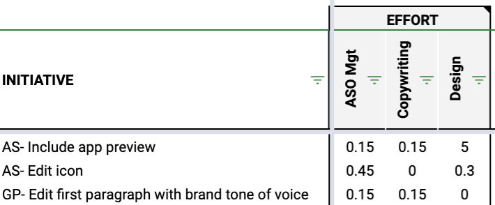
Example of scoring for “Effort”
Once you’ve estimated these values, use the below formula to express each experiment as a single value.

You will then have an overview which allows easy comparison, and subsequently prioritization:

Example of prioritization based on the RICE/PXL models adapted for App Store Optimization
Your hypotheses are prioritized? Sort them by themes
Looking at these scores, you should be able to group your experiments into themes. Themes allow you to draw high-level priorities and logic in your testing plan. This should allow you to focus on one thing, get the necessary learnings, and then move on.
We suggest that these themes are broad enough to encompass several individual experiments but specific enough so that its goal is clear. For example, in the Messaging category, a theme could explore ‘social proof’:
“We can increase conversion by including social proof in our store presence.”
We suggest grouping the experiments based on the different triggers leading to conversion, such as novelty, authority…
We identified three main overarching categories to identify your themes:
Product / Features, as the name suggests, deals with which of the app’s capabilities you are highlighting. If your app is a music-streaming service, will you run a series of experiments focussed around the aspect of offline listening? Perhaps you might instead point out the ability for listeners to collect their own music. Or will you If your app is all about food delivery, would you use the elements in your store listing to point out the broad number of restaurants you partner with, or will you instead focus on different ways to communicate the broad variety of payment options?
Layout & aesthetic deals with the visual aspects of experimentation. Does it make the most sense for your graphic assets to follow the trend of ‘flat’ design, or are you employing gradients and shadows effects? Would it make sense to use certain emojis textual assets? Are you showing extravagant device mockups? Should you be running tests on placements and sizes of captions? What’s in the background of your app video or preview?
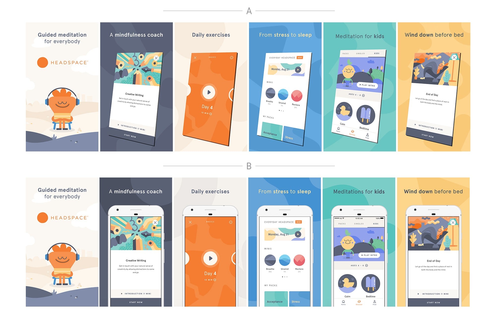
A simple example of a layout & aesthetic experiment — content, messaging and product features are not being tested here.
Messaging could be explained as ‘What we’re saying’, and ‘How we’re saying it’. Are you emphasizing your app’s features, or are you choosing to highlight the value that the app provides to its users? Should you leverage social proof, or focus on breaking popular misconceptions? Messaging also includes changes in the tone of the voice, which part of your user demographics you’re talking to, the jargon you’re using, or which problem you present yourself as a solution to. This could also refer to the content used in your assets. To continue with the food-delivery app example, are you changing your dishes you’re showing according to the time of year? Are you leveraging seasonal events like Black Friday or Christmas?
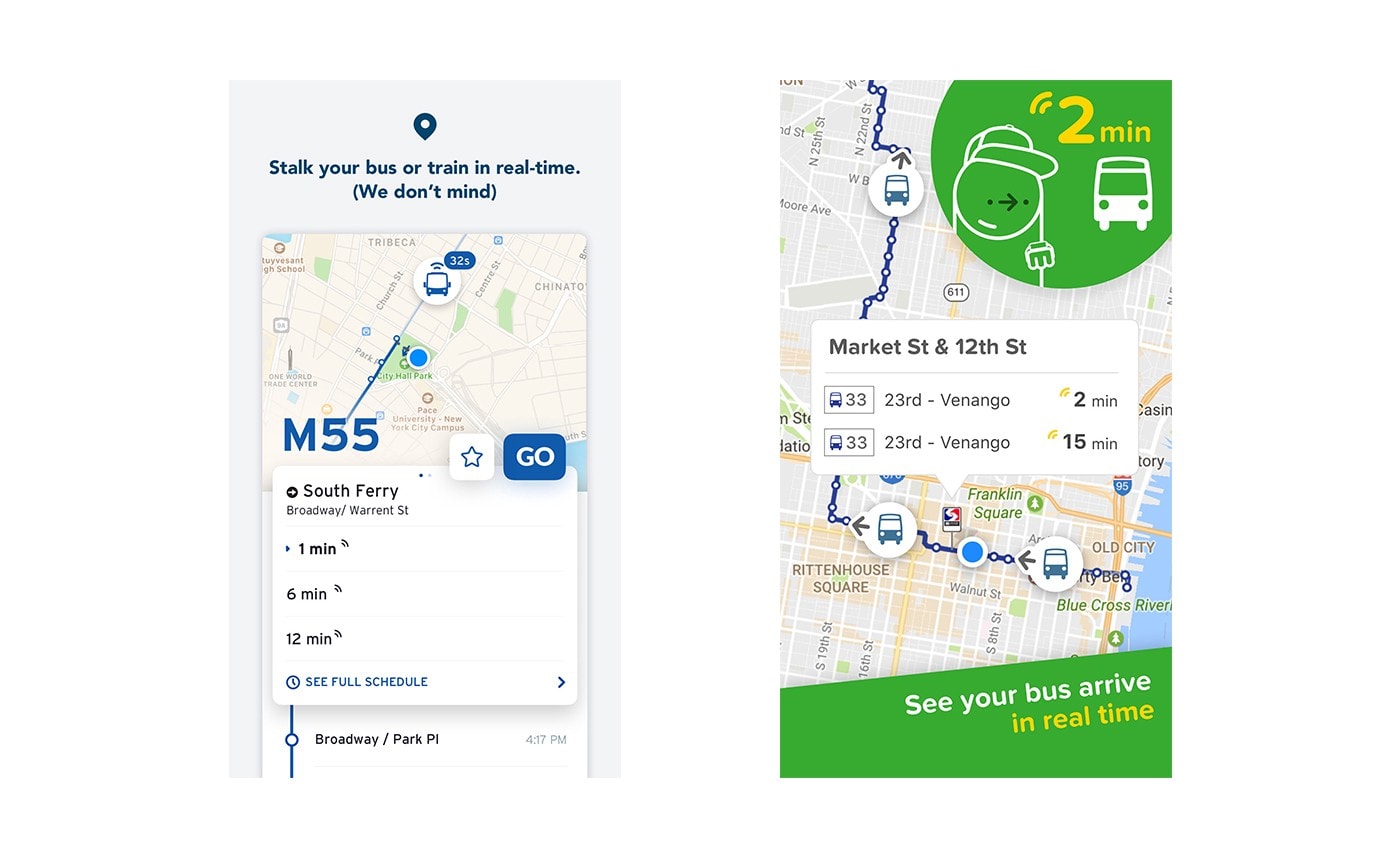
Transit (left) and Citymapper (right): two similar apps, two very different tones of voice. The way you speak to store visitors is fertile ground for experimentation.
Consider other criteria
Don’t forget to take this criterion with a pinch of salt: simply because you have got a list of experiments in certain orders doesn’t mean that you should blindly follow it.
Some experiments could also be implemented almost immediately. However, not all experiments can be tested right away. Some might be dependent on forthcoming product updates, or new brand guidelines; some might be tied into a marketing calendar which extends across other channels outside of ASO which require synchronicity.
We tried to include in the effort criteria some parameters like dependency (eg. based on the approval process), but some changes might also arise from changes in product strategy, increase in competitive pressure, etc.
Final thoughts
The framework presented in this article aims at helping you solve the perennial challenge of prioritization. It will allow you to drive your experimentation process forward with better-informed decisions and give you the necessary evidence to justify your actions.

