Keyword optimization (KWO) is the cornerstone of ASO, but in an ever-crowded marketplace, keyword optimization gains are incremental and require patience, time, and creativity. At Phiture, we lean on Toaster, our internal tool that supports much of the heavy lifting for Keyword Optimization for us.
Toaster is the brainchild of our ASO consultants and data scientists and was built around a single feature: to help scale organic traffic by automatically generating the optimal keyword set for an app. Our vision for Toaster extends far beyond KWO, but in this article we’re reflecting on why we’ve kept this feature at the heart of Toaster, and how a recent UX audit further enriched our tooling. Our findings are transferable, and we’re outlining them here to augment your own understanding of why a user-centric mindset is so important for KWO tooling.
Introducing Toaster
Toaster was born out of the Keyword Optimization Cycle, a framework to ensure ASO professionals have a strong title, keyword set and description. This is central to achieving high visibility. The cycle analyzes data from various sources in four stages. Namely: keyword identification (research), keyword scoring (prioritization), keyword targeting (developing the various sets), and finally measuring the uplift. You can find more detailed and downloadable resources in parts one and two of our introduction to keyword optimization in practice.
Phiture’s data team has been gradually automating parts of this process since 2015, efforts which crystallized into Toaster. Although there are many existing tools that support ASO, we decided to create an internal tool in order to align with the precise steps of the KWO Cycle, thoroughly cover our own data-driven processes, and track historical performance.
Since the beginning, therefore, the functionality of Toaster has closely followed the needs of its users: ASO experts. In 2021, after many iterations on the technical functionality of Toaster, we celebrated a new milestone in the establishment of a dedicated Toaster product team.
Today, Toaster as a product offers many more opportunities than piecemeal automation could, giving our ASO Consultants a comprehensive toolkit for keyword optimization. It can, for instance, include automation and algorithmic recommendations for keyword sets based on extensive data tracking over time. Analytics over time also enables install estimations through our estimated download score. Additionally, Toaster supports localization and is much easier to use than the spreadsheets that had previously supported our process.
That said, we don’t like resting on our laurels here at Phiture. That’s why we contracted User Experience and Design specialist, Aïan Moneo to perform a UX audit and help us translate individual feature improvements into a compelling vision.
UX Audit: Why & How?
The ultimate goal of the UX audit was simple: we wanted to understand how people use Toaster, what works well, and if there were potential opportunities to be had.
Working collaboratively with Aïan Moneo, we developed interview questions that would help us achieve a deeper understanding of the UX of Toaster. We found that the use of interviews as a research method enabled us to understand users’ perspectives in their own words and allowed for the drawing of connections between disparate requests.
The value of this was illustrated in several ways. Firstly, when most of the user feedback for a product (or a process that includes some automation) is in the form of feature requests or big reports, it can obscure what works well (and should be maintained in a future iteration). Secondly, interviews allow the possibility to ask follow-up questions to better understand the reasoning behind preferences, as well as to get the context of how the particular tool (or process) fits into the overall ecosystem of that person’s work.
In the UX audit for Toaster, the interviews with expert ASO consultants specifically focused on each of the four steps of the KWO cycle: (1) research, (2) prioritize, (3) target, and (4) measure. The result could inform the roadmap on what already works within the steps; what can be improved; and how it can be improved. In some cases the findings confirmed what the product team had already considered in their roadmap; in some cases the findings challenged aspects of the roadmap, providing fresh perspectives.
Ultimately, the outcomes from the interview fed into:
- Improved flow and user journeys.
- Quick wins for UX in the currently used iteration of Toaster.
- Wireframes to feed into the product roadmap and inspire the product vision for Toaster.
In addition, an important goal and outcome of this project was to create bridges in the tool between the four KWO steps. The next section includes some of the wireframes created on the basis of the UX audit which have thus far proven a great inspiration for potential future features and potentially improving the KWO process itself.
Lessons from the UX Audit for KWO
The interviews, taken together with our existing knowledge of user needs, helped the team understand the different relevant user journeys as well as what was already working well.
For example, with KWO, the process for a new client and a regular client look different. Ideas on what can be improved for each user journey range from specific improvements for one of the 4 KWO Cycle steps, to considerations of collaboration (such as with freelancers for localization) and reporting.
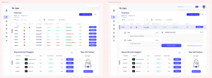
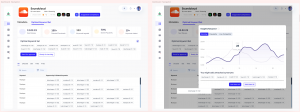
Wireframes Set 1: The suggested wireframes used a variety of helpful visual shortcuts to support each KWO step and to connect and bridge the steps.
Wireframes Set 2: A keyword deep-dive could surface automation specific to that keyword. This is one way that Toaster can support navigating complex information, integrate additional automation, and suggest actions that can bridge one KWO step to another.
KWO as a process requires different data and many analysis steps. Having a vision for Toaster can explore how to present that information in a digestible and actionable way. The fact that Toaster is an internal product offers a powerful opportunity to take these ideas onboard.
The suggested wireframes used a variety of helpful visual shortcuts, not only providing inspiration for how to support each KWO step, but also how to connect and bridge across the steps. Visualizations and charts are not the only way to address information needs more effectively; layout and color can support not just aesthetic but informational goals in a data-driven process.
One general approach to information visualization is to ensure that a good overview is shown first; that relevant filters are then available; and lastly that the user can find details on demand.
The above examples include overviews for an app across markets, which is one of the main challenges that Toaster was designed to address. The overview could also include additional automation, such as auto-suggest (Wireframe Set 1). Filters can help drill down into the historical data for a particular market over a specified time frame. Lastly, a keyword deep-dive could then surface automation specific to that keyword (Wireframe Set 2). In this way, Toaster can support navigating complex information in a way that integrates additional automation, and actions that can bridge one KWO step to another.
Key Take-Aways
Toaster was developed in a consistently user-centric way, starting with gradual automation of the KWO process, and then shifting to becoming an internal tool. To understand the user experience, especially as Toaster has evolved and been built internally, we found bringing an expert UX perspective invaluable to direct our research.
Toaster, in its first iteration, benefitted from the extensive iteration and feedback from users that took place before product development began much later. Before building an internal tool, consider how the existing process can be automated in small stages. What can already be learned from the existing automation? What are the different information needs of those already using the existing process? Approaching these questions for each of the KWO steps can illuminate connections and opportunities.
If you’re putting your own ASO tooling under the spotlight, we recommend considering supplementing disparate feature requests and bug reports with a bigger-picture view of what works well in the current process. In addition, connections can be made between the existing components of the tool (or tools) you might already use. This can help prioritize which aspects to optimize.
Before You Go
- Check out our original presentation of the Keyword Optimization Cycle, a framework to ensure ASO professionals have a strong title, keyword set and description.
- Please make use of our Mobile Growth Stack Slack community to ask us any other questions and we’d love to answer them where we can.
- If you need specific advice on Keyword Optimization, you can reach out to us here and one of the Phiture team will be in touch!

